By: Harris Amjad | Updated: 2024-05-17 | Comments | Related: > Power BI Charts
Problem
Microsoft Power BI Desktop provides a wide variety of visuals to its users. Sometimes, one wants to conduct a comparative analysis, a simple way to explore the relationship between the data categories within a set hierarchy. Hence, when a decision revolves around understanding the relationship of each element, this visual can provide an insightful analysis. This article will highlight all the steps to create a treemap chart in Power BI Desktop.
Solution
As we continue to advance through this age of rapid technological innovation, firms and different organizations also continue to follow behind these advancements, adapting to various trends, organizational and production management techniques that more than often enrich business activity, boosting revenue and profit figures, alongside a more satisfied customer base. Building upon this notion, we have noticed that in recent decades, nearly every big or small firm has resorted to a hybrid approach in their business decision-making progress, the integration of data-driven workflows with experts' judgments as a central processing unit for undertaking business decisions. Although the ratios of these two actors exist on a spectrum between different organizations, playing with data, building dashboards, and mining for hidden patterns and insights has become almost a necessity. Therefore, in this article, we will see how visualizations like a Treemap Chart can aid in the decision-making process.
What is a Treemap
A treemap visualization is a simple way to display a hierarchical dataset using a group of colored nested rectangles to represent different categories and their corresponding sub-categories. As we will see later, this visual is adapted from the working of a tree data structure.
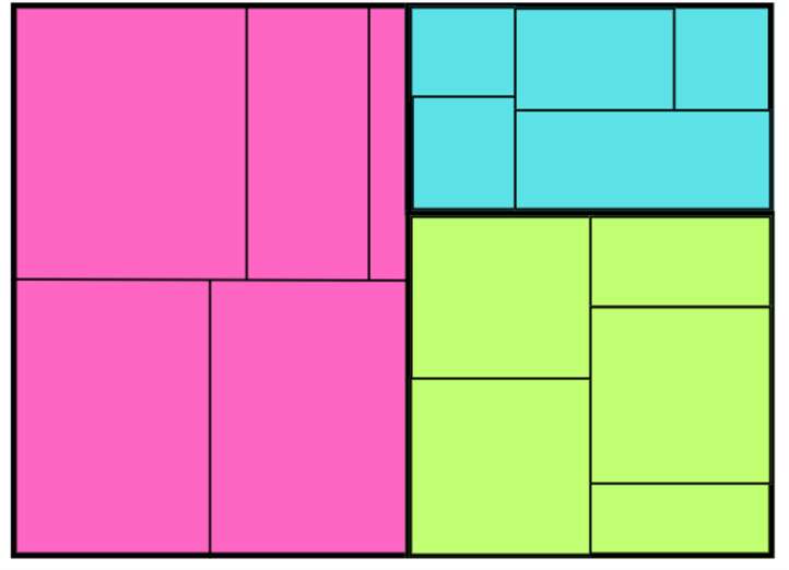
A typical treemap is illustrated above. To understand its workings and how it relates to the tree data structure, let's discuss its components:
- Branch Node: This refers to the individually colored rectangles in the visualization that encode the highest hierarchy level in the dataset. In short, it encodes the categories that are not produced as a result of a decomposition of some other bigger category. Therefore, the branch node does not have a parent node but could have several child nodes. For instance, the pink, green, and blue rectangles in our illustration above represent three different branch nodes.
- Leaf Node: The smaller rectangles within each branch node are the leaf nodes. They represent the lowest level of hierarchy in our dataset, where we can see that although each leaf node can have a parent node, it does not have any child node. In our diagram above, the smaller rectangles encode the leaf node of our visualization. For instance, if we consider the blue branch node, the five rectangles within it are its leaf nodes.
- Size: We can also notice that each branch node, and subsequently each leaf node, has different sizes. This is attributed to the fact that each category and its subcategory contributes to different values to form the 'whole' of this dataset.
Alongside these unique features, the treemap chart is accompanied by other common features, such as labels, legends, and other interactive features, to make the visualization more useful.
So, how can this visualization be helpful to us? We see that:
- Treemap charts are intuitive and easier to understand. Information can be easily absorbed, even at a glance, by anyone.
- Color encodings of branch nodes allow these categories to be differentiated. Also, they can be used to highlight and bring attention to a specific trend.
- It is a multivariate visualization, it represents relationships between multiple variables compressed into a single, two-dimensional visual.
- Large volumes of structured data can be summarized in a single visual, making it a more optimal choice to depict a high-level overview of complex systems and undergoing processes in a business.
Therefore, a treemap chart is a popular choice in market analysis to easily visualize the hierarchy of market segments and product categories. Its use is also pervasive in the financial sector, where expenditures, budgets, and cash flows of an organization can be broken down by different departments.
Create a Sample Dataset
Now that we understand the theoretical aspect of the treemap chart, it is time to get into the practicalities. As an example demonstration, suppose that as a finance employee, you need to find a concise way to illustrate the cash outflows of your hypothetical firm. For this purpose, we need an example dataset that contains a business entity's annual cash outflows on sustaining and investments into its assets: property, plant, and equipment (PPE), supplies, inventory, and long-term investments.
To start, we will first create our database and then access it using the following commands:
--MSSQLTips.com
CREATE DATABASE assets;
USE assets;
We will then create our table to contain the features of the asset, its subtype, and the amount spent acquiring that asset (the cash outflow).
--MSSQLTips.com
CREATE TABLE cash_outflows
(
    asset VARCHAR(40),
    sub_category VARCHAR(40),
    purchasing_cost INT
);
Now, we can finally populate our table with relevant values. For the PPE, your hypothetical enterprise has invested in buildings, land, machines, vehicles, and computer equipment. The enterprise also needed to top its supplies throughout the year, including furniture, stationary, and shipping supplies. The business has also purchased raw materials, work-in-progress goods, and finished goods to sell to customers. Lastly, the business also invested in long-term investments like bonds, stocks, and properties.
For our data entry, we will use the following SQL Server statements:
--MSSQLTips.com
INSERT INTO cash_outflows VALUES
('PPE', 'building', 120000),
('PPE', 'machines', 25000),
('Supplies', 'stationary', 3000),
('Supplies', 'shipping supplies', 7000),
('Investment', 'stocks', 55000),
('Inventory', 'raw material', 40000),
('Inventory', 'work in progress goods', 30000),
('PPE', 'machines', 10000),
('PPE', 'vehicles', 20000),
('Supplies', 'furniture', 15000),
('Inventory', 'finished goods', 70000),
('Inventory', 'raw material', 30000),
('Investment', 'stocks', 35000),
('PPE', 'computer equipment', 20000),
('Inventory', 'finished goods', 40000),
('PPE', 'vehicles', 13000),
('Inventory', 'raw material', 10000),
('PPE', 'building', 100000),
('Investment', 'properties', 60000),
('Investment', 'stocks', 35000),
('Inventory', 'finished goods', 60000),
('Supplies', 'shipping supplies', 9000),
('Investment', 'bonds', 20000),
('PPE', 'computer equipment', 40000),
('PPE', 'land', 110000);
We can visualize this dataset through the following command:
--MSSQLTips.com
SELECT * FROM assets.dbo.cash_outflows;

Creating a Treemap Visualization in Power BI
With this dataset, we can import this scheme into Power BI from SQL Server with ease. Then, we can summarize the structure of this dataset using the Treemap chart. To get started on this, we will go through the following series of steps:
Step 1: Importing the Dataset
Since we created our dataset using SQL Server, in the main interface of Power BI, click on the "SQL Server" icon in the "Data" section of the "Home" ribbon, as shown below.
Fortunately, Power BI also allows its users to import data from a multitude of sources, which can be explored under the "Get Data" option.

Afterward, the "SQL Server database" window will open, as seen below. Enter the relevant server and database credentials, then click OK at the bottom.

If Power BI has successfully established a connection with your database, the "Navigator" window will appear, as shown below. Below the "Display Options," select the required dataset, then click Load at the bottom.
As you can see, Power BI also provides its users a preview of the tables at this stage, making it easier to identify them and recall their use. Furthermore, we can use the "Transform Data" option to manipulate and clean the dataset using the Power Query Editor to discard any wrongful entries, anomalies, format, and structure required. Fortunately, we do not need to go through this step, as our dataset is clean and complete, just the way we need it.

Step 2: Creating the Visualization
Now that the dataset has loaded, you will be redirected to the main interface of Power BI. To make the Treemap chart, click on the "Treemap" chart icon, as shown below, under the "Visualizations" panel.
This step will create a skeleton or empty chart in the view window. We can also stretch and drag it manually to resize and position it appropriately.

To populate this visual with the required dataset, we will do the following:
- The "Category" field refers to the branch node of the treemap. Since the "asset" column contains data that is not being decomposed from another category, we will add this column under the "Category" field.
- The "Details" column refers to the sub-categories or the lead node of the visualization. Therefore, since the "sub_category" column contains the different subdivisions of the assets, it will go under the "Detail" column.
- The weights for our visualization will be provided by the "purchasing_cost" column, which will go under the "Values" field. These steps are outlined below.

Our visualization looks like the one below. We have constructed a very rudimentary version of the treemap chart.

Customizations
Although the treemap chart above serves its basic needs, it still stands to be improved. Fortunately, this visualization tool offers many modifications that can be applied to make our chart more desirable and practical. These measures also ensure flexibility and a hint of personalization when creating these visuals.

Power BI offers formatting options in two flavors: visual and general formatting.
Visual Formatting
Visual formatting relates to feature modifications unique to that visualization. For instance, not every visual has a branch or leaf node. Some modifications enabled through visual formatting are shown below.

We will be going over each of these options:
Legend. Here, we can decide if our visual needs a legend. If it does, we also can alter the position, title, font, size, and color of the text or numbers.

Colors. To enforce a more uniform or contrasting theme across the visual, we can change the colors of the branch nodes.

Data labels. We can also choose if we want the values of cash outflows to appear with the leaf nodes. If yes, we can alter and modify the text, alongside choosing an appropriate display unit and the number of decimal places.

Category labels. Here, we can modify the appearance of the branch node labels.

General Formatting
General formatting allows us to modify visual features that are generally common across most types of visualizations. For instance, every graph must have a title. Some of the modifications enabled by general formatting are shown below:

Properties. We can alter the position and size of our visual in the view window with a higher precision. We also have the option to pad the visual.

Title. We can add a more descriptive title to our visual with a personalized font, color, and size. Users also have the option to add a divider between the title and the rest of the visual. An option to append a subtitle is also available.

Effects. We can modify the overall appearance of the visual by changing the background color, adding a border, or a shadow.

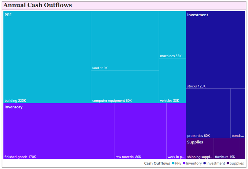
The final version of our treemap chart is shown below. It is more pleasing to look at with its uniform color scheme. Data labels are also displayed so viewers can quickly grasp the cash outflows from each leaf node.
Conduct Analysis
With the final version of our treemap chart, it is time to analyze it and understand what story it is trying to tell us regarding the hierarchical nature of the data. At a glance, we can instantly infer that there are four main categories of data: PPE, investment, inventory, and supplies. We can instantly see that the PPE asset has the largest cash outflow movement, followed by Inventory and Investment. The least outflow is generated by the purchase of supplies.
Delving into more specifics, the firm's largest amount of cash is spent on maintenance or purchase of buildings. It is also the largest outflow-generating asset in the PPE category. The most cash outflow is generated through the expenditure of finished goods in the Inventory category, and the purchase of stocks in the Investment sector. Lastly, the supplies-related assets do not contribute much to the overall cash outflows, with the least expenditure on stationary-related purchases.

Summary
This article successfully demonstrated how a treemap chart may be used in a data-driven decision-making process. Hopefully, the readers can easily understand the definition, features, and importance of this visual in summarizing the part-to-whole relationship in a dataset. After explaining the fundamentals, we also followed a more hands-on approach with this visual, where we first constructed a data schema in SQL Server and then used this dataset in Power BI to create a treemap chart to highlight a firm's cash outflows from different subcategories of its assets. Customization options for this visual were also highlighted, as well as an analysis of our final treemap chart.
Next Steps
- This section is for the curious reader who may wish to further explore the treemap chart and its related concepts. It is recommended to create more visuals with this dataset and see how they change with highlighting and cross-filtering a category or subcategory item in the Treemap chart.
- Furthermore, did you know that rather than using the visual formatting options to modify the color of the branch nodes, you can also use conditional formatting to do so? See where it might be relevant to do so.
- Users are also encouraged to explore other visuals suited to visualize hierarchical datasets. Although we only demonstrated a single level of hierarchy in this article, see if it is possible to display multiple levels as well. Then compare the results with other visualizations such as the Sankey chart, the Sunburst chart, and the Area chart.
- Explore other chart types in Power BI.
Learn more about Power BI in this 3 hour training course.


About the author
 Harris Amjad is a BI Artist, developing complete data-driven operating systems from ETL to Data Visualization.
This author pledges the content of this article is based on professional experience and not AI generated.
View all my tips
Article Last Updated: 2024-05-17