By: Ray Barley | Comments (2) | Related: 1 | 2 | 3 | 4 | 5 | > Reporting Services Charts
Problem
I'm looking at several new visualization features in SQL Server 2008 R2 Reporting Services and the data bar looks like something that I could really use. Can you provide an example of how to use this in a report?
Solution
The data bar is a new visualization that essentially provides a bar chart within a single cell in a report. This enables you to easily compare the data in one row to another based on the relative length of their data bars.
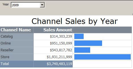
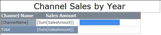
In this tip I will walk through creating a report that uses a data bar. As an example I will create a simple report using Report Builder 3 which is available on the SQL Server 2008 R2 Feature Pack site.. A preview of the report is shown below:
My report will use the ContosoRetailDW database and show channel sales for a given year. I will use the following query in the report:
SELECT c.ChannelName, SUM(f.SalesAmount) SalesAmount
FROM dbo.FactSales f
JOIN dbo.DimDate d ON d.DateKey = f.DateKey
JOIN dbo.DimChannel c ON c.ChannelKey = f.ChannelKey
WHERE d.CalendarYear = @Year
GROUP BY c.ChannelName
ORDER BY c.ChannelName
To create a new report choose the Table or Matrix Wizard in Report Builder, create a data source, a dataset (i.e. the query above), then add the columns to the matrix as shown below:
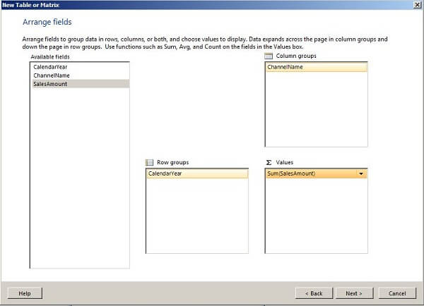
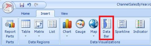
Note that this gives us calendar years on the rows, channel names on the columns, along with the total sales. To add a data bar to the report, click the Data Bar on the Insert tab as shown below then click in the report cell where you want to render the data bar:
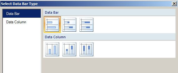
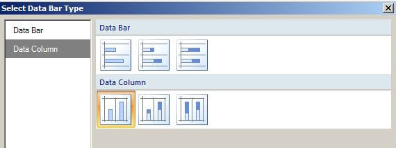
After clicking in the cell where you want to add the data bar, you'll be prompted to choose the data bar type; select the Data Bar as shown below:
After choosing the data bar, the report designer will update and show the following layout:
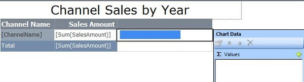
Double click inside the cell where you added the data bar to show the Chart Data dialog as shown below:
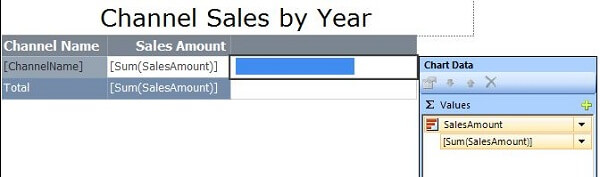
Click on + and select SalesAmount from the available options; the data bar will render based on the Sum(SalesAmount) as shown below:
At this point the report is ready to run and the output is shown below:
The data bar allows us to visually compare the total sales of one channel relative to another.
Now let's do another report and show a different type of data bar. I'll use a slightly different query that shows sales grouped by year and channel:
SELECT d.CalendarYear, c.ChannelName, sum(f.SalesAmount) SalesAmount
FROM dbo.FactSales f
JOIN dbo.DimDate d ON d.DateKey = f.DateKey
JOIN dbo.DimChannel c ON c.ChannelKey = f.ChannelKey
GROUP BY d.CalendarYear, c.ChannelName
ORDER BY d.CalendarYear, c.ChannelName
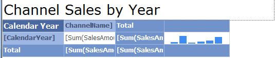
The report will show years on the rows and channels on the columns. Instead of a single data bar, I'll have one for each channel. Here's the report layout in the designer:
When I selected the data bar, I picked the Data Column instead of the Data Bar as shown below:
Double click inside the cell with the data bar to show the Chart Data dialog and fill it in as shown below::
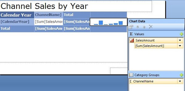
Note that ChannelName has been added to the Category Groups; essentially the data bar is rendering the sum of SalesAmount for each ChannelName. The report now looks like this:
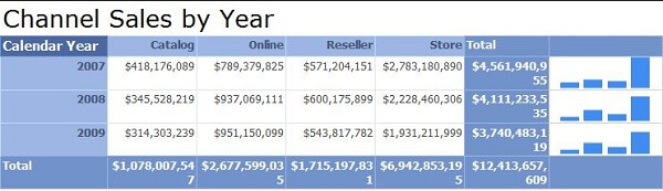
Note the four vertical bars (one for each ChannelName) versus the single horizontal bar in the first report.
Next Steps
- Data Bars are a new addition to SQL Server Reporting Services 2008 R2 and provide a nice way to spice up your reports with a bit of visualization.
- You can download the Contoso Retail DW sample database used in the report from this CodePlex site. Select ContosoBIdemobak.exe and follow the instructions for installing.
- You can download the sample reports here.
- You can download Report Builder 3 from the SQL Server 2008 R2 Feature Pack site.


About the author
 Ray Barley is a Principal Architect at IT Resource Partners and a MSSQLTips.com BI Expert.
This author pledges the content of this article is based on professional experience and not AI generated.
View all my tips