By: Scott Murray | Comments (2) | Related: > Power BI Charts
Problem
What are Power BI Funnels and Waterfalls and how can they best be used?
Solution
Often when you hear the term waterfalls and funnels you may think of a physics exam or maybe some sort of geological effect, but in this case, we are actually referring to a set of charts that are available in Power BI. A funnel chart actually shows you values as you move from one series to the next, in the shape similar to a funnel. A waterfall chart shows you changes or variances over the course of a set of categories. We will cover both of these charts in more detail throughout the rest of this tip.
Power BI Funnel and Waterfall Charts
To get started you will need to download Power BI Desktop from - https://powerbi.microsoft.com/en-us/desktop/. Power BI Desktop is the client application that is available for you to design Power BI Dashboards on a local desktop. Once Power BI desktop is installed we can go ahead and start working with the two chart types. We are going to make use of the Wide World Importers SQL 2016 database for our sample data. You can download the Wide World Importers database from - https://github.com/Microsoft/sql-server-samples/tree/master/samples/databases/wide-world-importers. In particular, we will be using the WideWorldImportersDW database.
We are now ready to demonstrate some of the details for each of these chart features. Also note that the Power BI Community has several “enhanced versions” of many charts which can be reviewed at - https://store.office.com/..
Power BI Funnel Chart
A funnel chart is designed to show the natural progression of a value over a series; many times, the series is over some time period or set of stages of a project. Generally, the values will adjust, downward or upward, in a consistent sequence to allow the funnel to be uniform, width wise, and narrow somewhat consistently from period to period, stage to stage or series point to series point. However, the uniformity is not a “hard” requirement. Let us get started with our example.
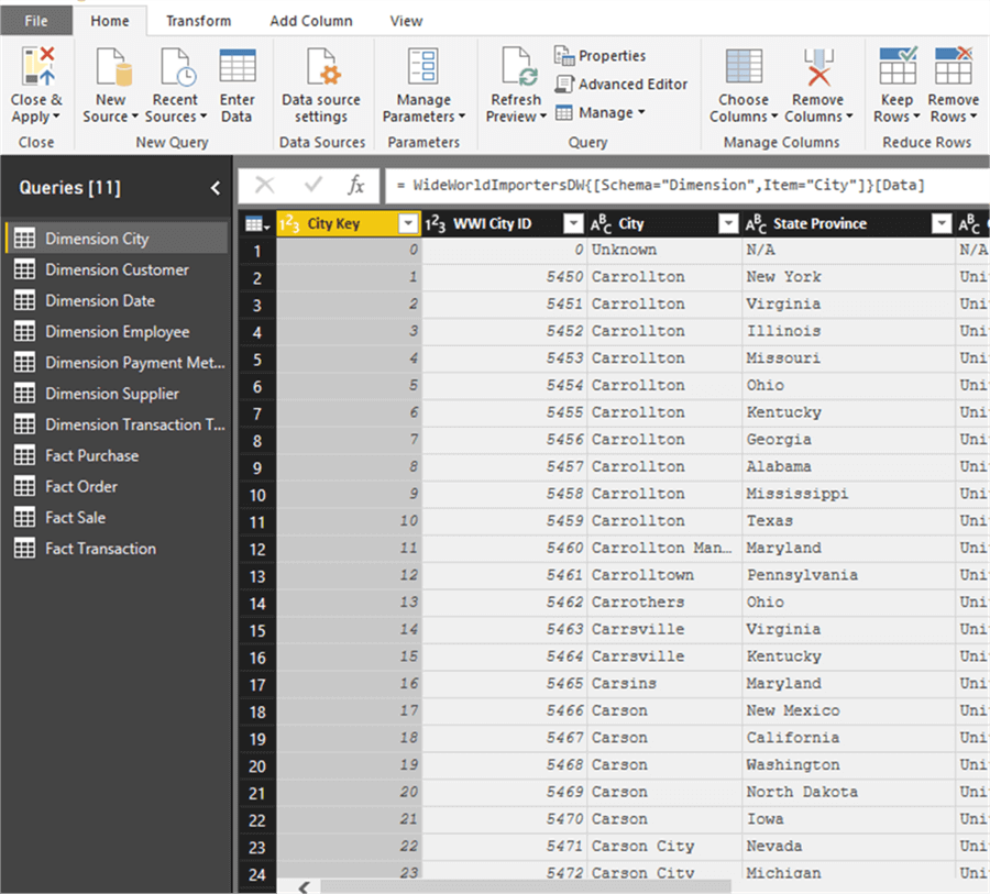
Our first step is to load several tables from the WideWorldImporters Database; the Fact Sale and Dimension City tables will be utilized for this tip.
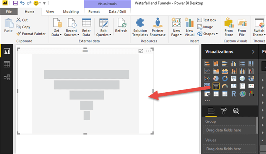
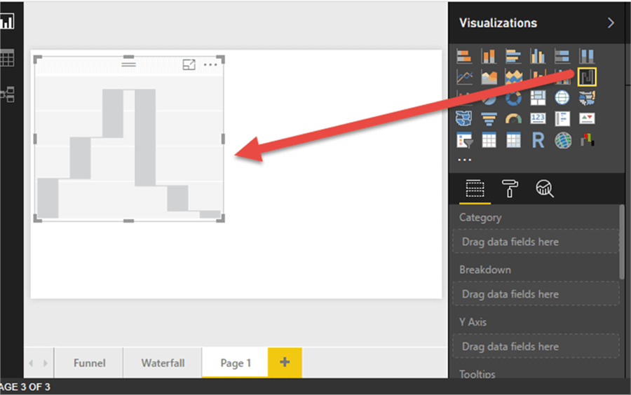
Next, the Funnel chart will need to be selected and dragged onto the design grid.
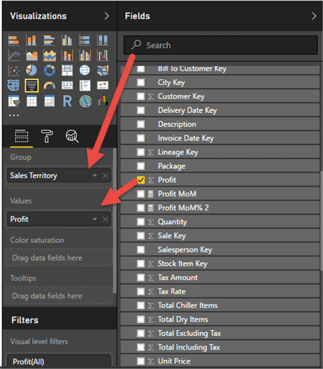
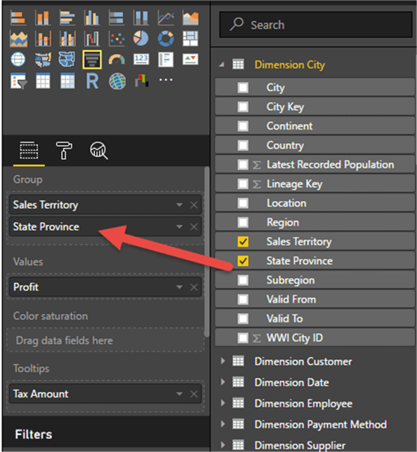
Next we add a measure value, Profit from Fact Sale, to the Value area and then add Sales Territory from Dim city to the Group area.
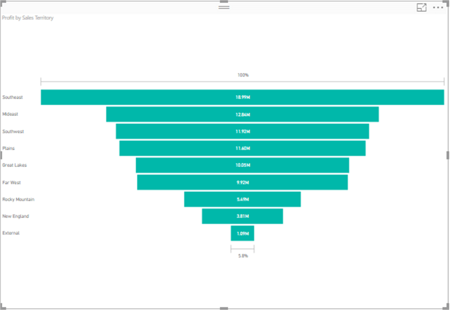
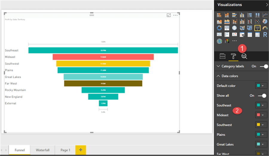
Now, as shown below, our basic funnel graph is formed. It shows the series change from largest to smallest of the Sales Territory regions (all in the shape of a funnel).
However, we can add several features to our basic chart. First, we can go to the format tab, and adjust the data colors used by each of the group categories. As illustrated below, we set a default color, and then each data point in the category, the Sales Territory in our example, can have its own color customized.
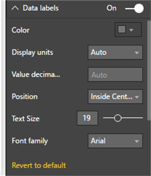
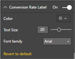
Additionally, we can adjust the data labels and conversion labels font and formatting as shown next. These changes will make it easier to see the raw values.
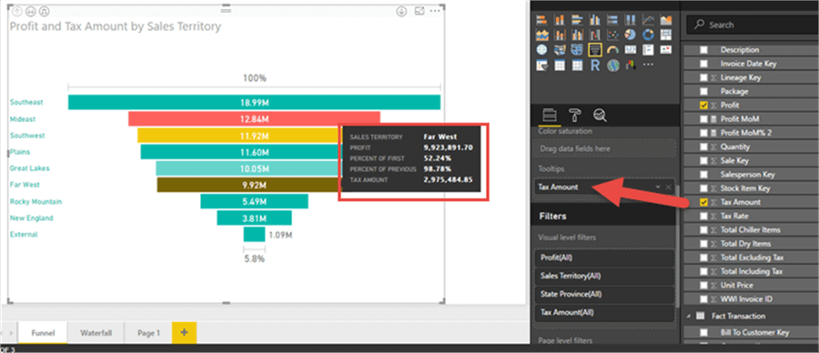
We can also add fields to the tooltip that appears when hovering over the visual. In the below example, the Tax Amount was added. Notice on the tooltip that other details are included in addition to the value we added. The percent of first and percent of previous are very nifty additions.
Finally, we can add drill down capabilities by adding a second category group, StateProvince in the below screen print.
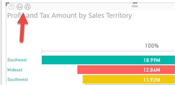
Now on the upper left corner of the visual we have two drill down buttons; the first, with two down arrows not connected, drills down one full level, whereas the button with two down arrows that are connected does an expand all drill down.
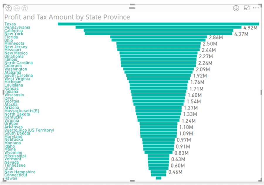
The results of the expand down one level show the break down by state.
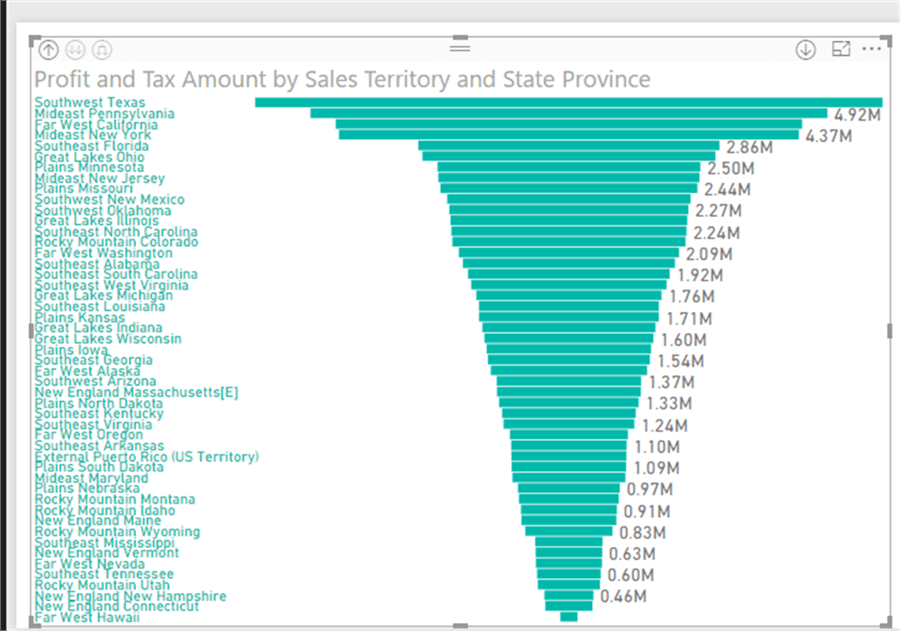
The Expand All option first shows the Sales Territory and then the State / Province.
NNow, let us move on to Waterfalls.
Power BI Waterfall Visualizations
Waterfall charts share some similarities with the funnel chart in that it attempts to show change over some series or category. However, instead of showing total or summated values, a waterfall visualization actually focuses on the variation or cumulative effect between different values. Thus, instead of showing the total sales for a group of years, a waterfall chart will show the difference or variance between sales figures from year to year or category to category. The implication is to show the trend that is occurring between values in the series; it is a great chart to show how you got to a specific ending result.
We will use the same dataset we used for the funnel visualization to show the features of a waterfall chart. Thus, the first step is to add the waterfall visual to the design grid.
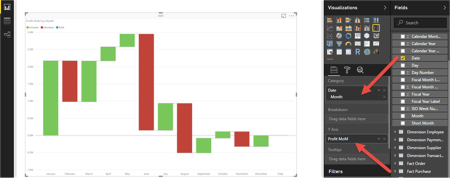
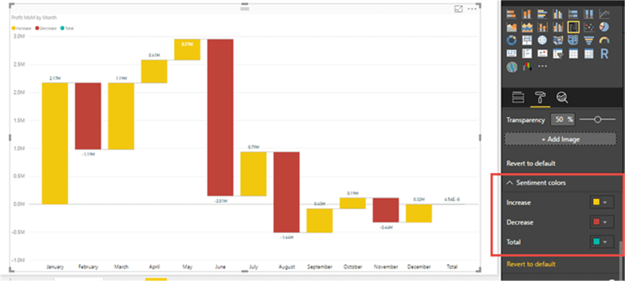
Next, we will use the Profit Month over Month (Profit MoM) measure as the Y axis and then use Month as the Category. You can see in the below example the ups and down of the Profit from month to month.
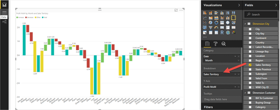
We can further refine or breakdown our waterfall by adding a breakdown value. This feature provides us with the “biggest” contributors to the change in value. For the below illustration, we added Sales Territory to the breakdown field, which in turn shows the breakout of each category, the month, by the top 2 Sales Territories plus a summary category of Other.
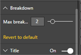
We control the number of breakout categories by going to the Format Tab and then scrolling to the Breakdown pane.
Additionally, we can change the colors for each of the waterfall bars/columns by using the Sentiment colors pane.
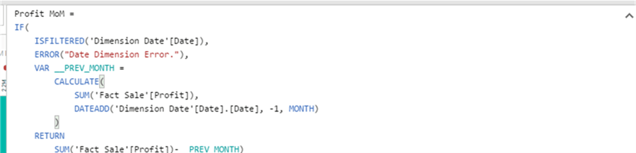
One item that you may be asking about is how did I calculate the Month over Month Value? We need to use a formula to create a new measure for that calculation. The calculation is based on the Dimension Date Month field and the Quick Measures option (I hope to do a future tip soon on the Quick Measure which is currently in preview mode). The formula is shown below.
As you can see, these two charts break out of the ordinary bar and line chart mode and provide several key insights in a handy visual format.
Next Steps
- Explore many of the Power BI Custom Visualization: https://store.office.com/en-us/appshome.aspx?productgroup=PowerBI&ui=en-US&rs=en-US&ad=US
- Create MTD, QTD, YTD values in Power BI: https://www.mssqltips.com/sqlservertip/4841/calculating-mtd-qtd-ytd-running-and-cumulative-total-in-power-bi/
- Introduction to the Power BI and the M Language: https://www.mssqltips.com/sqlservertip/4043/introduction-to-the-power-bi-desktop-and-the-m-language/
Learn more about Power BI in this 3 hour training course.


About the author
 Scott Murray has a passion for crafting BI Solutions with SharePoint, SSAS, OLAP and SSRS.
This author pledges the content of this article is based on professional experience and not AI generated.
View all my tips