By: Cate Murray | Updated: 2014-09-05 | Comments (2) | Related: More > Professional Development Resume
Problem
Studies in recent years have shown that the average Resume Reviewer/Reader spends between 6-15 seconds skimming a resume before deciding whether or not to keep reading. One of the biggest improvement areas when it comes to resumes has nothing to do with the content itself, but how that content is presented. You want to ensure your content is relevant, but also that it really pops!
Solution
When you consider that the average resume reviewer will only look at your resume for 6-15 seconds, it’s easy to understand why it is imperative that your resume is in a reader-friendly format that’s easy to scan, and quickly communicates your main differentiators and competitive advantages to whoever is looking at your resume! Here are some of our suggestions for improving the look and feel of your resume!
Evaluate several layouts and pick one which is visually appealing
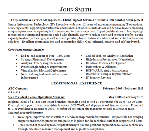
There are several resources out there, such as Live Career, which offer a variety of resume templates from which to choose. It’s well worth it to invest some time and money to choose a quality template, such as the one below, which you can customize with all your experience and accomplishments!

Prioritize content
You want to ensure your main competencies, especially as they relate to the roles you’re applying for, are immediately visible! For example, if you’re applying for a SQL Server DBA opportunity at a large organization which will be in a leadership capacity, consider adding a ‘Tag Line’ similar to the one below. Again, these tag lines can act as your 3-5 second ‘Elevator Pitch.’ Also, don’t hide relevant certifications, technical skills and all your accomplishments at the bottom of your resume.

Have a comfortable mix of white space and words
The layout of your resume is very important because it is the first thing the hiring manager sees and you only have a few seconds to make a positive impression. You want your resume to be inviting, attractive, and professional as you want the reader to have a positive experience and heighten their interest so they’ll want to know more about you! If the resume has too many words and not enough white space, the resume will look cluttered and it may distract the reader. You want your resume to be “reader friendly” and white space helps guide the eye from one key section to another. Having a good combination of white space and words will really help your resume pop.
Use bullet points over paragraphs, especially when outlining your job duties and accomplishments
In our experience, hiring managers prefer bullet points over paragraphs because it is so much easier to read and digest. Having strong and solid bullet points will help your resume stand out. A few recommendations on bullet points:
-
Under your work accomplishments, include specific
numerical data if possible. For
example: “Oversaw a global team of 10 and managed projects ranging from 500K to
$5 million” vs. “Oversaw a global team and managed mid-to-large scale projects”.
- Highlight skills that are important in your industry, field, skill set, etc. If you had a chance to work with the latest, hot technology, make sure it’s prevalent in your bullet points.
Consider using tables, column format, etc… for outlining your technologies
Rather than listing out all of your technologies in paragraph form, organize them in a manner so they’re easy to read. Another best practice is to categorize, similar to the below examples, so the reviewer can easily distinguish your experience with different technologies and tools.


Be Consistent
- Line spacing, horizontal spacing, and character spacing
- Past vs. Present tense
- Indentation
- Bolding, Italicizing, Underlining, Font Type/Size - DON’T OVER DO IT
- Font (Arial 10 or Times New Roman 11 or 12 are most common)
Next Steps
- If you’re starting a resume from scratch, or just want to look at more formatting options, check out Resume Templates via livecareers.com, which is one of our personal favorites when it comes to Resume Builders! Also, once you’re finished with your resume, ask several people in your network to do a “gut check,” where you show them your resume for 6-10 seconds, and then ask them questions about the UI aspect of it. For example, was it information overload? What were the top things that stood out? Would you keep reading it? How could you improve?
- For more advice on Resumes, feel free to watch the webcast we did on July 22nd via the MS SQL Tips archives!
About the author
|
Erica Woods has nearly a decade in the IT staffing world, an MBA,
and is a member of the Professional Association of Resume Writers
and Career Coaches.
|
About the author
 Cate Murray is responsible for managing the nationally-based talent acquisition strategies of the Apex Systems PMO and Business Analysis Practice and holds her PMP certification from PMI.
This author pledges the content of this article is based on professional experience and not AI generated.
View all my tips
Article Last Updated: 2014-09-05


