By: Rob Fisch | Updated: 2010-04-29 | Comments | Related: > SharePoint
Problem
I have read about many of the new features in SharePoint 2010. I would like to actually see some of them.
Solution
The beta version of SharePoint 2010 has been available for months. Recently I had a chance to take a look under the covers and find some interesting new features.
In this article I will show you some of the things I have found...
The first thing I noticed is that there has a been a concerted effort to make the menus more graphically based, and to provide dynamical navigation options for administrators to select various options. The picture below shows the standard "Create" options, when adding a new SharePoint object. Notice the "filter by" options on the left.
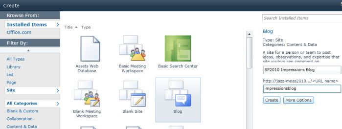
Whenever you "create" a new list or other SharePoint object, the interface shows an animated spinner until the object is created.

Creating a Sub-Site
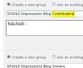
Below is a screenshot while creating a new sub-site. I am disappointed that Microsoft keeps "Members" as the group name for the default group of users getting "contribute" permissions.

Here's my recommended correction from a previous article.
Blogs
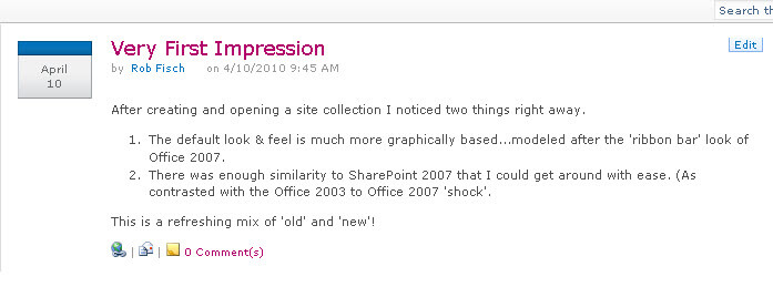
SharePoint 2010 blogs have a new look, while much of the functionality remains the same as WSS3/MOSS2007 blogs.
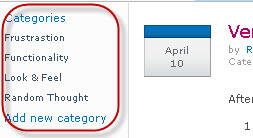
The categories for blogs can be updated on-the-fly (shown below).
Libraries
From the "Create" menu, I have objects filtered by "Library". There are a few more library types to choose from.
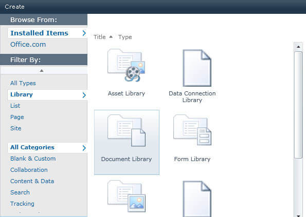
Below is a thumbnail graphic of one of the document library screens. Click on the graphic for a high resolution peak at some of the options.

Workflows
When creating SharePoint 2010 workflows from a web browser, there are some refreshing enhancements to the available options. Notice the option to require "Manage Lists Permissions to start the workflow". This enables workflow designers and SharePoint Administrators to be more granular with controlling permissions.

These workflow options are a welcome addition to the web browser workflow creation wizard.

Navigation & MS Office Interactivity
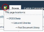
For better or worse, Microsoft removes the old "breadcrumbs" navigation indicators, instead, adding a little icon. When clicked, navigation hints are offered in a hierarchical (indented) structure...which is a little more intuitive and takes up less screen real estate (but a little trickier to find at first).
Every list and library menu offers increased visibility and functionality for integration options to and from other Microsoft Office products.
I tried linking a SharePoint calendar using the MS Access option.
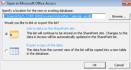
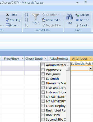
First off what I found was the connectivity worked just fine, even from MS Access 2007 to SharePoint 2010. Secondly, I found that MS Access exposed some fields that were not apparent in the SharePoint Calendar, such as Calendar event attendees. I can only guess that these fields were meant to integrate with Outlook 2010 (which I have not tried yet.)
Updating the fields using MS Access had an immediate effect on the SharePoint fields. (Be careful, this is VERY powerful.)
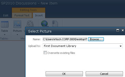
In previous SharePoint versions, whenever referencing images from a Content Editor Web Part or enriched multiline text field, there was no integrated facility to add image files to working document libraries. SharePoint 2010 offers the ability to for this to work on-the-fly, a nice feature enhancement.
Also note that many of the form windows now pop-up in front of a main screen (instead of taking over the browser window completely...leaving the user to constantly wonder where they were.) This is one of my favorite usability enhancements to SharePoint 2010.
Other enhancements
There are many, many new features to look at. More than I can fit into this article. This was just to share a little of what is under the hood of what I saw in SharePoint 2010.
Next Steps
- Check out MSSQLTips.com for great information about Microsoft SQL Server.
About the author
 Rob Fisch has worked with SQL Server since version 6.5 as a dba, developer, report writer and data warehouse designer.
This author pledges the content of this article is based on professional experience and not AI generated.
View all my tips
Article Last Updated: 2010-04-29


