By: Siddharth Mehta | Updated: 2011-06-08 | Comments | Related: > SharePoint
Problem
Data discovery (and problem decomposition) are driving processes in a root cause analysis exercise. Dashboards and scorecards represent highly aggregated and summarized data. After a high level category becomes the focus for the root-cause analysis, an interactive mechanism is required for navigating through aggregated data (in a dimensional schema of a cube). This "problem decomposition" ends with a data discovery which is generally the end result of root cause analysis. In this tip we would take a look at how PerformancePoint Services can satisfy this data analysis requirement.
Solution
PerformancePoint Services (PPS), now available in SharePoint 2010, offers a visualization known as the Decomposition Tree. Decomposition trees are a way to navigate data (rather than generate a "canned" report) and can only be activated from an analytical chart or analytical grid from a context-specific (right-click) menu.
In this tip we will take a look at how to use decomposition trees to navigate through the data, and learn how to use this visualization for problem decomposition.
Dashboard Designer is a one-click application available in PerformancePoint Services. It is the IDE which is used to develop dashboarding related objects using PPS. We will be using the Analytical Grid to start discussing Analytical Grid visualization. The Analytical Grid is a first-class object available in PPS. Its basic use is to display data in a pivot table format from a cube, which users can slice and dice to analyze the data. Data in this grid can also be analyzed using a visualization known as Decomposition Tree, which is the main focus of this article. If you want to dive a little deeper in Dashboard Designer and Analytical Grid, you can check out this link.
For the purposes of this discussion, the AdventureWorks DW sample database has been used, using sample SSAS solution.
Follow the below steps in which we will learn how to work with decomposition trees.
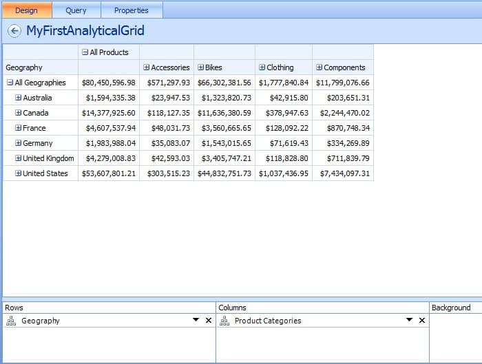
1) Create a simple Analytical Grid using data from the AdventureWorks cube. We have used the Geography hierarchy from the Geography dimension on the Rows axis, and the Product Categories hierarchy from the Products dimension on the Columns axis. Your report using the Analytical Grid in PPS should look similar to the screenshot below.
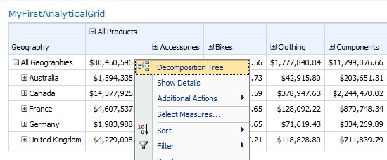
2) After publishing to an appropriate destination (for example any dashboard on a SharePoint page on a BI Site), navigate to the site. Right-click on this grid, and you should find "Decomposition tree" option in the menu as shown below.
3) After selecting it, a new window should pop-up which should look similar to the screenshot below.
There are several elements to observe here.
a) The name of the measure whose value is reflected across both dimensions is reflected in the top-left corner.
b) A rounded value at each level is reflected along with the name of the member. If you watch the tooltip of this member you will find more details about the actual value, along with the weight of the value of the member in the entire group. The blue bar also represents the weight of the member in the entire group.
For example, in the screenshot below you can make out that the United States has total sales of approx. 54 million, and it carries a weight of 66% of the total sales in the entire group i.e. All Geographies which is the sum total of all the countries.
c) As we have used a hierarchy, at every level until the deepest level of the hierarchy you will find an expand/collapse button and it will decompose the values to a more granular level than its top level.
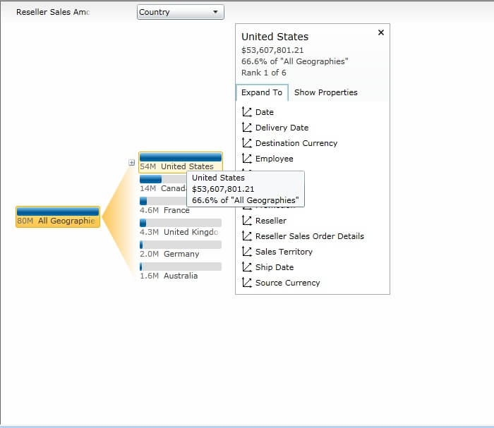
4) As you can see in the screenshot (above), when you click on any member, you can select if you want to associate any other dimension to the member of the selected dimension.
For example, the Geography hierarchy is formed out of Country -> State/Province -> City. But you intend to navigate from Country -> State/Province, and then analyze data for some member and you need to see the decomposition of data for this member in another dimension.
For example you found that sales of California is highest among the group and you intend to find out that the sales of which category of products was the best.
In that case, select the Category level from "Product Categories" hierarchy of the "Products" dimension and then you can continue drilling down that hierarchy. The screenshot below depicts what we intend to analyze.
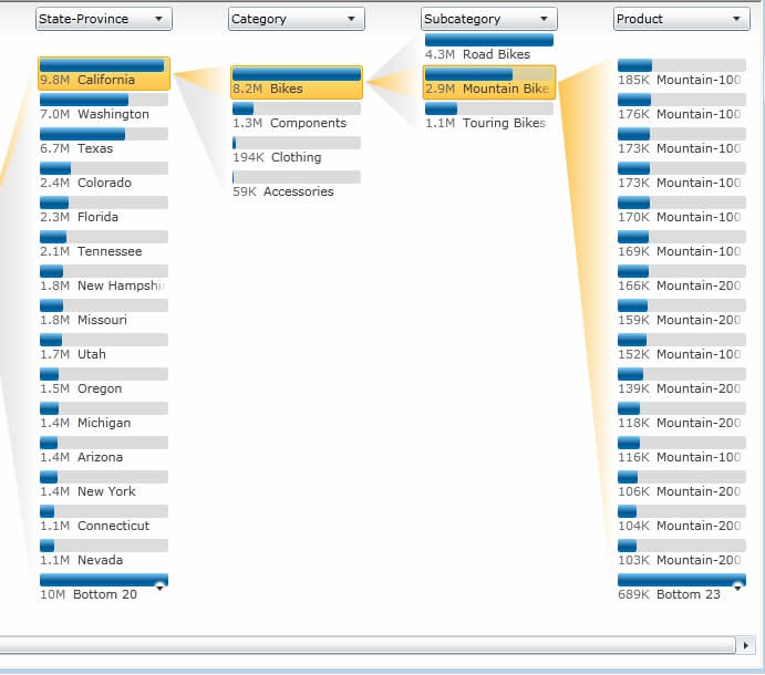
5) In terms of navigation of data, you would almost never get a vertical scrollbar, whatever be the number of members you are analyzing.
The reason for this is that decomposition trees aggregate data for the members that do not fit within the length of the screen and shows it collectively as the last member. If you look carefully in the screenshot below, you will find the last member (showing Bottom 19).
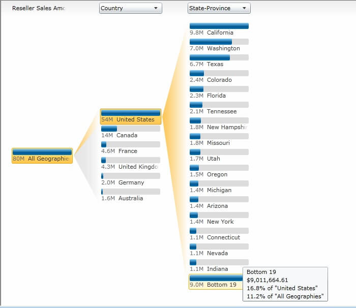
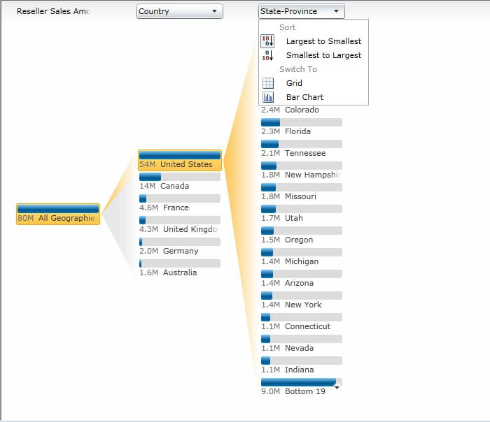
6) In terms of arranging the data, when you click on the column header, you will find options to sort data as well as the ability to analyze data in different views (see below).
In summary, when a business user starts analysis from a particular level in this visualization, it readily calculates the weight, displays the actual values, associates different dimension members and helps in breaking down the problem area, which can be out of reach of many 'canned' reports. Also no special configuration is required for this visualization. It works really well as long as there is a sound configuration in your dimensional model (cube design).
Next Steps
- Create a more complex analytical grid and check out how you can start using decomposition trees at a particular level.
- Try associating two dimension members to a measure group that are not associated in the dimensional model.
- Read this tip on How to Configure PerformancePoint Services in SharePoint 2010.
- Check out the tip on How to create SharePoint Out Of The Box Charts Using Business Data Catalog.
About the author
 Siddharth Mehta is an Associate Manager with Accenture in the Avanade Division focusing on Business Intelligence.
This author pledges the content of this article is based on professional experience and not AI generated.
View all my tips
Article Last Updated: 2011-06-08


