By: Knox Cameron | Updated: 2011-07-13 | Comments | Related: > SharePoint
Problem
You've got people putting their documents into SharePoint, and assigning metadata tags. They appreciate that they can now find the documents they want more easily, using views grouped by client or consultant, instead of digging through folders. But where's the "wow factor": something that makes them really sit up and notice how much better things are with SharePoint? Something that makes all the "tagging" hassle worthwhile?
Solution
Let's take it to the next level!
This tip will show you how to go beyond grouping to make views that actually make work fun... well, maybe not. But let's see what we can do to liven things up...
The examples given assume you have a document library set up with the columns and views described in part 1.
Show the consultants' pictures
In part 1, we set up a document library with documents tagged for the type of document, to which client they relate, and which consultant is responsible for them. We set up views showing documents grouped by client and by client city.
Now, let's create a view that is grouped by consultant. But let's make it a bit more interesting. For starters, why don't we leverage the profile pictures set up in SharePoint and show more information about the consultant with the documents.
With SharePoint 2007, this would have been difficult to achieve, but it's a snap in SharePoint 2010. In any list view, select the Library Settings button on the Library tab.
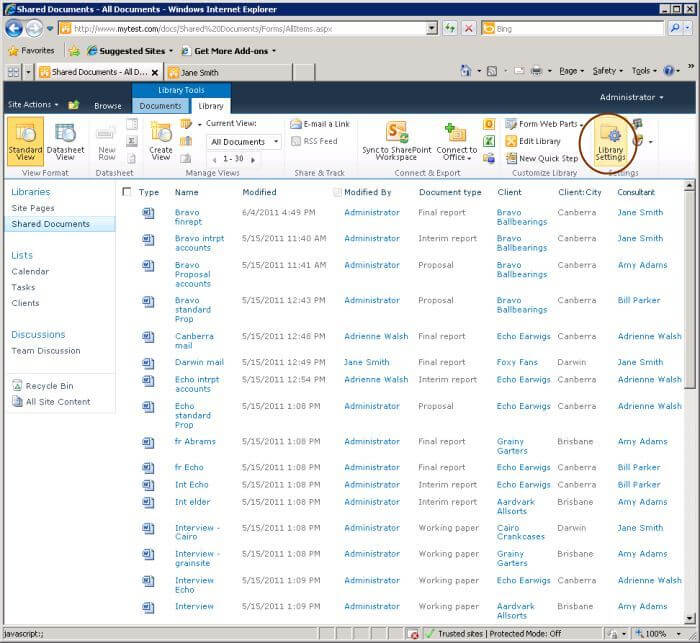
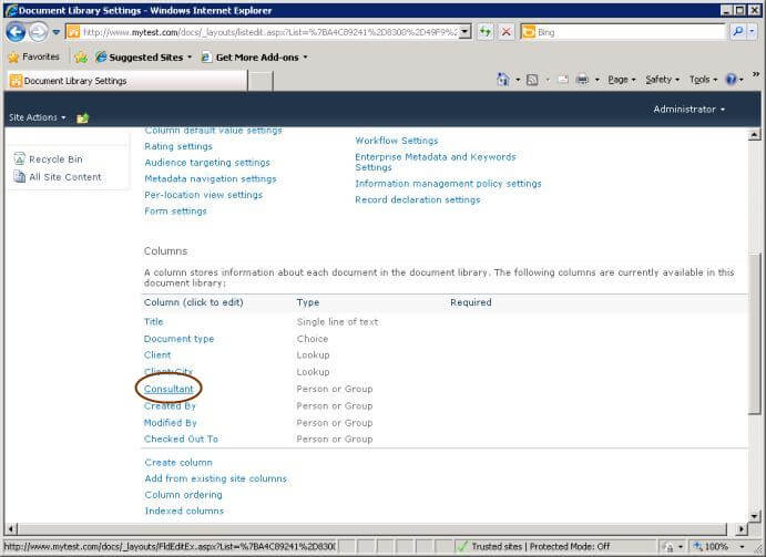
Scroll down to the Columns section and select the Consultant column.
Scroll down to the "Show field:" drop-down which gives lots of different options for how to display this field.
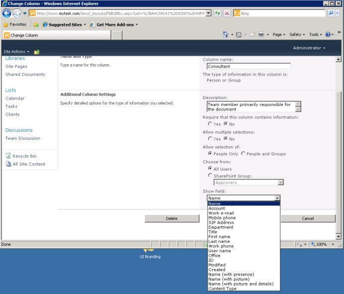
Let's try the "Name (with picture and details)" option. Select this, then select OK.
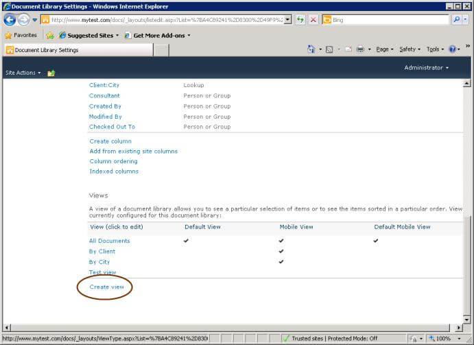
Now let's create a view showing the documents grouped by consultant. At the bottom of the Views section of the library settings, select Create view.
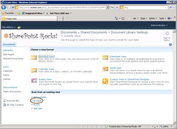
Rather than start from scratch, let's use the existing By Client view as a starting point. Select the link to start from that view.
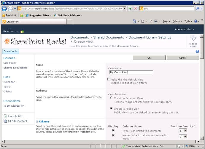
Type as the view name By Consultant.
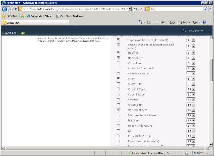
Scroll down to the list of visible columns. Since we are going to group by consultant, we can un-check consultant. Let's check Client and Document type to add them to the view.
Scroll down further and expand the Group By section. Change the first grouping to Consultant and the second to None.
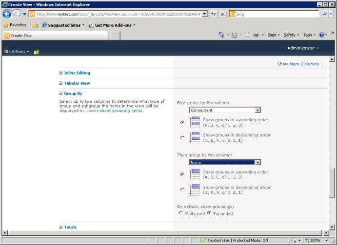
Finally, scroll to the bottom and select OK. Now the view is much friendlier and more personal!
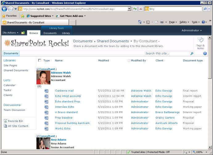
Now let's return to the default view. To do this, select the All Documents view from the drop down at the top of the screen.
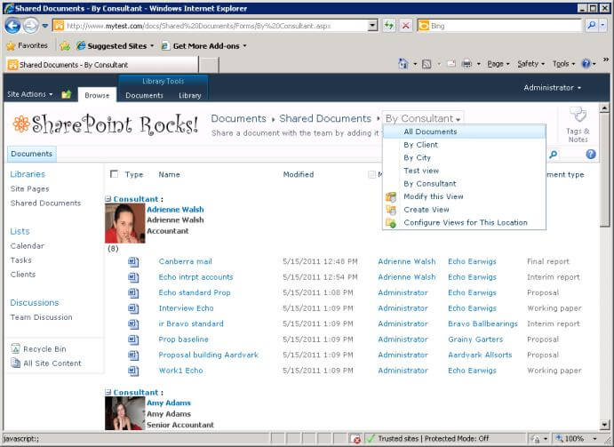
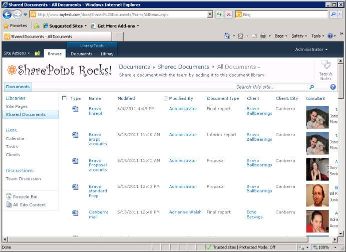
As you can see, the change we made to the consultant column affects all views. This is unfortunate - it would have been much more flexible if Microsoft let us change the way the column appears in particular views.
In this view, including the consultant's picture spaces out the document entries rather annoyingly. If you want to show just the consultant name in this view, while leaving the picture and details in the other, this can be done. However, we can't do this using normal view settings. We will need to modify this view using SharePoint Designer to show just the consultant name.
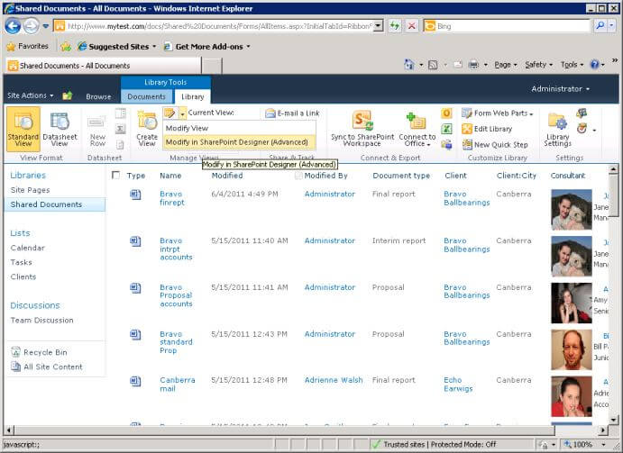
Select the library tab in the ribbon. In the Manage Views group, there is a drop down with options to modify the view, or modify the view in SharePoint Designer. Select the latter option. (Note: this will only work if you have SharePoint Designer installed on your machine. If you don't, it is available as a free download from Microsoft.)
SharePoint Designer will launch. Depending on the security settings in your site and on your machine, you may be prompted for user credentials to connect to the site from SharePoint Designer (SPD). SPD will then open your view as a web page.
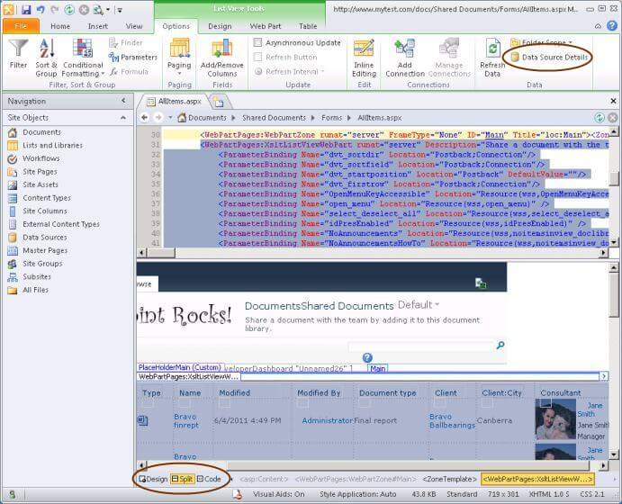
This is the "Split" view, with the page code on top and the design view underneath. You can select between Design only, Code only or Split using the buttons at the bottom left of the page (circled in the above screenshot).
We will look further at how we can modify views with SPD later. For now, all we want to do is replace the consultant picture and details with simply the consultant's name. First, we need to bring up the task pane which shows the details of the data available in the data source (in this case, the document library).
To do this, select the Data Source Details button in the Options tab in the ribbon (circled in the above screenshot).
If you scroll down in the Data Source Details pane, you can see there are various options for information about the consultant. One that gives us just the name is Consultant.title.
The simplest fix is to replace the existing consultant details with this title. To do this, scroll to the right in the view and click on the picture of the consultant in the first row. This should select the whole consultant details, which are one block of content in the view.
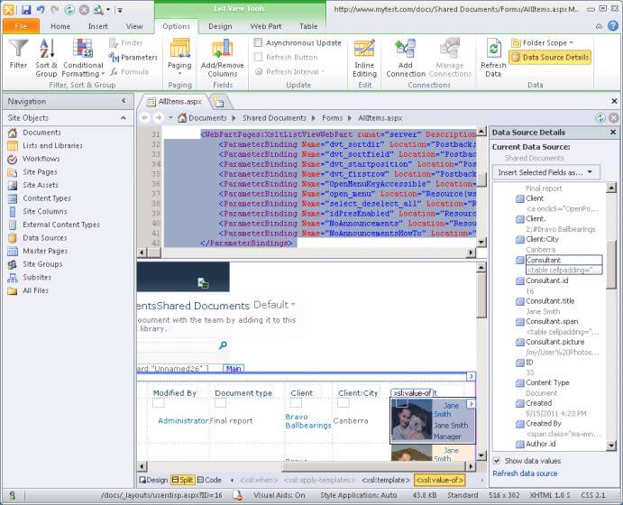
In the Data Source Details pane, click on the Consultant.title field, then select Item(s) from the Insert Selected Fields as... drop down at the top of the pane.
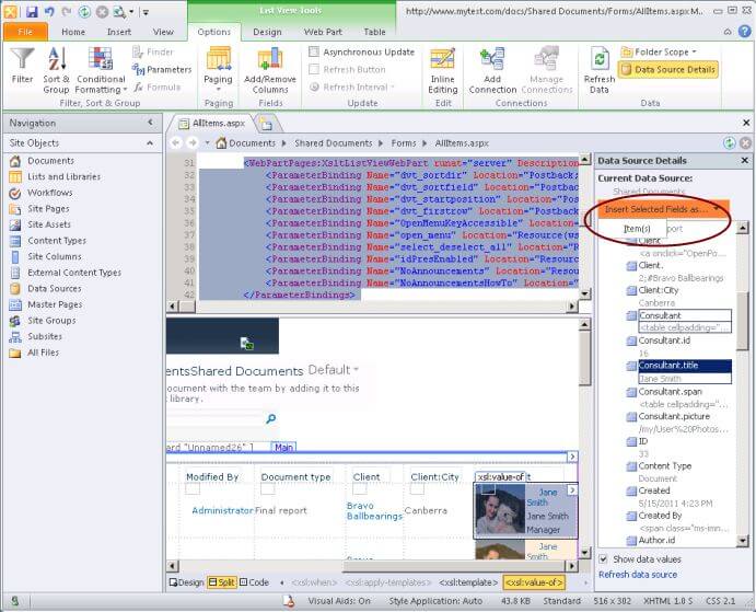
Because we selected the consultant details, these will be replaced with the title.
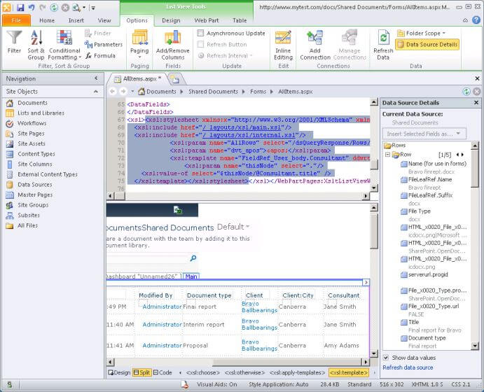
Save the modified view by pressing Ctrl S, or clicking the diskette icon at the top left of the window. (Isn't it funny how iconography perpetuates outdated technology - like railway crossing warning signs which show a steam engine puffing smoke!) Then close SharePoint Designer and return to the browser window. The browser should refresh to show the updated view (or else press F5 to force it to refresh).
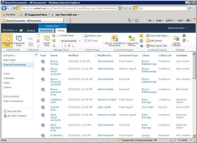
- An unfortunate side-effect of this particular change is that you will now get an error message if you attempt to customize this view again in the browser. From now on, you can only edit this view using SharePoint Designer. If you want to go back to using the browser, you can use the option"Revert XSLT" on the Design tab in SPD . This will undo the change where we replaced the consultant's picture with just the name, and put the view back to the way it was before we did anything in SPD.
Color coding and formatting views
SPD gives you access to a lot of capabilities to enhance the presentation of views well beyond what you can do through the web interface. To take it to the max, and make views that really sing and dance, you will need to learn to use tools like JavaScript, jQuery, XSLT and CSS. But let's see what we can do without going too deeply into code!
To start with, let's add another column to our library to indicate document status in a review cycle. To keep it simple, we won't use SharePoint Server's publishing features, but just maintain our own tag indicating whether the document is in "Draft", "Under review" or "Final" status.
As we did in part 1, in the document library, use the Create Column button in the Library tab of the ribbon. Call the column "Review status", column type Choice, description "Stage in the review cycle". Enter the three choices "Draft", "Under review" and "Final". Leave the other options at their defaults and select OK.
As before, switch to Datasheet View and assign values for this new column to the documents in the library.
Now we will use SPD to colour code the items in the view. We will leave draft items in black, but shade items under review yellow and items that are final as green.
As before, select the option to modify the view in SharePoint Designer. In SharePoint Designer, by default the whole view is selected. Click on something within the body of the view - it doesn't matter what because we will be applying formatting to the whole row.
Now select the Format Row option in the Conditional Formatting drop-down of the Options tab in the ribbon.
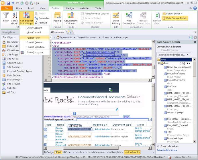
The first dialog asks for the condition(s) when the formatting will be applied. Select the field Review status and the value Under review.
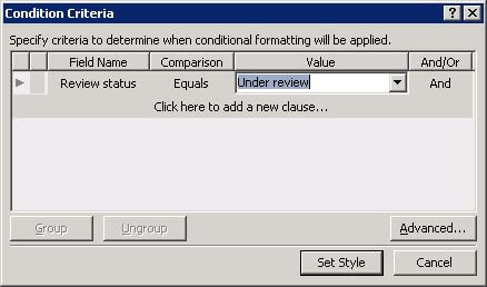
Now select Set Style. The next dialog provides a raft of options for applying formatting in the html code of the view. For this example, select the Background category on the left and select a light yellow shade as the background color.
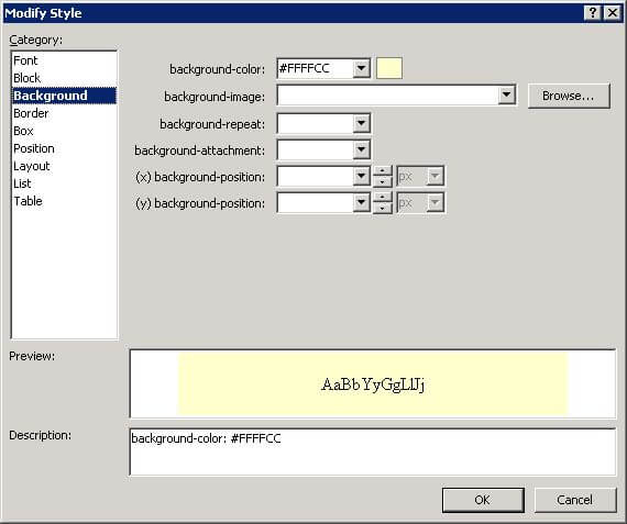
- When I first tried this, I selected a color in the Font category to change the color of the text. Although this appears to work in SharePoint Designer, when you go back to the view in the browser it doesn't work. The reason is that this dialog applies formatting commands to the table row, but any table row formatting is then overriden by font colors in the styles applied to table cells.
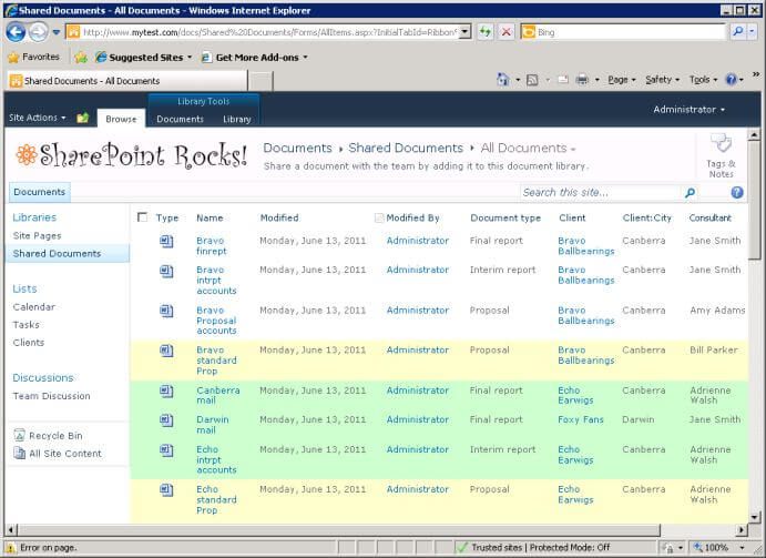
Select OK. If you scroll down the Design view, you should see that any entries for documents that are under review is shaded yellow. Repeat the same process to shade entries for documents that are final in light green.
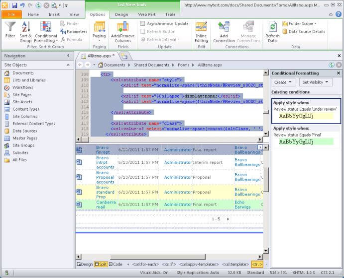
Save the view, close SharePoint Designer, and see what the view now looks like in the browser.
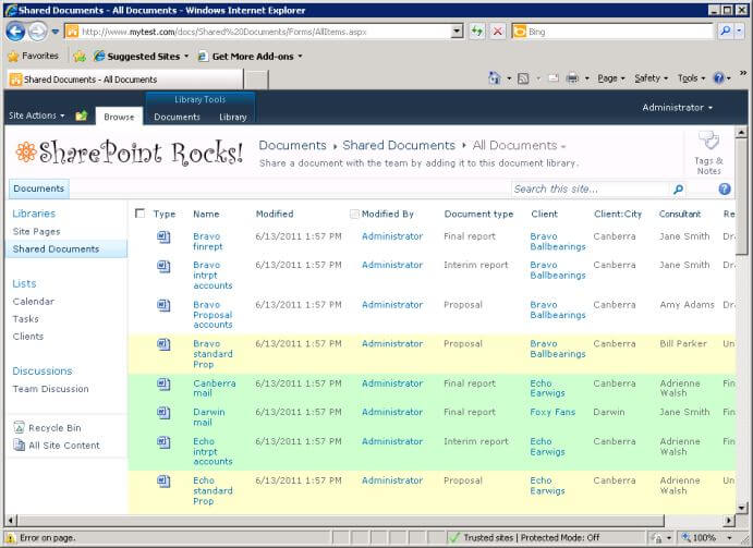
Now let's fix the date display to just show the date, not the time. Again, use the option to edit this view in SharePoint Designer.
Unfortunately, there is no way to simply select the date format from a drop down, as there was with DataForm Web Parts in SPD 2007. We are going to have to edit the code of the formula. Select one of the modified dates in the design pane in SPD, and select the Formula button in the Options tab in the ribbon.
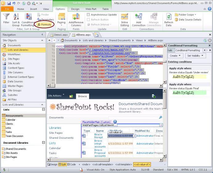
In the dialog, select the Text / String function category. Drag across the existing XPath expression so that it is all selected, then double click the string function in the list.
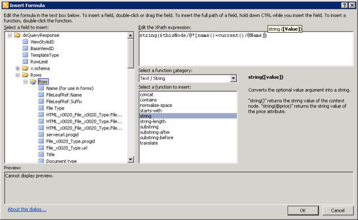
This formats the existing date and time as a string. Now select the Date / Time function category. Again, drag across the existing XPath expression so that it is all selected, then double click the FormatDate function in the list.
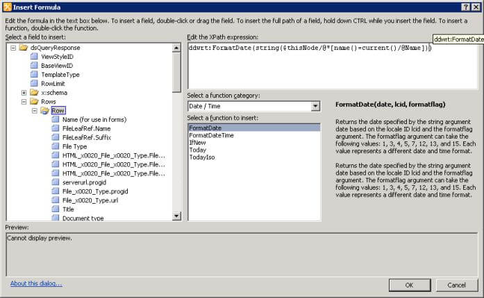
As you can see from the description of the FormatDate function, it needs two more parameters: 'lcid' and 'formatflag'. The locale for US English is the number 1033, and the formatflag of 1 gives you a simple date. So type the following at the cursor position just inside the right parenthesis:
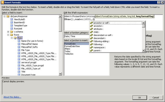
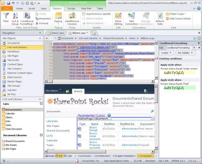
Select OK. If you get an error, press Ctrl Z to undo the change and try again. Otherwise, you should see this:
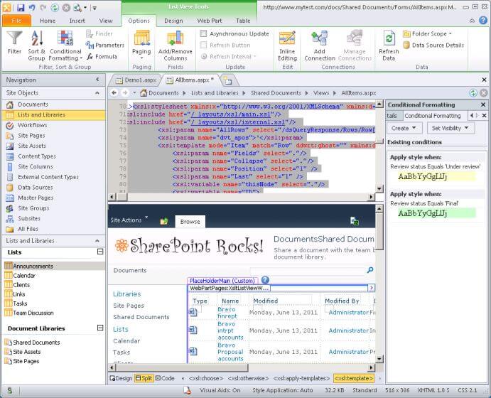
You can experiment with editing the formula to use different date formats, selecting one of the options for formatflag shown in the dialog. The formats given by formatflag values are documented here. For example, formatflag set to 3 gives a long date format like this:
Once you have it the way you want it, save it in SPD, close SPD and go back to the browser to see the final result.
Flagging items by date
Another thing it can be useful to do is to filter or highlight items in a view where (say) a review date has passed. There are a number of possibilities in SharePoint, like using workflows to send e-mails, but let's just look at what we can do fairly easily with a view.
The first possibility is to use filtering to create a view of overdue documents. For example, let's say that we want to know which documents are in the status "under review" but haven't been modified for more than 30 days, implying someone needs to follow them up. You can set up a view with filters like this:
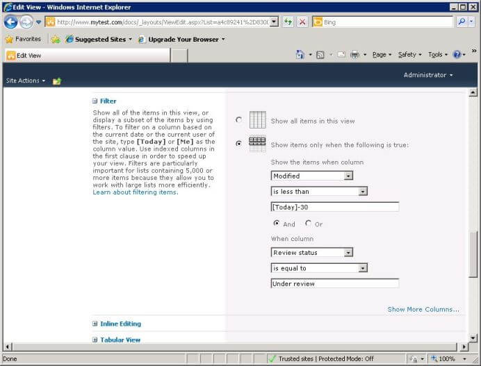
However, you may also want to show all items including the due date in a view, or color code items based on a due date. The best way to achieve this is to create a calculated column which works out the due date, then filter and format using the calculated column.
First, we need to create another column which will be the modified date plus 30 days. In the document library in SharePoint, select the create column button on the library tab of the ribbon. Enter as the column name 'Review by' and select the type Calculated. Enter a meaningful description.
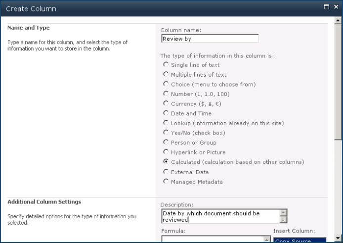
For the formula, type the following (to save typing, you can double click the column names in the list on the right at the appropriate point to add them into the formula).
If the status of the document is "Under review", this formula returns the date the item was modified plus 30 days. Otherwise, it returns an empty string.
Select the data type Date and Time, and the format Date Only. Leave Add to default view selected.
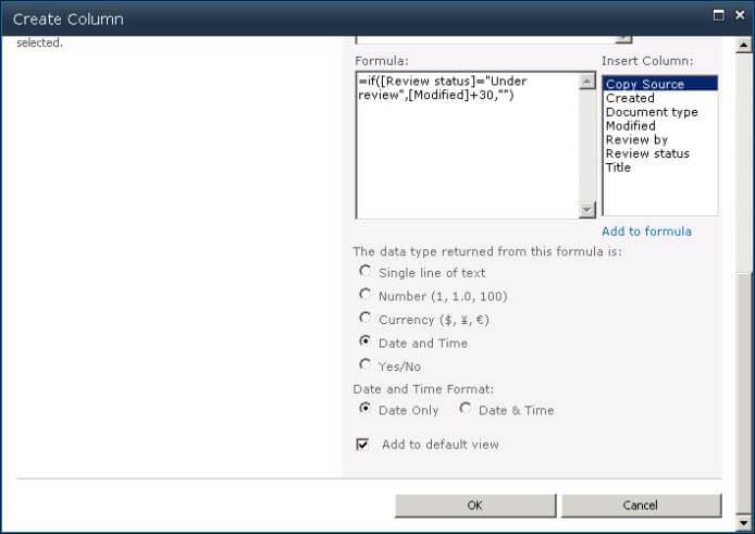
Select OK. You should now see the new column on the right of the view, with dates for items that are under review.
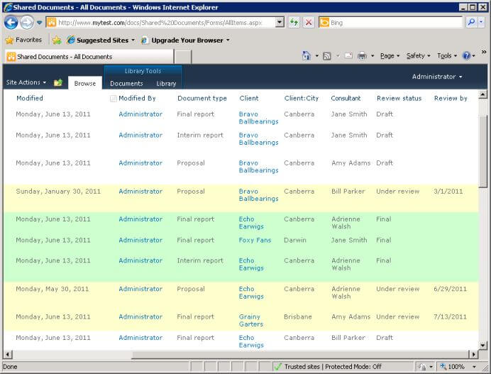
As a last step, let's color-code red documents that have gone beyond their review by date. Once again, select the library tab in the ribbon, and select the option to modify the view in SharePoint Designer.
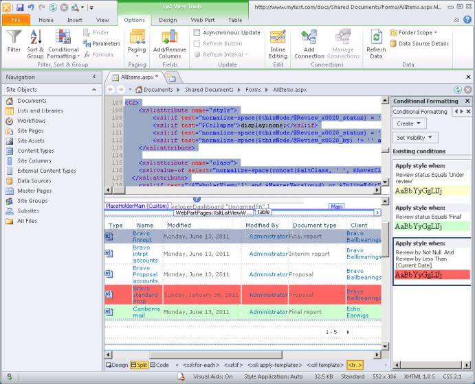
Click somewhere in one of the rows of data in the view, and select Format Row from the Conditional Formatting button in the Options tab of the ribbon.
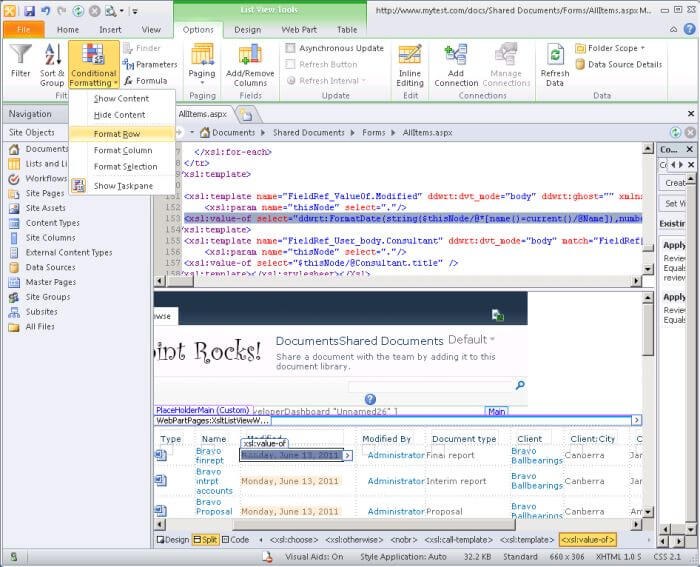
We want to flag items where there is a review by date, and it is in the past. So, select the Review by column and the comparison Not Null. Then on the next row, select the Review by column again and the comparison Less Than to select rows where the review by date has passed (the value [Current Date] is filled in automatically when you select a Date field).
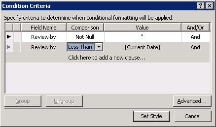
Select Set Style. Again select a background color. I selected a shade of pink rather than bright red, as people find that ugly and hard to look at.
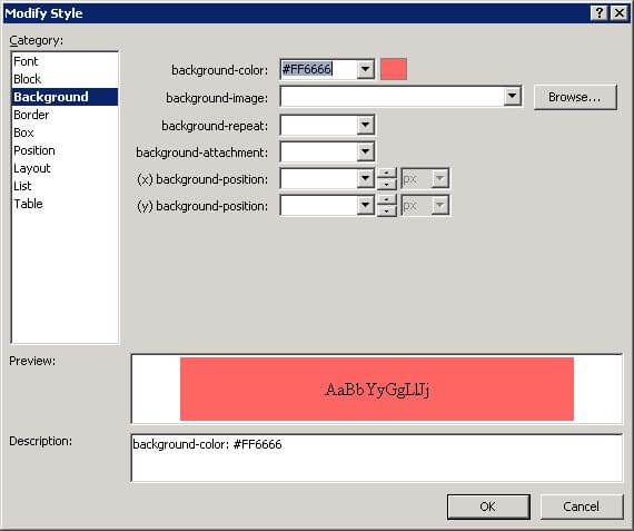
Select OK.
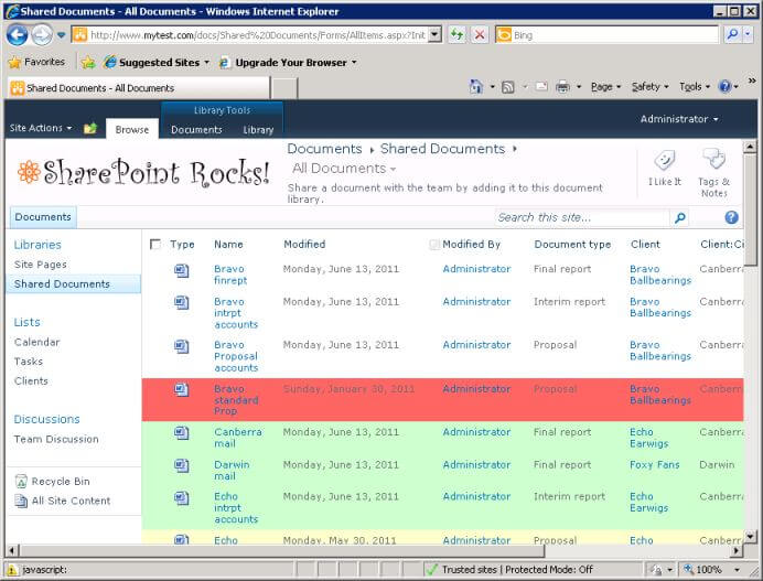
Save changes, close SharePoint Designer and return to the view in the browser. Refresh if necessary to see the final result. The document which has passed its review by date is highlighted.
Next Steps
- Experiment with building views, testing the various options available through the browser
- See what you can do in SharePoint Designer, including color coding with conditional formatting (as shown in this article), but also simple things like applying bold or italics to text in the view
- Show some sample views to your users and get their feedback on what they would find useful to see
- Read more about the advantages of SharePoint document libraries over file servers in SharePoint: It's not your father's file server!
- Read more about customizing views with lists in How To Effectively Use SharePoint List Views - Part 1 (Basic Views), How To Effectively Use SharePoint List Views - Part 2 (Filtering and Sorting) and How To Effectively Use SharePoint List Views - Part 3 (Grouping and Summarizing)
About the author
 Knox Cameron
This author pledges the content of this article is based on professional experience and not AI generated.
View all my tips
Article Last Updated: 2011-07-13


