By: Siddharth Mehta | Updated: 2017-08-15 | Comments | Related: > Power BI
Problem
SQL Server 2017 Machine Learning Services is set to bring machine learning capabilities to SQL Server with the integration of R and Python in SQL Server. Data exploration is a key and primary step of machine learning which requires analyzing how different attributes (also called variables in statistics) interact with each other and the relationship between them. The scatterplot graph is a preferred way of studying the relationships of different attributes with each other. But in multivariate data analysis, that involves studying the relationship of various attributes with each other which requires creating a number of scatterplots. Using the scatterplot control available in Power BI, for each and every combination of attributes is neither a scalable nor a maintainable solution. We need a solution that can automatically create scatterplots for required combinations of attributes, so that we can visualize and analyze the relationships in a single report instantly. In this tip, we will look at how to address the very first data analysis challenge for machine learning with Power BI.
Solution
Power BI R script visual can be used to generate a scatterplot matrix for multivariate data analysis visualization.
In this tip we will use Power BI to import a data set from SQL Server and create a scatterplot matrix using the R script control to study the nature of relationships between different attributes or variables. We will assume that Power BI Desktop, SQL Server Database Engine and R is already installed on the development machine.
The first step is to access data of interest from the corresponding data source. Power BI supports a variety of data sources. For the purpose of this demonstration, in this tip we will be using SQL Server as the data source and will be accessing data from a table that contains sample data of NFL wins and losses by individual teams. For the same, open Power BI Desktop, select the “Get Data” menu and the SQL Server menu option. This should bring up a screen as shown below.
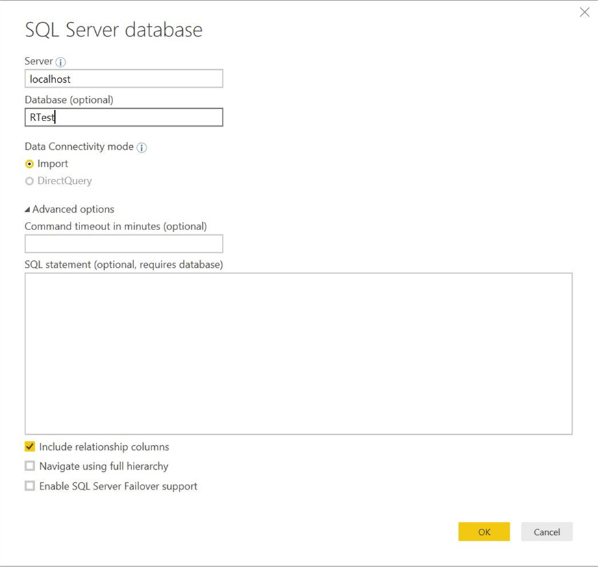
Provide appropriate server and database name as shown above, and click OK. This should bring up a screen as shown below. Here you are required to provide credentials that Power BI will use to connect to the database to import data.
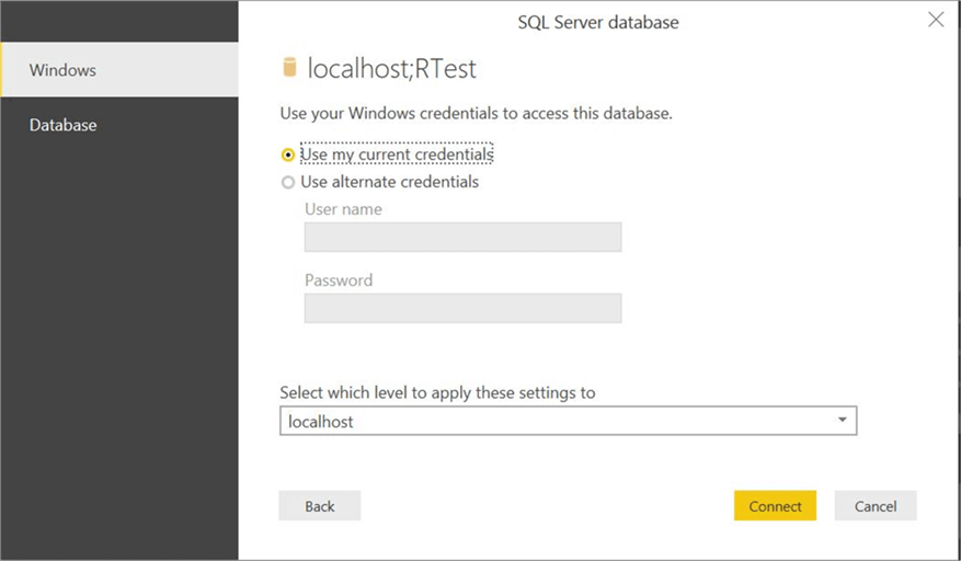
After providing the required credentials, click Connect. This can bring up a pop-up dialog as shown below in case your data source does not support encryption. Click OK and proceed to the next step.

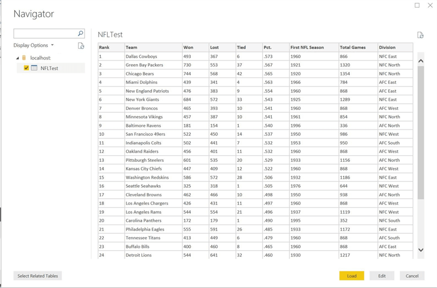
Here we have connected to the database and the corresponding tables. Data for the selected table is shown in the preview mode. You can click the Load button to load the data in the data model for use in Power BI Desktop. Here we are interested in analyzing the relationship between fields like Total Games, Won, Loss, Teams, etc.
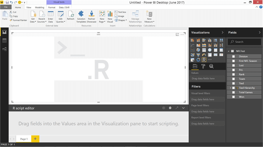
You should be able to find the fields in the Fields pane. Our intention is to analyze the relationship between different fields of interest using a single graphic. We need a range of scatterplots for each one to one combination of fields, which can be addressed using a scatterplot matrix. To create this, either we can use the scatter chart and manually create a matrix which is not an ideal solution or another way of creating a scatterplot matrix is by using R script visual. Click on the R script visual control to add to the report layout as shown above.
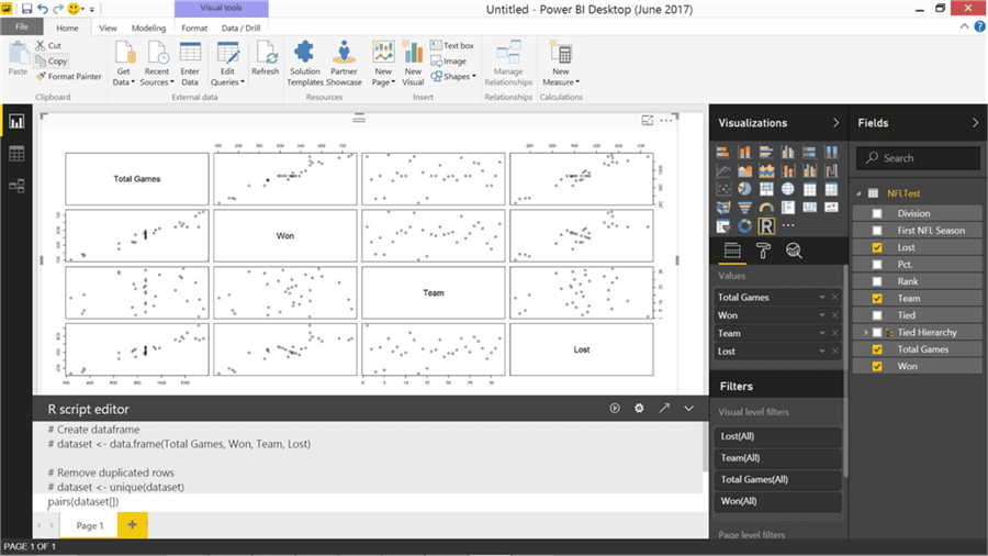
Let’s say that we are interested in analyzing the relationships between Matches Won, Matches Lost, Total Games and Teams. So select those field names after selecting R script visual in the report layout. This will create the code to load the selected fields in the data frame as well as remove duplicates. You can find this in the greyed section of the R Script editor. The data is loaded in a data frame named dataset.
There is a simple yet very powerful function named pairs in R to create a scatterplot matrix. Just add the function in the script inside the R editor as shown above and then click the execute button (on the R script editor) to execute the script. This will create a scatterplot matrix in the R script visual as shown above. Using a single line of code, we have created 12 scatterplots to analyze the inter relationships between the 4 attributes in a matrix fashion.
If you carefully analyze, you can figure out that Total Games vs. Won as well as Total Games vs. Lost has a near linear relationship, which is a strong indicator to apply the Linear Regressions family of supervised machine learning models to these attributes. The rest of the attributes do not seem to have that kind of relationship. You can also manipulate the scale, color and other features of the scatterplot to make it more suitable for your analysis.
If you were using the same code in T-SQL, you would be compelled to save this graphic as SSMS does not have a in-built mechanism to display graphs generated from R. So using Power BI we can perform exploratory data analysis on multivariate data with the R script visual control.
Next Steps
- Try to implement this same approach on the data of your interest and analyze the nature of relationships between different attributes for identifying the probable machine learning algorithm.
Learn more about Power BI in this 3 hour training course.
About the author
 Siddharth Mehta is an Associate Manager with Accenture in the Avanade Division focusing on Business Intelligence.
This author pledges the content of this article is based on professional experience and not AI generated.
View all my tips
Article Last Updated: 2017-08-15


