By: Gauri Mahajan | Updated: 2019-06-11 | Comments (6) | Related: > Azure Data Studio
Problem
With the April 2019 release of Azure Data Studio (previously known as SQL Operations Studio), Microsoft has re-released SandDance as a Preview extension in Azure Data Studio. SandDance is one of the well-known and powerful data visualization tools. In this tip, we will learn how to use SandDance in Azure Data Studio and how this tool is helpful in gaining insights about data.
Solution
Azure Data Studio uses a visualization technology – SandDance, from Microsoft Research to create quick visualizations for the .csv and .tsv files that we will be using. It is an interactive and dynamic visual that allows us to represent every data element in the chart. With its intuitive and customized interface, SandDance helps to dynamically navigate through dense and rich data easily. It enables users to discover patterns and create stories with their data using its different attributes and capabilities.
The data displayed in the visualization canvas twirls like grains of sand and hence the name SandDance.
You can download the latest released version of Azure Data Studio from here. We have downloaded a zip file for the Windows installation. Once it is downloaded, extract it to a folder and browse it for the application file. When you open the exe file by double clicking it, the following Azure Data Studio screen loads.

Installing SandDance in Azure Data Studio
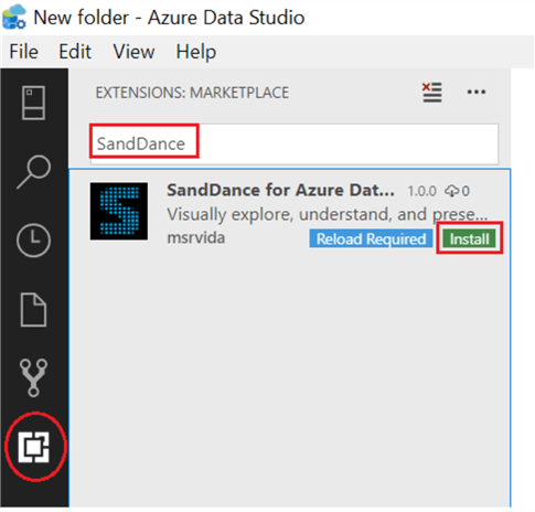
SandDance is an extension that can be installed from the Marketplace section. Click on the Extensions icon present on the left vertical menu bar to install SandDance in the Azure Data Studio. You can also use keyboard shortcut (Ctrl+Shift+X) to do the same. Type keyword SandDance in the search textbox and hit the Install button as shown below.

Setting up data to work with SandDance
After the SandDance extension is installed, click on File on the main menu bar and select Open Folder… [Ctrl+K Ctrl +O].

Browse to a folder that contains either a .csv or .tsv file and select the folder. After the appropriate folder is opened, all the files present in the folder can be accessed in the Explorer section in Azure Data Studio. This Explorer icon is placed on the vertical menu bar as seen in the screenshot below.

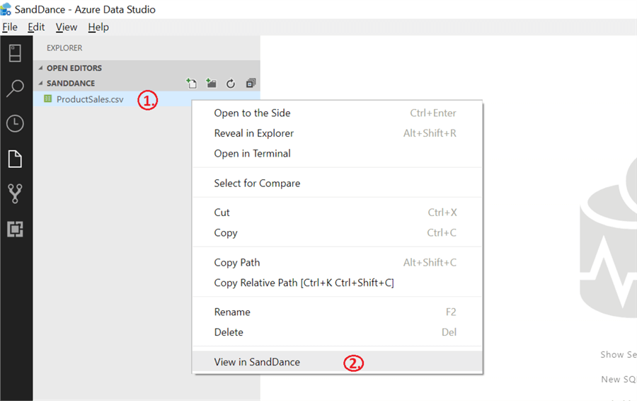
To demonstrate how SandDance works, we will refer to a csv file (ProductSales.csv) that contains fictitious Product Sales data over a period of four years. You can download it from here. Also, feel free to use any .csv or .tsv file that you have in your system. Right click the file ProductSales.csv and choose the View in SandDance option in the Explorer view tab as shown below.

Once selecting the View in SandDance option, the default SandDance visualization – Scatter plot is displayed with some random selection of various chart options in the SandDance visualization canvas as shown below. You can expand this layout space by dragging it all the way to the left. Let’s go ahead and look at various charts available in SandDance visualization in Azure Data Studio that help to identify insights about our data.

Scatter Plot in SandDance
We can plot one of the most commonly used scatter graphs in SandDance visualization canvas with just a few clicks. In the screenshot below, the scatter plot shows data for Total Sales Amount and Units sold along with the additional information of the Product Category Name (Accessories, Bikes, Clothing and Components) as different colors of the data points in the plot. This visualization helps to quickly infer the following facts about the data:
- Even though the number of units sold for the Bikes is lesser, it has managed to be the maximum sales amount.
- Quantity sold for Clothing is the highest, but with the lowest total sales amount.
- For Accessories and Components categories, both units sold and total sales amount are low.

Bar Chart in SandDance
Apart from Scatter Plots, Bar Charts are also widely used to visualize and display our data. We can discover comparisons or relationships between different sets of data using bar charts in SandDance. Let’s go ahead and create one in the SandDance visualization canvas with Product Category Name on the X Axis. We are comparing four different product categories (Accessories, Bikes, Clothing and Components) and displaying them in the form of bars. Additionally, we have added Product SubCategory Name to the bar chart (in the 'Color by: mapping field') to color the bars based on these values.

All subcategories of the products are classified in four main product categories bars with different colors. We can dig in deeper by clicking on a subcategory name present in the legend to have more insights about the data. One such example is shown below with Jerseys being selected in the legend section and the corresponding yellow area is highlighted in the Clothing bar.

Tree Map in SandDance
The Tree Map chart is yet another data visualization technique that SandDance supports. Tree maps are usually helpful in working with a very large amount of data and SandDance works best for the data that has not yet been aggregated. Click on the third radio button in the Chart tab and a smooth animated transition from Bar chart to Tree Map takes place in the SandDance visualization canvas. Here, we are visualizing the pattern for Total Sales Amount across four Product Category Names. This pattern reveals that the business made massive sales in the Bikes category and there were not enough sales in the Accessories category.

SandDance Menu’s
We just covered three important charts supported by SandDance, let’s quickly understand a bunch more interesting and useful capabilities offered by SandDance in its vertical and horizontal tab menu bars.

Under the Chart selection, we have charting options like Scatter plot, Bar chart and Tree Map to analyze our data. The size of the data points in the scatter plot can be adjusted using the sliding bar as shown below for greater legibility.

The Chart color option lets us choose different sets of color schemes from a wide range of color palettes available for various charts in SandDance.

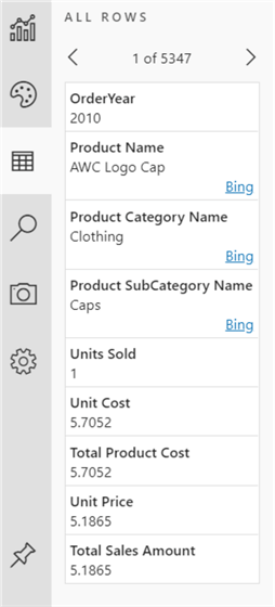
The data browser lets us scroll back and forth through all the data row by row. Additionally, it identifies a few attributes from the dataset and provides an option to check them in the web browser. In our case, if you see the below screenshot, it lets us search for Product Name, Product Category Name and Product SubCategory Name in 'Bing' to understand more about these elements.

In order to further investigate and explore our data, we can make use of the Select by search feature in SandDance to narrow down our data. We can filter the dataset based on relevant conditions and can also add as many conditional expressions as required. For instance, in order to calculate the number of bikes that are sold more than 20 in number, we provided conditions as shown below and pressed the Search & Select button. 12 data points meeting this search criteria are highlighted in yellow and the rest of the data is greyed out in the scatter plot.

SandDance Snapshots
Next in the queue comes Snapshots that helps create screenshots of the SandDance chart canvas and we can use it for our future reference. One such example is to create a snapshot as shown below.

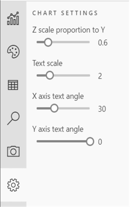
We can use the Chart settings feature in SandDance to draw basic cosmetic changes to the SandDance charts. Formatting charts like increasing or decreasing the font size, adjusting text angles at X and Y axis, etc. can be easily done in this section.

Select and Filter data in SandDance
Let’s quickly review the horizontal menu bar that contains views like Filtered and Selected in SandDance as shown below. The first view in the menu bar is ALL ROWS that enables us to go over each row one by one. Filtered and Selected tabs not only assist in making interaction with data much easier and quicker, but also data professionals can dig much deeper into data analysis based on evidences just with a few expressions and clicks. Let’s go ahead and see how it actually works.

We will refer to the same scatter plot we created above with a slight change of color-coding on the 'Product SubCategory Name' field instead. Let’s work through some random example, say, because of some unusual discrepancy in the Total Sales Amount of the ‘Components’ products category, the business wants to verify the records with sales more than 5000. We can do so in SandDance by using the Select by Search tab in the vertical menu bar and using expressions as shown below. Once we press the Search & Select button, 48 data points (that are components and have sales more than 5000) are selected in yellow and we can navigate through these 48 records in the SELECTED view (marked in the red circle below). We can use Clear selection on the top bar to disregard this selection and proceed further.

Isolate data in SandDance
We can further explore these selected records visually using Isolate or Exclude options in the top bar. Click on the Isolate button to pull out the selected observations and plot them separately offering better decision-making capabilities for data professionals. Additionally, you can go over these 48 records one by one in the FILTERED view as seen in the screenshot below.

Exclude data in SandDance
When working with a large amount of data, developers often run into a situation where they need to get rid of unnecessary data in order to have a succinct data visualization of the relevant information only. SandDance contains the Exclude button that supports excluding selected data from the charts.
Clicking on Stop filtering on the top bar will revert the changes we made to the plot by isolating the selected data shown above and it will send the data back to where it was before. Now, in order to disregard a set of data, say, we don’t want to refer to the products ordered in Year 2012, we will go to the Select by Search tab and add an expression to select data for the OrderYear = 2012. Once the data that matches our condition is selected, click on the Exclude button on the top menu bar to omit all the data for the year 2012 in the scatter plot canvas.
In the first screenshot below, the entire dataset is represented in the plot and in the subsequent plot, data is excluded for year (2012) is displayed using the Exclude option.


View in 3D
Apart from supporting powerful capabilities (as described above) in 2D view, SandDance also offers an option to visualize charts in a 3D view through its dynamic and customizable interface. Click on the View in 3D icon located on the extreme right side of the top bar to display the visualization in a 3D view.

An interesting 3D visualization of the Bar chart is prompted in the SandDance canvas as shown below. It shows the count of units sold in each year and also the color-coded distribution of various product categories.

Limitations with SandDance
Memory consumption is affected proportionally with the row count in the view. The recommendation is to refer to a dataset with less than 100k rows. Since, this installation is still in preview mode, we anticipate more good stuff in the near future.
Summary
We covered a complete overview of SandDance in Azure Data Studio. This data visualization tool is extremely helpful especially when there is a need to find insight into your business and projects quickly.
Next Steps
- You can try building charts available in the SandDance tool and enforce the transition between multiple views to visually understand and explore the data. Also, consider the 3D view for stunning and insightful visuals.
- Check this link to review the official Azure Data Studio documentation.
- Refer to Azure Data Studio tips here to learn more about this tool.
About the author
 Gauri Mahajan is very passionate about SQL Server Reporting Services, R, Python, Power BI, the Database engine, etc. and enjoys writing.
This author pledges the content of this article is based on professional experience and not AI generated.
View all my tips
Article Last Updated: 2019-06-11


