By: Scott Murray | Updated: 2020-01-21 | Comments | Related: > Power BI
Problem
What advanced features are available in the Power BI Q&A functionality? Also, how does the new Q&A visual work?
Solution
Recent updates to the Q&A features and functionality in Power BI have added a significant depth and breadth to what can be done using Q&A. Included in these feature updates is a new Q&A visual which puts the Q&A functions within the design window. Furthermore, the new visual provides two levels of support; one level for the report consumer and a more detailed level for the report designer. Of course, the report designer version supplies features that allow for customization of the Q&A functions including formatting of the visual, the "understood" and "suggest" linguistics used to drive the questions and answers and finally restrict certain items from being included in Q&A results. Within the following tip, these topics will all be covered.
Before we get started with some examples, be sure to download the latest version of Power BI desktop from here. Additionally, we will be using the WideWorldImportersDW database as a basis for our data sources; this database can be downloaded from GitHub. If you need a refresher on bringing data into Power BI please see this tip.
We will setup a simple report from the Wide World Importers database that uses the Fact Sales table, along with the City, Customer, and Date Dimension tables. We will also start with a blank design grid which will fill up as we use the Q&A functions.
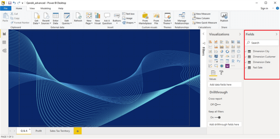
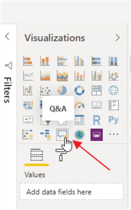
Once you have validated that you have the latest release of the Power BI Desktop, the Q&A visual should be available in the visualization well.
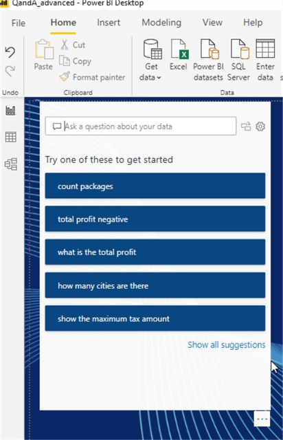
As shown below, immediately upon placing the Q&A visual onto the design grid, the visual offers some instantaneous suggestions of possible questions that could be asked. These suggested questions are based on the data sets that have already been loaded into the Power BI file.
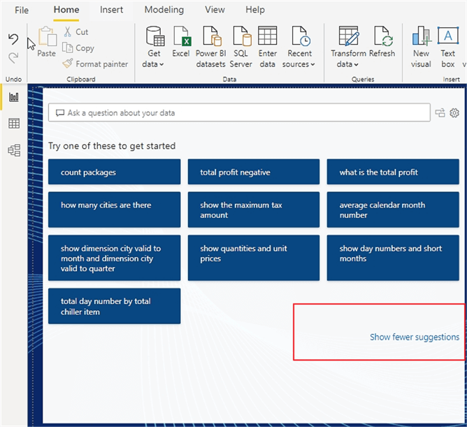
Clicking on the "Show all suggestions" options provides more expansive list of possible questions for the loaded data sets. Additionally, just like any other visual, the visual size and frame can be enlarged (or shrunk) based on your desired size for the visual. You will also notice that some of the suggestions make perfect sense, such as what is the total profit or show the maximum tax amount. However, others, such as the average calendar month number, do not seem to be something that would be a valid or relevant question.
Cleaning up our data model will help to prevent irrelevant questions from being suggested. As shown in the below illustration, several of our date fields, such as, month number, year, day number are all determined to be numeric (i.e. measures), so Power BI thinks they could be measures and thus are available to be summarized.
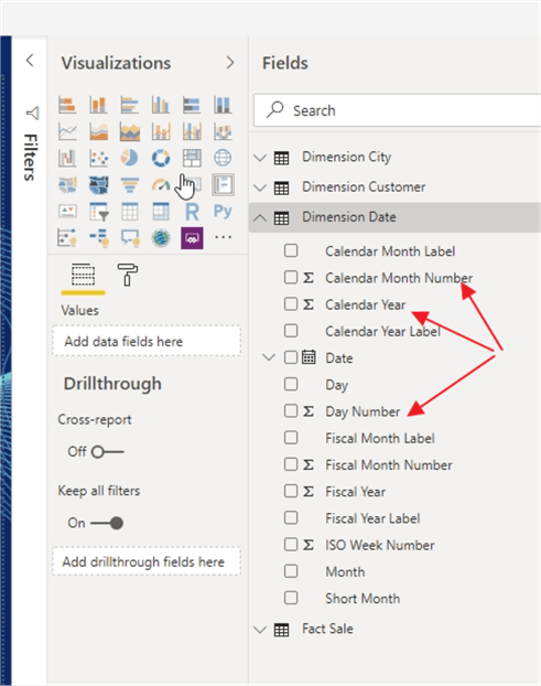
To address this situation, each field that is not a measure needs to be set to Don’t summarize in the summarization setting, as displayed next.
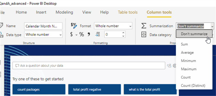
By changing these fields to "Don’t summarize", the suggested list of questions seems more sensible and appropriate. Power BI is no longer trying to summarize years for example. These changes should be made to any field that are not normally summarized or aggregated in any way.
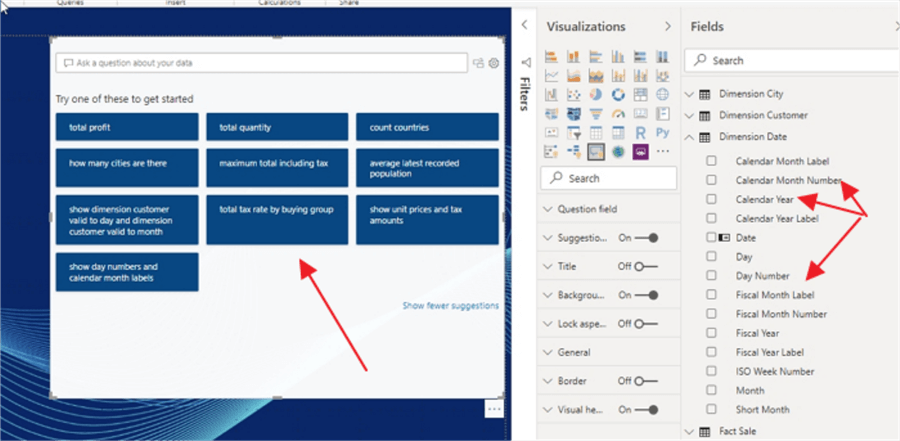
Likewise, it is a good idea to set any date dimensions / tables, if used in the model, to be the Power BI model date table.

Using correct data types and field types are an important consideration for model design (not just for the Q&A feature, but for other features and its usage in DAX). Equally important is the names that are used for the datasets and fields in the data model. Power BI uses these names to come up with the suggest questions; thus, the clarity of the questions are only as good as the names that are used. For instance, in the below example, the Dimension Customer dataset (table) was changed to just Cust and the Customer Name field as changed to just Name. On the left side, the suggested questions now say "custs" which would likely not be relevant or helpful to someone using Q&A.
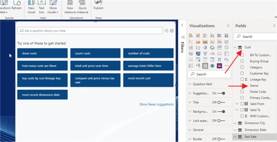
Changing the Cust dataset name back to Customer and the field name back to Customer Name makes a significant improvement in the relevance of the suggested questions. These suggestions not only improve the suggested questions, but also as end users create their own questions, using correct data types, correct names, and a date table help to allow for those users’ questions to be answered as well.

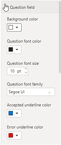
Similar to just about any other visual, we do have some formatting options for the Q&A visual. A title can certainly be added, but even more important are the font color and background color Question Field formatting options. The following font and color options can be changed by going to the question field pane for the visual:
- Background color for the question input box
- Font color for the question input box
- Font size for the question input box
- Font for the question input box
- Underline color for terms that Power BI recognizes (blue in the below screen print)
- Underline color for terms that Power BI does NOT recognize (red in the below screen print)
- Background highlight color for suggested questions that appear as you type a question
- Font color for suggested questions that appear as you type a question
- Font size for suggested questions that appear as you type a question
- Font for suggested questions that appear as you type a question

Thus, in the below illustration we can see many of the font color settings in action. The word "cucst" shows a red underline since it is not recognized while the word "profit" shows a blue underline as it is recognized. Likewise, Power BI thinks it recognizes co as Colorado, although it also offers several other suggestions too.

Now that the basics of the new Q&A visuals have been covered, we can move on to using the visual. First, we formulate a simple question to get the Total Sales excluding tax by buying group and delivery year.

If we are satisfied with the visual that was created, we can easily convert it to an actual visual by clicking the convert to standard visual icon in the upper right corner.

Now the visual is a line chart and can be modified as any other visual. Just a quick warning though, the only way to go back to the Q&A visual after converting to a standard visual is the undo button (at least from what I could determine). Additionally, even while in Q&A mode, the visual will interact with other visuals on the page using highlighting and filtering based on items that are selected within the Q&A visual.
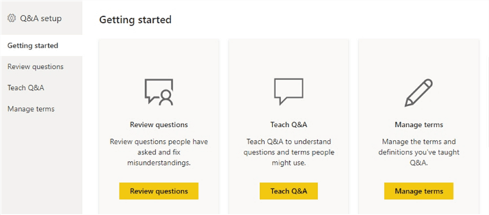
Clicking on the gear icon in the upper right corner of the visual opens the Q&A setup screen which allows you to adjust several advanced settings surrounding the terms and questions used in the Q&A visual.

The Q&A setup allows for a report designer to review questions that are being asked of the Q&A visual, allows for adding specific questions to the selection list (i.e. teaching that Q&A module) and finally a way to maintain the terms and synonyms used in the Q&A feature.
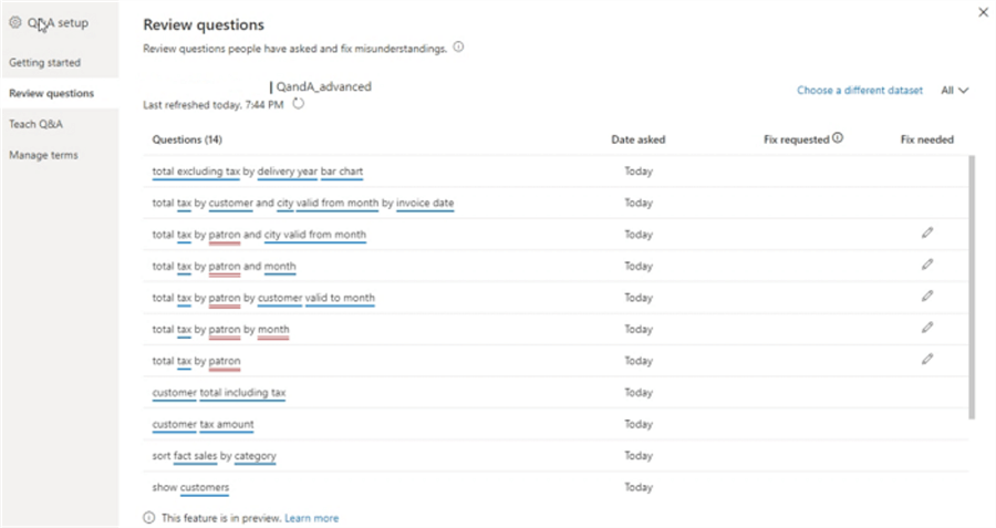
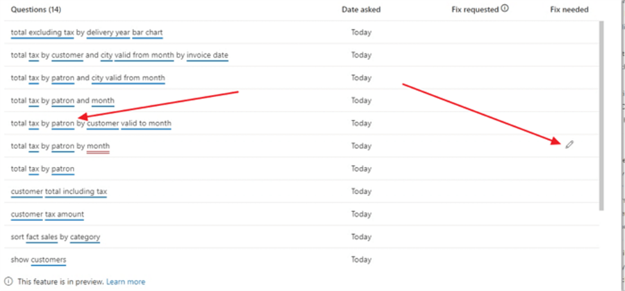
Let us take a look at the review questions area. This area allows us to review questions that have been asked of the Q&A visual in order to determine which questions are popular and which if any may need to be fixed. As you can see in the below example, "customer" has been replaced with "patron". Power BI does not understand what the term patron signifies, so in the questions list, it is underlined in red, as compared to terms it does understand and underlines in blue. Power BI gives us the option to fix the questions right from this screen by clicking on the pencil icon. Note, the question list only shows questions from the past 28 days.
In this example, the word patron is selected for change and then submitted.

By highlighting the word Patron, we can now define what we mean by patron. The word patron is equated or referred to customer in our Q&A module now.

Upon hitting save and going back to the Review questions screen, you will notice that all the questions which contained the word patron and were underlined in red now are displayed with a blue underline!
Heading to the Manage terms window, we can also see that the term patron was added to the taught terms list.

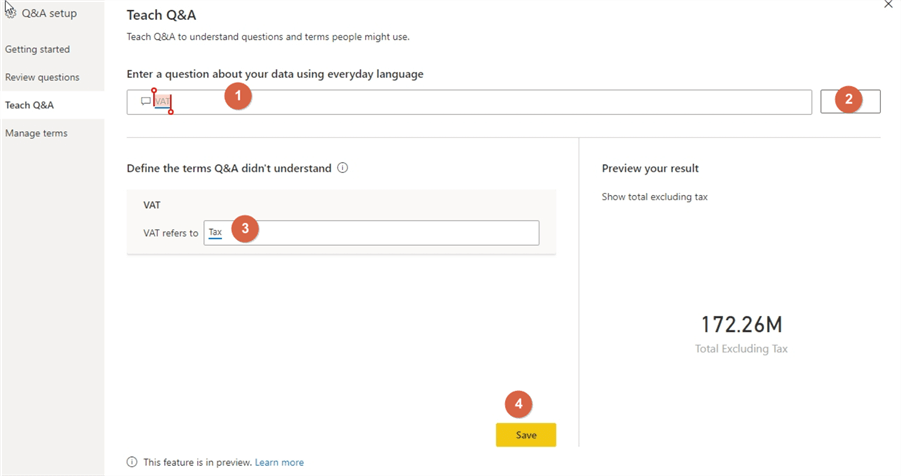
If you have a list of terms to add manually before the questions have been asked, these can be added directly in the Teach Q&A screen. In the below example, the term VAT was used, and this was equated to Tax.
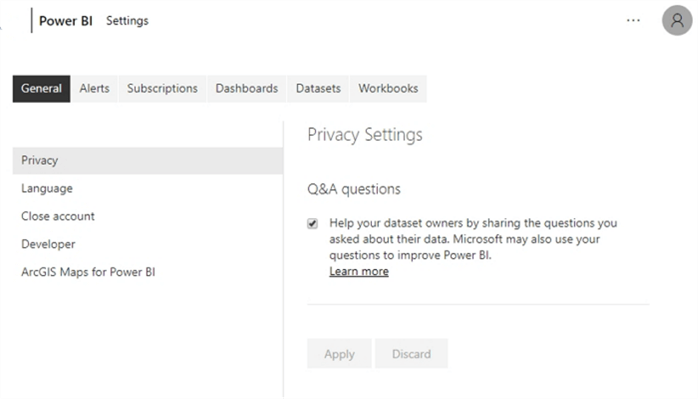
In order to fully utilize the Review Questions list, it is a good idea to request your users to go to their Power BI settings and then select General, then Privacy. They would then want to check the "Help your dataset owners by sharing questions…." option. Of course, turning on this option makes these questions also available to Microsoft, so be forewarned.
After publishing the Dashboard Report to the Power BI Service, now the end user can formulate a question with VAT and Patron and Power BI translates that to Total Tax by Customer, respectively.

If a term needs to be deleted as it is no longer valid, then it can be deleted from the Manage terms window.

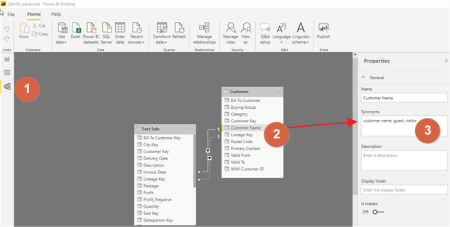
Finally, there is one alternate way to add equivalent terms or definitions for a dataset field. First, you will need to select the model tab from the left side, and then the field to be changed should be selected. The properties box should appear (you may have to unhide it). In the synonyms text box, a list of equivalent terms can be added to this list.
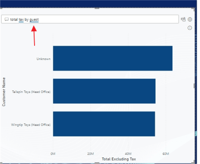
Now when using one of the terms in the synonym list, Power BI recognizes that term as an equivalent value; in our example "customer name". Notice in the screen print below, we see a blue underline for the word guest. Note that synonyms do NOT show up in the Manage Terms list.
The Power BI Q&A visual has ramped up the power of natural language processing that can take place within Power BI. With just minimal setup, the Q&A visual can create a powerful, interactive tool for report consumers.
Next Steps
- Check out the following resources:
Learn more about Power BI in this 3 hour training course.
About the author
 Scott Murray has a passion for crafting BI Solutions with SharePoint, SSAS, OLAP and SSRS.
This author pledges the content of this article is based on professional experience and not AI generated.
View all my tips
Article Last Updated: 2020-01-21


