By: Aveek Das | Updated: 2020-03-10 | Comments | Related: > Power BI
Problem
Recently, I had a requirement from one of my clients to design a Power BI report in which they wanted to visualize the cumulative sales by week of quarter. They wanted to understand their sales performance for every quarter starting from the 1st week of that quarter till the end.
In Power BI, or to be more specific, in DAX, we do not have a direct way of calculating the week of quarter. Although, there is a WEEKNUM function in DAX, it returns the week number of the year and not the quarter or month.
Solution
Since there is no way to get the week number of the quarter directly in DAX, I will show a workaround for how this can be achieved in Power BI. Just to make the article simpler, I’ve attached a screen print of the chart that we are going to build in this tip.
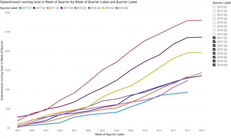
Figure 1 - Cumulative Sales Amount by Week of Quarter
Figure 1 shows the cumulative sales for every week of a quarter. Notice that each quarter has around 13/14 weeks and the week number restarts for every quarter. Each quarter is represented by a single line which is also marked in the legends section.
Step 1 - Loading the data into Power BI
Let’s begin by loading the data into the Power BI environment. For the sake of this tip, I’ll use a sample superstore dataset and perform all the calculations accordingly. This sample dataset is attached within the tip along with the Power BI report that you can use for your reference. See the Next Steps section to download.
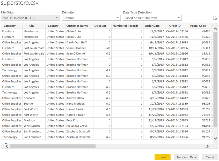
Figure 2 - Loading Data into Power BI
Step 2 – Generating calculated columns
Once we have the data loaded into Power BI, we will be using only two columns from the dataset for the final charts. Based on these two columns, we will calculate some other columns and tables later in this article.
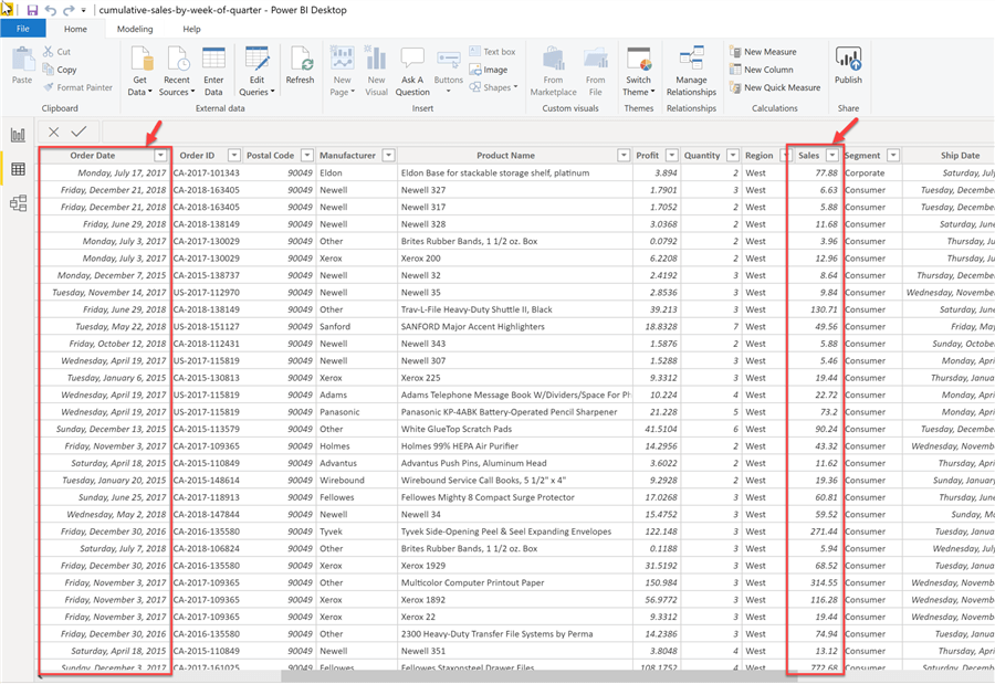
Figure 3 - Columns used from the dataset
As you can see from the Figure 3, we will be using the "Order Date" and "Sales" columns as the base of our calculations.
Now, based on the Order Date, we will calculate the following two columns that will aid in our solution later.
- Week Number – A number from between 1 to 52/53 generated by using the WEEKNUM function preceded with the year of the date.
- Quarter Label – A label to extract the quarter name from the date using the QUARTER function preceded with the year of the date.
The script for calculating both these columns are provided below.
Week Number = YEAR(superstore[Order Date]) & FORMAT(WEEKNUM(superstore[Order Date]),"00")
Quarter Label = YEAR(superstore[Order Date]) & " Q" & QUARTER(superstore[Order Date])
Notice that for calculating the Week Number, I’ve used a FORMAT function. This is just to be consistent with the single digit week numbers so that the value will always be returned as a two-digit week number.
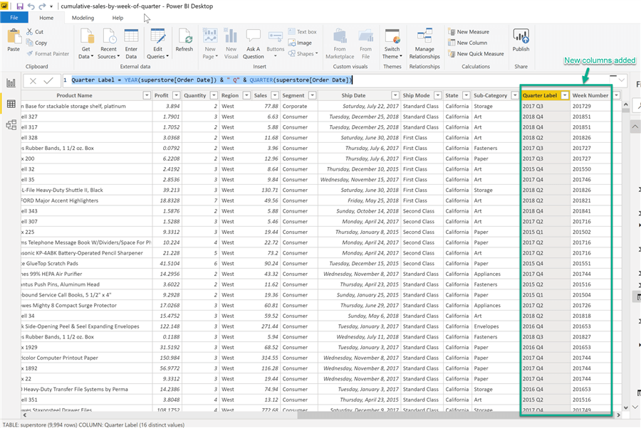
Figure 4 - New Columns Added
Step 3 – Summarize the Detailed Data
In the source dataset, the data we have is available daily. However, for our report, we require the data on a weekly basis and not in a daily manner. In such a scenario, we can summarize the detailed daily data into another table which will contain summary data on a weekly level. We can then use this table and generate our charts.
Let’s go ahead and create this summary table now. I have provided the script to create this table here.
Weekly Sales = SUMMARIZE(
    superstore,
    superstore[Quarter Label],
    superstore[Week Number],
    "SalesAmount",SUM(superstore[Sales])
)
This script will group the entire dataset based on Quarter Label and Week Number and then calculate the sum of Sales from the original dataset. This summarized data will be stored in a new calculated table – "Weekly Sales".
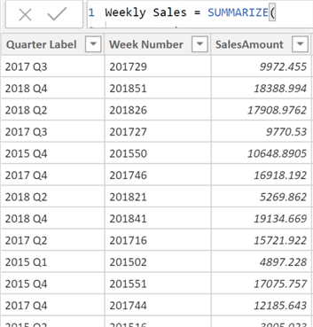
Figure 5 - Weekly Sales Table
In Figure 5, notice that we have aggregated the SalesAmount on a weekly manner based on the Week Number that we have calculated in our previous step.
Step 4 – Calculate Week of Quarter
Now that we have our data summarized in Weekly Sales, we can generate a week number for each of the quarters available in this dataset. For this purpose, we will leverage the RANKX function in DAX such that we can generate a number that will start afresh for every quarter in the table.
The script to calculate Week Of Quarter is provided as below.
Week of Quarter = RANKX(
    FILTER(
        'Weekly Sales',
        'Weekly Sales'[Quarter Label] = EARLIER('Weekly Sales'[Quarter Label])
    ),
    'Weekly Sales'[Week Number]
    ,
    ,ASC
)
The RANKX function basically assigns a number to each record available in the table. When we use it in combination with the FILTER and EARLIER expressions. We can calculate the rank for each of the rows within a group of rows in the context.
This column will return the row numbers for all the records and restart the counter to the beginning as soon as the Quarter Label changes.
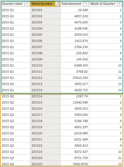
Figure 6 - Week Of Quarter
In the above figure, notice the values for Week Of Quarter for 2015 Q1 (marked in green) and how the values of 2015 Q2 (marked in yellow) restart as the quarter changes.
Step 5 – Calculate Week of Quarter Label
Finally, for the purpose of presentation, we will add one more calculated column that will provide us the Week Of Quarter with a label that can be used in the report. The script to generate this column is as follows.
Week of Quarter Label = "W" & FORMAT('Weekly Sales'[Week of Quarter],"00")
After adding this column in the Weekly Sales table, we have the final table as follows.
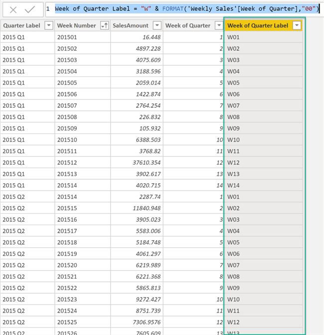
Figure 7 - Added Week of Quarter Label
Step 6 – Create the calculated measure for Cumulative Sales Amount
The final step in preparing the dataset is to create a calculated measure that’ll give us the running total of the Sales Amount for each week in the quarter.
The formula for generating the Cumulative Sales Amount is as follows:
Cumulative Sales Amount =
CALCULATE(
    SUM('Weekly Sales'[SalesAmount]),
    FILTER(
        ALLSELECTED('Weekly Sales'[Week of Quarter Label]),
        ISONORAFTER('Weekly Sales'[Week of Quarter Label], MAX('Weekly Sales'[Week of Quarter Label]), DESC)
    )
)
Alternatively, you can also create a calculated measure by selecting New Quick Measure from the context menu of the Weekly Sales dataset. Select Calculation as "Running Total", Base Value as SalesAmount and Field as Week of Quarter Label.
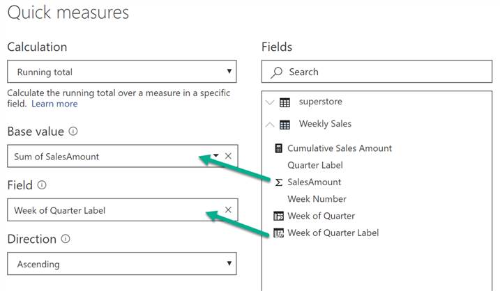
Figure 8 - New Quick Measure
Step 7 – Build the report
Now that we have the entire dataset prepared for our chart, let’s go ahead and create the chart as displayed in the beginning of this article.
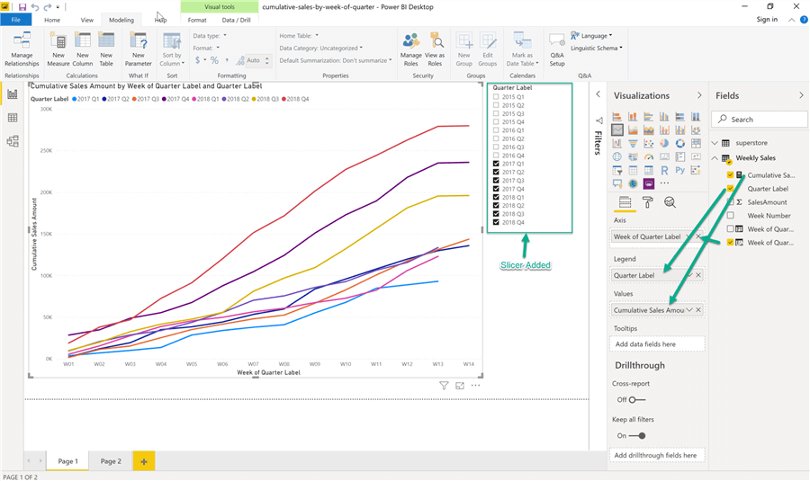
Figure 9 - Building the report
As shown in the figure above, drag and drop the Week of Quarter Label to the Axis, Quarter Label to the Legend and Cumulative Sales Amount to the Values pane. For the purpose of better visibility, we have also added a slicer with the Quarter Label information in it so that we can selectively compare the sales for the quarters available in the dataset.
Thus, our final report is now ready for analysis and we can infer that the quarter – 2018 Q1 has the highest Week over Week growth as compared to the other quarters available.
Next Steps
- Read more about the SUMMARIZE function in DAX.
- Understand how RANKX works in DAX.
- Download files for this tip.
Learn more about Power BI in this 3 hour training course.
About the author
 Aveek Das is an experienced Business Intelligence and Data Analytics professional with over four years of expertise in the Microsoft SQL Server BI stack along with Power BI, Qlik and Tableau.
This author pledges the content of this article is based on professional experience and not AI generated.
View all my tips
Article Last Updated: 2020-03-10


