By: Kenneth A. Omorodion | Updated: 2020-12-21 | Comments (2) | Related: > Power BI
Problem
Sometimes there is a requirement to ensure all slicers are represented in a single slicer selector in Power BI reports. There are currently two ways to achieve this, using DAX logic to create a dynamic slicer, and using dynamic M Query parameters in Power BI. Dynamic M Query parameters was recently introduced by the Power BI team for this purpose. However, there are situations in which Dynamic Query parameters might not be the best solution or where Dynamic M query parameters cannot be achieved. This is where we can leverage the approach discussed in this article. See this Microsoft documentation on some current limitations of Dynamic M query parameters.
Solution
For this tip, I have imported the FactInternetSales table from AdventureWorksDW2012. What we are trying to achieve is a combination of six columns (this can be any number of columns as metrics in your case though). We are using as slicers into one slicer and then look at the values across time and per customer.
To achieve this, we need to chronologically follow the steps outlined below:
- Import the dataset
- Create a Calendar date table and set up the data model
- Create an All Measures table with an index column
- Create the selections DAX logic
- Create your visuals and slicers
STEP 1: Import the dataset
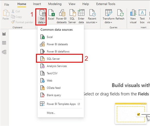
This is the simplest part of the tip. All we need do is create a connection to SQL Server and import the FactInternetSales table to Power BI as seen below.
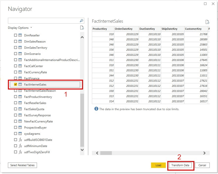
Next, select the FactInternetSales table which will be imported to Power BI and click "Transform Data" as seen in the diagram below.
After importing the data, you can perform any transformation or cleansing as needed.
STEP 2: Create a Calendar date table and set up the data model
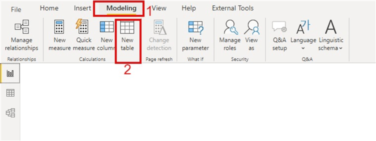
Although there is a ready-made Calendar date table in the AdventureWorksDW2012 known as Dim.Date, for the purpose of this article we are assuming there is no Calendar date table and we are required to create one. To do this, select the "Modeling" tab at the top of the Power BI screen and then click "New Table" as seen in the diagram below.
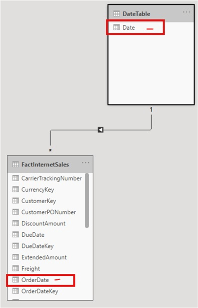
We will be using the OrderDate column in the FactInternetSales table as our date column for visualizations. This can then be applied to our Calendar date table creation as seen below.

DateTable = CALENDAR(MIN(FactInternetSales[OrderDate]), MAX(FactInternetSales[OrderDate]))
We then need to set up our data model to create a relationship between the Calendar date table and the FactInternetSales table.
STEP 3: Create an All Measures Table with an index column
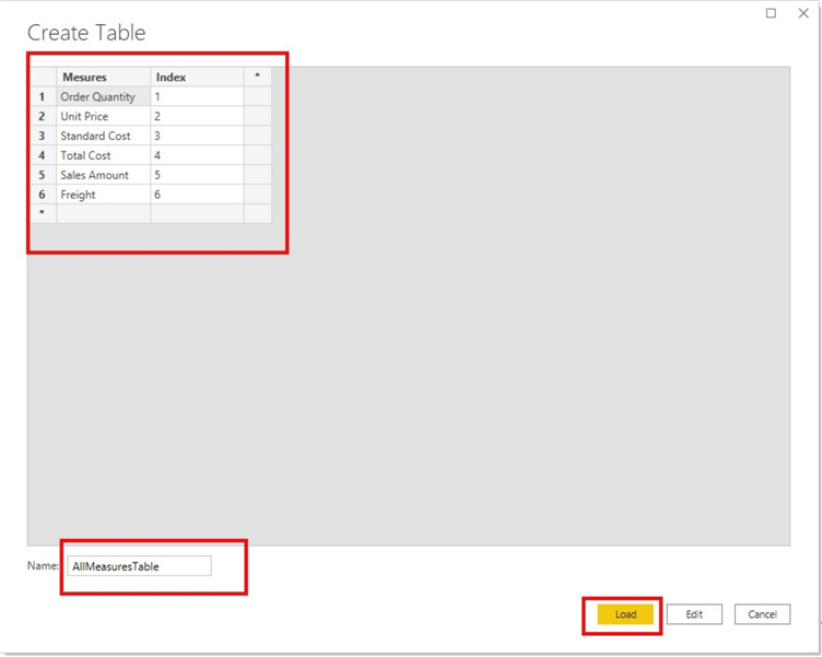
Next, create a table with all the columns we are using as metrics. In this case, I have selected to use the following columns in the FactInternetSales table: Order Quantity, Unit Price, Standard Cost, Total Product Cost, Sales Amount, and Freight. We also include an index column with this table as is demonstrated below.
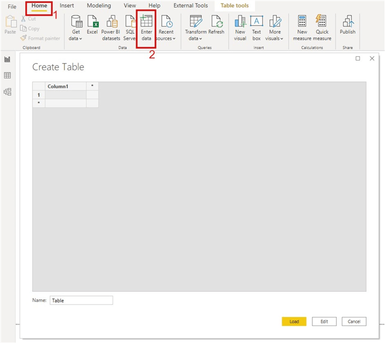
At the top of the Power BI desktop page, we select "Enter data" and enter the names of the columns we need to include in our slicer in the Measures column, as well as an increment of one for every row in the Index column. Note that the measures names do not need to be written exactly as they are in the FactInternetSales table. For example, the column Order Quantity is actually "OrderQuantity" in the FactInternetSales table. This can be seen in the diagram below.
STEP 4: Create the selections DAX logic
After creating the AllMeasures table, we need to create the underlying DAX logic for a single selection slicer.
However, before creating this, we need to create some very simple aggregation DAX calculations for the six columns we are using. Since all six columns are of numerical data types, it is okay to use the AVERAGE aggregation for them. A sample for Sale Amount is shown below.
SalesAmtCal = AVERAGE(FactInternetSales[SalesAmount])
Next, we apply these to the DAX logic calculation as seen below.
SalesAmtCal = AVERAGE(FactInternetSales[SalesAmount])
Slicer Selection =
IF (
    ISCROSSFILTERED ( AllMeasuresTable[Mesures]),
    SWITCH (
        SELECTEDVALUE ( AllMeasuresTable[Mesures]),
        "Order Quantity", 'FactInternetSales'[OrderQtyCal],
        "Unit Price", 'FactInternetSales'[UnitPriceCalCal],
        "Standard Cost", 'FactInternetSales'[StandardCostCal],
        "Total Cost", 'FactInternetSales'[TotalCostCal],
        "Sales Amount", 'FactInternetSales'[SalesAmtCal],
        "Freight", 'FactInternetSales'[FreightCal]
    ),
    " "
)
The calculated measure is also shown in the diagram below.
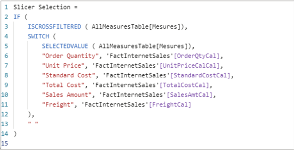
This formula can be modified if needed. For example, if nothing is selected, you might want to display something instead of blank.
STEP 5: Create your visuals and slicers
The last step is to create visuals that help demonstrate how the whole process works. First, drag the date (hierarchy column) in the Calendar date table into a clustered column chart and add the slicer DAX logic measure in Step 4 into the values section as seen below.
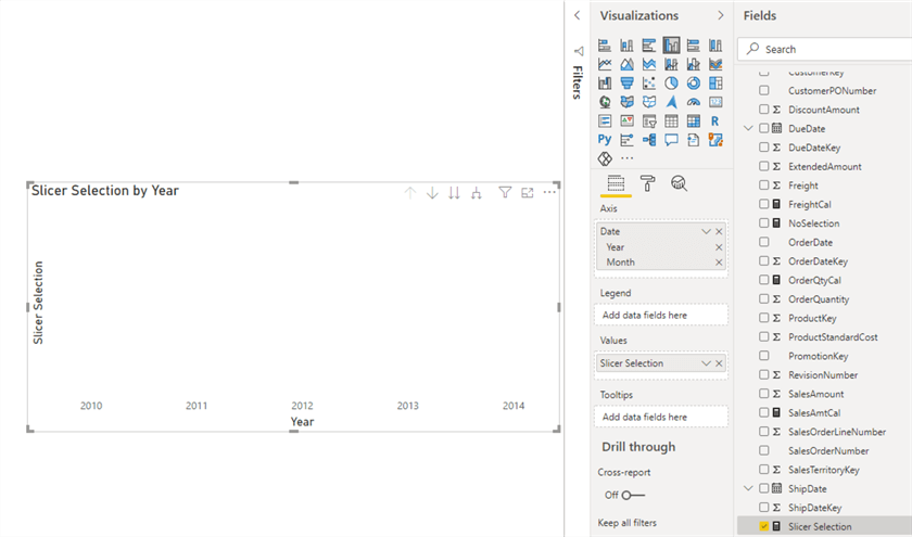
As you can see, its currently blank. This is because we have to select a measure to be displayed in the visual. To do this we need to drag the "Measures" column from the "AllMeasuresTable" and make it a slicer as seen in the diagram below.
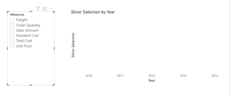
When we select any of the measures in the slicer, we can visualize it in the clustered column chart as seen in the two diagrams below.
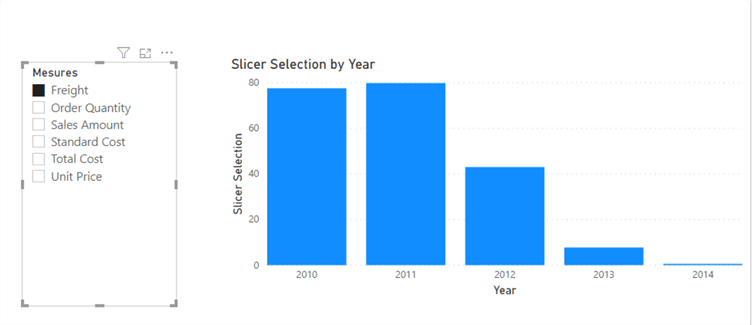
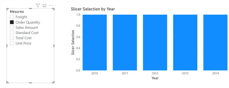
This logic can be taken even further in many ways, but one clear requirement would be how can we dynamically display the measure being selected as the title of the visual. To do this we need to create one more measure as seen below.
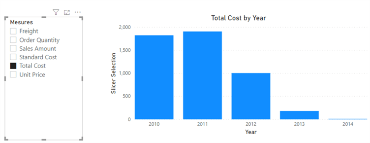
Titles = SELECTEDVALUE(AllMeasuresTable[Mesures])& " " &"by Year"
This is also seen in the Power BI formula bar below.

Click on the visual (i.e. the Clustered column chart visual) and then (1) select the Format brush and (2) expand the "Title" section as seen in the diagram below. Next, (3) select the "fx".

Then, in the "Based on field" section, (1) navigate to the DAX measure "Titles" we just created and (2) select this as seen in the diagram below.
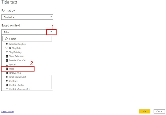
Once that is done, you will be able to see and more easily understand the measure selected in the slicer as seen in the diagram below.
There are several ways this logic can be applied in a business setting; however, this is just a tip on how the approach works. I plan on writing another tip on how the dynamic M query parameters can also be used in a similar vein.
Next Steps
- You can download AdventureworksDW here.
- You can get more information on Microsoft sample databases here.
- Get some details on using Selected Value in DAX from sqlbi here.
- Try this tip out with your own data.
Learn more about Power BI in this 3 hour training course.
About the author
 Kenneth A. Omorodion is a Business Intelligence Developer with over eight years of experience. He holds both a bachelor’s and master’s degree (Middlesex University in London). Kenneth has the MCSA, Microsoft Data Analyst - Power BI and Azure Fundamentals certifications. Kenneth is a Microsoft Certified Trainer and has delivered corporate training on Power BI, SQL Server, Excel and SSRS.
This author pledges the content of this article is based on professional experience and not AI generated.
View all my tips
Article Last Updated: 2020-12-21


