By: Matteo Lorini | Updated: 2020-12-30 | Comments | Related: More > R Language
Problem
In this article we will cover how you can use SQL Server R Services and create charts and graphs to plot data from R queries.
Solution
R has a package called ggplot2 that allows developers to create statistical graphs. In this article, I will show you how to install this package and then use it to plot some values from the AdventureWorks2014 database.
I am using SQL Server 2016 and this SQL Server version does not allow us to plot graphs directly in SQL Server Management Studio. However, we can create an external file that contains our graph. The following steps will show how to work with statistical graphics in RStudio first. This tip will end with an example on how to create graphs using SSMS
Step 1: First, we need to install the statistical ggplot2 package. This is executed by the following command:
install.packages("ggplot2")

Step 2: As an example, we will use AdventureWorks2014 database and the Sales.SalesOrderHeader and Sales.SalesTerritory tables to create graphs.
SELECT t.Name, YEAR(orderdate) [Year], Month(orderdate) [Month], concat(cast(YEAR(orderdate) as char(4)),' - ', DATENAME(month,orderdate)) [Year_Month_Name],
SUM(s.SubTotal) AS [Sub_Total],
STR(Sum([TaxAmt])) AS [Total_Taxes],
STR(Sum([TotalDue])) AS [Total_Sales]
FROM Sales.SalesOrderHeader AS s
INNER JOIN Sales.SalesTerritory as t ON s.TerritoryID = t.TerritoryID
GROUP BY t.Name,YEAR(orderdate), Month(orderdate), DATENAME(month,orderdate),concat(cast(YEAR(orderdate) as char(4)),' - ', DATENAME(month,orderdate))
ORDER BY t.Name,YEAR(orderdate), Month(orderdate)

Step 3: Next, we will create an R script in RStudio that connects to SQL Server and reads the data returned from the above query and plot a graph.
The R code below connects to our SQL Server database and reads the data into a dataframe called gmt.
library(ggplot2)
library(RODBC)
library(dplyr)
 sqlcnt <- odbcDriverConnect('driver={SQL Server Native Client 11.0};uid=xxxxxxxxx;pwd=xxxxxxx;server=xxxxxxxxx;database=AdventureWorks2014;rows_at_time=1024')
 sqlQry <- "SELECT t.Name, YEAR(orderdate) [Year], Month(orderdate) [Month], concat(cast(YEAR(orderdate) as char(4)),' - ', DATENAME(month,orderdate)) [Year_Month_Name],
SUM(s.SubTotal) AS [Sub_Total],
STR(Sum([TaxAmt])) AS [Total_Taxes],
STR(Sum([TotalDue])) AS [Total_Sales]
FROM Sales.SalesOrderHeader AS s
INNER JOIN Sales.SalesTerritory as t ON s.TerritoryID = t.TerritoryID
GROUP BY t.Name,YEAR(orderdate), Month(orderdate), DATENAME(month,orderdate),concat(cast(YEAR(orderdate) as char(4)),' - ', DATENAME(month,orderdate))
ORDER BY t.Name,YEAR(orderdate), Month(orderdate) "
 gmt <- sqlQuery(sqlcnt,sqlQry, stringsAsFactors = F,as.is = T)
To verify that the data has been loaded correctly, issue the following command:
View(gmt)

Step 4: Finally, we have our data and it is time to use R function ggplot.
For this example, we call ggplot() function with dataframe gmt as an input parameter. Use the aes() function to construct aesthetic mappings by passing the X and Y coordinates.
ggplot(gmt, aes(x=Year_Month_Name, y=Sub_Total)) + geom_point()

The output graph is as follows:

We have just produced our first graph. However, it is too dense because we are trying to plot too much data at once.
Filter the output to year 2012 and name Australia.
ggplot(filter(gmt, Name == "Australia" & Year == "2012"), aes(x=Year_Month_Name, y=Sub_Total)) + geom_point()

The function aes(), aesthetic mappings used with ggplot() is versatile and allows us to re-arrange and build multiple types of graphs.
For example, we can break down our graph by month and summarize it by Total Taxes as follows.
ggplot(data=filter(gmt, Name == "Australia" & Year == "2012")) +
       geom_point(mapping = aes(x=Year_Month_Name, y=Sub_Total, color =Year_Month_Name, size = Total_Taxes ) ) +
       facet_wrap(Year ~ Month)

In the next example, we will display only the Total Sales of the last quarter of 2012.
ggplot(data=filter(gmt, Name == "Australia" & Year == "2012" & (Month == "10" | Month == "11" | Month == "12")) ) +
       geom_point(mapping = aes(y=Year_Month_Name, x=Sub_Total, color =Year_Month_Name, size = Total_Sales ) )

Step 5: Let's see how it works using SSMS.
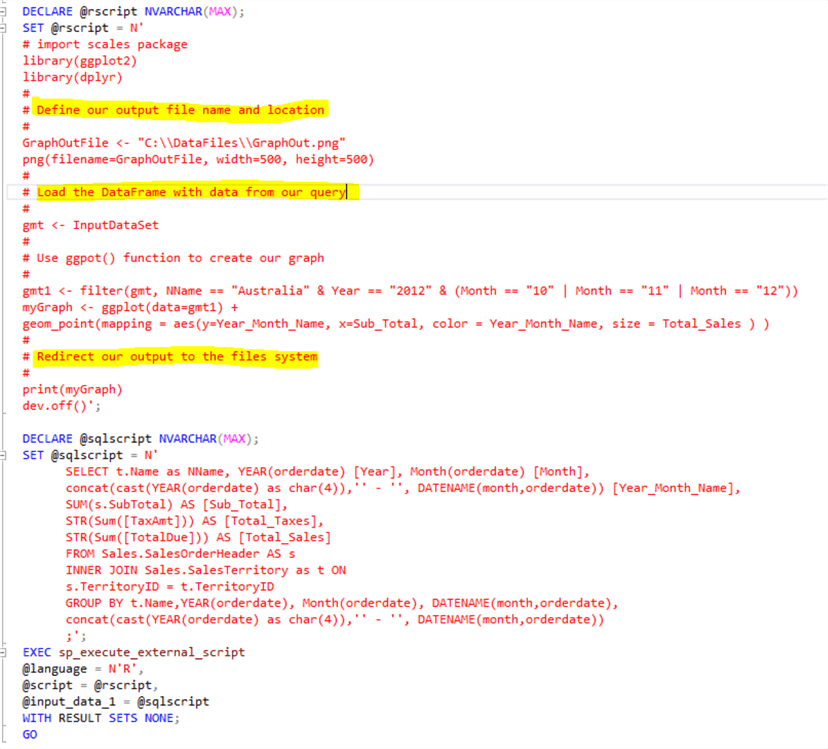
Since it is not possible to visualize an R graph inside SSMS, we must redirect the Graph output to an external file. The following code shows how this can be done.
USE AdventureWorks2014;
GO

DECLARE @rscript NVARCHAR(MAX);
SET @rscript = N'
  # import scales package
  library(ggplot2)
  library(dplyr)
  #
  # Define our output file name and location
  #
  GraphOutFile <- "C:\\DataFiles\\GraphOut.png"
  png(filename=GraphOutFile, width=500, height=500)
  #
  # Load the DataFrame with data from our query
  #
  gmt <- InputDataSet
  #
  # Use ggpot() function to create our graph
  #
  gmt1 <- filter(gmt, NName == "Australia" & Year == "2012" & (Month == "10" | Month == "11" | Month == "12"))
  myGraph <- ggplot(data=gmt1) +
  geom_point(mapping = aes(y=Year_Month_Name, x=Sub_Total, color = Year_Month_Name, size = Total_Sales ) )
  #
  # Redirect our output to the files system
  #
  print(myGraph)
  dev.off()';

DECLARE @sqlscript NVARCHAR(MAX);
SET @sqlscript = N'
      SELECT t.Name as NName, YEAR(orderdate) [Year], Month(orderdate) [Month],
      concat(cast(YEAR(orderdate) as char(4)),'' - '', DATENAME(month,orderdate)) [Year_Month_Name],
      SUM(s.SubTotal) AS [Sub_Total],
      STR(Sum([TaxAmt])) AS [Total_Taxes],
      STR(Sum([TotalDue])) AS [Total_Sales]
      FROM Sales.SalesOrderHeader AS s
      INNER JOIN Sales.SalesTerritory as t ON
      s.TerritoryID = t.TerritoryID
      GROUP BY t.Name,YEAR(orderdate), Month(orderdate), DATENAME(month,orderdate),
      concat(cast(YEAR(orderdate) as char(4)),'' - '', DATENAME(month,orderdate))
      ;';
EXEC sp_execute_external_script
  @language = N'R',
  @script = @rscript,
  @input_data_1 = @sqlscript
  WITH RESULT SETS NONE;
GO

We can see the output file has been created in our file system.

We can open it using the Windows Paint application to see the visualizations.

Conclusion
The R function ggplot() is versatile and can be used to create many types of statistical graphs. I recommend you check out this resource to see all the possible parameters of each function.
Next Steps
- The reader will need to install RStudio in order to test this tip.
- R Tutorial
- Check out these tips
About the author
 Matteo Lorini is a DBA and has been working in IT since 1993. He specializes in SQL Server and also has knowledge of MySQL.
This author pledges the content of this article is based on professional experience and not AI generated.
View all my tips
Article Last Updated: 2020-12-30


