By: Rick Dobson | Updated: 2022-05-24 | Comments | Related: > TSQL
Problem
Show how to display Heikin Ashi / candlestick charts based on financial time series data stored in SQL Server. Also, present a stored procedure for computing Heikin Ashi chart values in SQL Server. Transfer via csv files the observed financial time series and computed Heikin Ashi chart values to Python. Present Python code samples that illustrate how to display candlestick charts for observed prices and Heikin Ashi computed values. Visually show with candlestick charts potential use cases for Heikin Ashi computed values based on observed prices.
Solution
Heikin Ashi charts are a special kind of candlestick chart. A traditional candlestick chart graphs open, high, low, and close prices observed over a set of periods, such as hours, days, or weeks. The prices for each time period are represented by a single candlestick. The collection of candlesticks over multiple periods denotes a time series of prices for a security. Instead of plotting observed open, high, low, close prices, as in traditional candlestick charts, Heikin Ashi charts present average candlesticks based on the current and prior periods. This averaging process filters out day-to-day random changes and makes it much easier to discern short-term price trends.
The candlestick chart was originally created for the use case of tracking rice market prices in Japan during the 1700's. Since the early 1990's, candlestick charts are used for other types of markets, such as stocks, bonds, treasury bills, commodities, fiat currencies, and crypto currencies. This prior MSSQLTips.com article introduces database professionals to candlestick and Heikin Ashi charts. The charts in the prior tip were based on data stored and charted at either the Yahoo Finance site or the Stooq.com site. Another prior tip Compute and Display Heikin Ashi Charts in SQL Server and Excel illustrates how to graph financial time series data from data stored in SQL Server with Excel.
This tip extends prior coverage of candlestick charts by taking advantage of financial time series data stored in SQL Server and charted via Python. Two prior tips (here and here) provide examples of how to migrate financial time series data from Yahoo Finance and Stooq.com to SQL Server. The current tip extracts selected time series data for different ticker symbols from SQL Server, computes Heikin Ashi chart values, and displays the observed open, high, low, close candlestick values along with the Heikin Ashi candlesticks. Then, Python and the Plotly external graphing objects library are adapted for creating traditional candlestick and Heikin Ashi charts from the financial data stored in SQL Server. This tip differs from a prior one that graphically compares observed prices to Heikin Ashi values in Excel Compute and Display Heikin Ashi Charts in SQL Server and Excel. Python implements its charting solutions through a programmatic interface while Excel implements its charting solution through a manual interface.
Programmatic solutions may be more difficult to create initially, but they can provide greater automation than manually based approaches. Also, programmatic solutions tend to offer a wider range of features than is available from manual solutions. Finally, programmatic solutions offer the chance to reuse code.
Processing data for this tip
This tip tracks and displays observed open, high, low, close prices as well as Heikin Ashi values for ten ticker symbols. Each ticker is examined over a timespan of several months. The timespans, which can differ from one ticker to the next, are selected to illustrate how Heikin Ashi values can add value to the interpretation of underlying observed prices. This section relies on a stored procedure for the extraction of observed prices and the computation Heikin Ashi values based on the extracted observed prices. The stored procedure accepts input parameters that specify a ticker symbol along with a start date and an end date for the timespan associated with a ticker.
The following table shows the symbol for each of the ten tickers examined in this tip. The second and third columns show the start date and end date for each ticker's timespan. The ten timespans occur over a fourteen-year interval from as early as 2009 through as recent as 2022. This facilitates the comparison of observed prices versus Heikin Ashi values over a wide range of different time series.
| Ticker Symbol | Start Date | End Date |
|---|---|---|
| NVDA | 2020-02-18 | 2020-05-15 |
| AAPL | 2020-02-18 | 2020-05-15 |
| UNH | 2021-09-01 | 2022-02-18 |
| SHW | 2021-03-03 | 2021-08-26 |
| AMZN | 2018-04-02 | 2018-01-31 |
| ADBE | 2009-01-01 | 2009-05-31 |
| UNP | 2009-01-01 | 2009-04-30 |
| NEE | 2017-03-15 | 2017-06-13 |
| PSA | 2015-10-01 | 2015-12-31 |
| SPY | 2021-10-01 | 2021-12-31 |
The T-SQL code to pull the observed prices and compute the matching Heikin Ashi values relies on a stored procedure named for_retrieved_and_HA_candlesticks with three input parameters. The first parameter (@symbol) specifies the ticker symbol for a run of the stored proc. The second and third parameters (@start_date and @end_date) designate the beginning and end of a timespan associated with a ticker symbol. The stored proc returns its output via two results sets. The first results set is for the observed prices. The second results set is for the Heikin Ashi values based on the observed prices.
Here is a script to create the for_retrieved_and_HA_candlesticks stored proc in the DataScience database.
- The use statement designates DataScience as the default database.
- The drop proc if exists statement removes any prior version of the for_retrieved_and_HA_candlesticks stored proc from the default database.
- The body of the stored proc has three major parts.
- The first part creates a fresh version of the #for_temp_HA_candlesticks
temp table. This table has ten columns.
- The first two columns are for the symbol and date for a temp table row.
- The next set of four columns are for observed open, high, low, close prices from the source data table (yahoo_finance_ohlcv_values_with_symbol).
- The next set of four columns are for the Heikin Ashi values computed from the four columns of observed prices.
- The first part also populates the first six columns and the tenth column (HA_close) in the temp table.
- The second part populates the seventh, eighth, and ninth columns in the temp table.
- The third part displays two results sets.
- The first results set has the date, open, high, low, close, and symbol columns for the observed prices.
- The second results set has the date, open, high, low, close Heikin Ashi values and the symbol value.
- If you seek a more detailed explanation of the process for deriving Heikin Ashi values from observed prices, please review this prior tip Compute and Display Heikin Ashi Charts in SQL Server and Excel. The version of the code in this tip is modified to display two results sets of six columns each instead of just one results set of ten columns as in the prior tip, but the computational process is essentially the same.
- The first part creates a fresh version of the #for_temp_HA_candlesticks
temp table. This table has ten columns.
use DataScience

drop proc if exists for_retrieved_and_HA_candlesticks
go

-- observed prices and Heikin Ashi values
-- for @symbol from @start_date through @end_date
create proc for_retrieved_and_HA_candlesticks
@symbol nvarchar(10), @start_date date, @end_date date
as
-- retrieve observed prices for candlesticks and
-- compute values for HA candlesticks and
-- store in temp tables
-- first row values
-- and for all HA_close column values
declare
 @HA_open money,@HA_open_prior money
,@HA_close_prior money
,@high money
,@low money
,@current_row int = 2
,@max_current_row int = (
  select count(*)
  from yahoo_finance_ohlcv_values_with_symbol
  where symbol = @symbol
  )

drop table if exists #for_temp_HA_candlesticks

-- retrieve observed prices and
-- and compute first row values for HA_open, HA_high, and HA_low
-- and compute HA_close for all rows
select
 row_number() over (order by date) r_number
,symbol
,date
,[open]
,high
,low
,[close]
,case
  when row_number() over (order by date) = 1 then
   [open]
 end HA_open
,case
  when row_number() over (order by date) = 1 then
   high
 end HA_high
,case
  when row_number() over (order by date) = 1 then
   low
 end HA_low
,case
  when row_number() over (order by date) = 1
   then ([open] + high + low + [close])/4
  when row_number() over (order by date) > 1
   then ([open] + high + low + [close])/4
 end HA_close

into #for_temp_HA_candlesticks
from dbo.yahoo_finance_ohlcv_values_with_symbol
where symbol = @symbol
and date >= @start_date and date <= @end_date

--------------------------------------------------------------------------------------

-- compute HA_open, HA_high, and HA_low column values
-- for all rows after the first row
While @current_row <= @max_current_row
begin
-- get prior @HA_open and prior @HA_close to current row
   set @HA_open_prior =  (select HA_open  from #for_temp_HA_candlesticks where r_number
      = (@current_row - 1))
   set @HA_close_prior = (select HA_close from #for_temp_HA_candlesticks where r_number
      = (@current_row - 1))

-- computed HA_open as average of prior @HA_open and prior @HA_close to current row
   set @HA_open = (@HA_open_prior + @HA_close_prior)/2

--update HA_open column value in #for_temp_HA_candlesticks for current row
   update #for_temp_HA_candlesticks
    set HA_open = @HA_open
   where r_number = @current_row

-- store high and low for current row, respectively,
-- in @HA_high and @HA_low
   set @high = (
      select high from #for_temp_HA_candlesticks where r_number = @current_row)
   set @low = (
      select low from #for_temp_HA_candlesticks where r_number = @current_row)

-- compute HA_high as maximum of current period's high and
-- current period values for HA_open and HA_close
-- else clause in case statement handles special case of
-- high = HA_open = HA_close
   update #for_temp_HA_candlesticks
    set HA_high =
               case
               when @high > HA_open and @high > HA_close then @high
               when HA_open > @high and HA_open > HA_close then HA_open
               else HA_close
               end
   where r_number = @current_row

-- compute HA_low as minimum of current period's low and
-- current period values for HA_open and HA_close
-- else clause in case statement handles special case of
-- low = HA_open = HA_close
   update #for_temp_HA_candlesticks
    set HA_low =
               case
               when @low < HA_open and @low < HA_close then @low
               when HA_open < @low and HA_open < HA_close then HA_open
               else HA_close
               end
   where r_number = @current_row

-- increase @current_row by 1 to update column values in next row
set @current_row = @current_row + 1
end

--------------------------------------------------------------------------------------

-- display observed prices results set for copying to Excel
select
 date
,[open]
,high
,low
,[close]
, symbol
from #for_temp_HA_candlesticks

-- display HA value results set for copying to Excel
select
 date
,HA_open  [open]
,HA_high  high
,HA_low   low
,HA_close [close]
, symbol
from #for_temp_HA_candlesticks

go
Here is a short script excerpt for invoking the for_retrieved_and_HA_candlesticks stored proc for the NVDA ticker symbol.
- The script declares three local variables named @symbol, @start_date, and @end_date, which are subsequently populated with set statements.
- Then, the local variables are passed to the for_retrieved_and_HA_candlesticks stored proc in an exec statement.
use DataScience

-- for NVDA ticker symbol
declare @symbol nvarchar(10), @start_date date, @end_date date

set @symbol = 'NVDA';
set @start_date = '2020-2-18'
set @end_date = '2020-5-15'

exec [dbo].[for_retrieved_and_HA_candlesticks] @symbol, @start_date, @end_date
In the T-SQL script available in the download file for this tip, there are nine additional versions of the code from the declare statement through the exec statement for the remaining nine ticker symbols tracked in this tip.
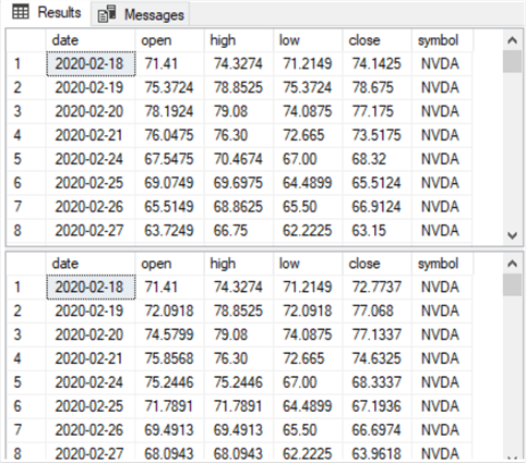
The following screen shot shows the first eight rows each from the first and second results sets from the for_retrieved_and_HA_candlesticks stored proc. Recall that the first results set is for the observed prices, and the second results set is for computed Heikin Ashi values based on observed prices.
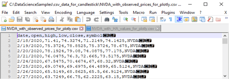
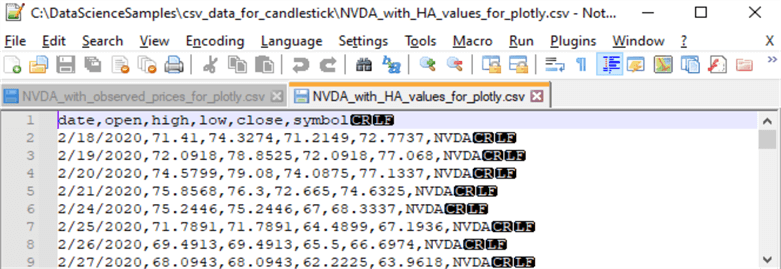
The following two screen shot excerpts from Notepad++ display csv file segments based on the first and second results sets in the preceding screen shot. The top screen shot is for the first results set showing observed prices. The csv file excerpt depicted in top screen image below is from a file named NVDA_with_observed_prices_for_plotly.csv in the C:\DataScienceSamples\csv_data_for_candlestick path. The csv file excerpt in the bottom screen image below is from a file named NVDA_with_HA_values_for_plotly.csv, which resides in the same path as the first csv file excerpt. The second screen shot below is for Heikin Ashi values based on observed prices.
Python scripts for graphing the two csv files per ticker symbol
You can download Python for free from this website. The Python scripts used in this tip to create candlestick charts require two external libraries that do not automatically download with the Python core code and its internal libraries; both of the external libraries are also available for free. One external library is the pandas library. The other external library is the plotly.graph_objects library. You can use the pip utility to install Python external libraries.
- For example, if Python 3.10 is installed in the c:\Python310 path, then you can install pandas in the c:\Python310 path with this command in a cmd window.
pip install pandas
- Similarly, you can install the plotly.graph_objects library in the c:\Python310 path with this pip command in a cmd window.
pip install plotly
This tip uses two nearly identical Python scripts for plotting candlestick charts – one with observed prices data and another with Heikin Ashi values based on observed prices.
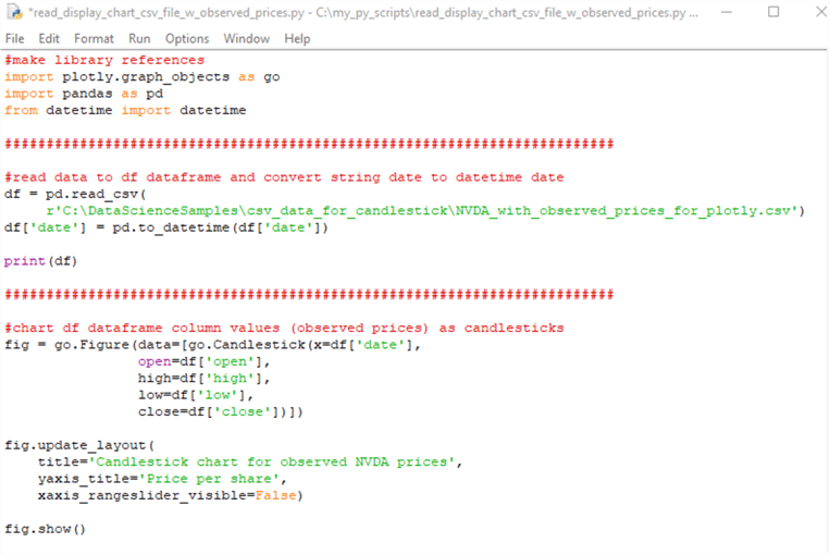
Here is the script for plotting candlesticks for observed prices for the NVDA ticker symbol. The filename for the Python script is read_display_chart_csv_file_w_observed_prices.py. The script has three parts.
- The first part makes script references.
- The plotly.graph_objects and pandas library references appear first.
- The datetime reference is for the Python internal datetime library.
- The second script part imports with the read_csv method a csv file into a pandas dataframe object (df). A dataframe is frequently considered as analogous to a spreadsheet. The to_datetime method converts the string object in the date column to a Python datetime object. Recall that the values in a csv file are strings.
- The third script part invokes and applies the plotly.graph_objects library
to assign the df object to a candlestick chart. There are three parts
to the application.
- The Figure method of the graph_objects library assigns a candlestick chart to the fig object. The candlestick chart pulls its data from the open, high, low, and close columns of the df object.
- The update _layout method of the fig object assigns titles to the candlestick chart and y-axis in the chart. The rangeslider is a handy feature when you want to subset dates from the original source data. However, in this application it is not necessary because the data are filtered before they are passed to a csv file. Therefore, xaxis_rangeslider_visible is set to False.
- The show method of the fig object displays the candlestick chart on a tab in a browser. I tested plotly.graph_objects with the Chrome browser, and I found that the image would frequently hang when it was trying to load the candlestick chart image into a browser tab. When this happened, I could resolve the issue by right-clicking the tab and choosing Reload.
Here is the script for plotting candlesticks for Heikin Ashi values based on observed prices for the NVDA ticker symbol. The filename for the Python script is read_display_chart_csv_file_w_HA_values.py. With two exceptions, the code within the following Python script file is identical to the preceding Python script.
- The csv filename argument for the read_csv method from the pandas library is different. Notice the argument matches the name of the last csv file excerpted in the prior section.
- Also, the chart title in the following script is different than in the preceding Python script. In particular, the new title indicates it is plotting HA values instead of observed prices.
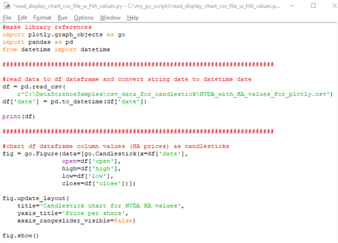
These two Python scripts can easily be re-used for each of the ten ticker symbols used in this tip. Just edit the ticker symbol text in the read_csv method and in the chart title. MSSQLTips.com offers a prior tip for the IDLE environment. This environment can be used to edit and run Python scripts.
Visualizing Heikin Ashi chart use cases
Now that you have a basic understanding of what Heikin Ashi values are versus observed prices as well how to graph Heikin Ashi values and observed prices in candlestick charts, it is time to demonstrate how to visualize them together to help with understanding market trends and ipotential trading strategies. This section attempts to evaluate visually if Heikin Ashi values can provide clues about when to buy and sell stocks for a profit.
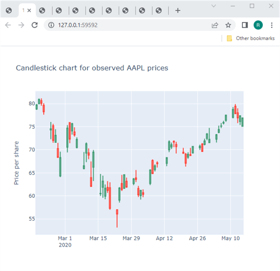
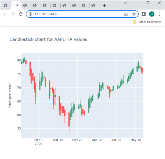
The following table presents two candlestick charts over the same timespan for the AAPL ticker. The top candlestick chart is for observed prices, and the bottom candlestick chart is for Heikin Ashi values. Candlesticks with a green body are for trading days during which observed prices or Heikin Ashi values rise from the open through the close of market activity. Candlesticks with a red body are for trading days during which observed prices or Heikin Ashi value decline from the open through the close of market activity.
The two charts look very similar, but there are also some important differences.
- In the category of similarities, the candlesticks for both charts appear in a V pattern. This is not a requirement of candlestick chart, but it sometimes happens – particularly around times when there is a reversal from falling prices to rising prices.
- However, the order of green and red candlesticks is not identical for the dates in the two charts. More specifically, green candlesticks are more clustered with other green candlesticks in the bottom chart of Heikin Ashi values. Likewise, red candlesticks are also more clustered with other red candlesticks in the Heikin Ashi chart.
- The order of green and red candlesticks in the Heikin Ashi chart reveals that once candlesticks start to rise, they continue rising until they start to decline. Also, once candlesticks start to decline, they continue declining until the trend reverses or transitions to a no-trend range of dates.
- The declining candlesticks in the V pattern are generally from mid-February through around mid-March in 2020.
- In contrast, the rising candlesticks in the V pattern are generally from a little past mid-March through mid-May in 2020.
- In addition to isolating uptrends from downtrends, Heikin Ashi charts can also identify periods when there is neither an uptrend nor a downtrend. In this scenario, the candlesticks fall roughly along a flat line.
- The ability to highlight uptrends, downtrends, and no trends can give clues
about when to buy and sell securities.
- For example, it is a good time to buy a security around the beginning of an uptrend.
- Likewise, it is a good time to sell a security around the beginning of a downtrend.
Another type of visual comparison of observed price candlesticks versus Heikin Ashi candlesticks is for the selection of buy and sell dates as well as buy and sell prices. The difference between the sell price and buy price is the change amount for a buy-sell cycle. For an uptrending buy-sell cycle, the change amount is the profit per share for a trade. Downtrending buy-sell cycles result in losses.
- The buy and sell dates can be determined from the Heikin Ashi candlestick chart. This is so because the Heikin Ashi chart clearly identifies the start of an uptrend and the beginning of a following downtrend.
- On the other hand, the buy price and the sell price must be determined from the observed price candlestick chart. This is because only the observed price candlestick chart has observed prices. The Heikin Ashi values in an Heikin Ashi candlestick chart has smoothed prices instead of actual observed prices.
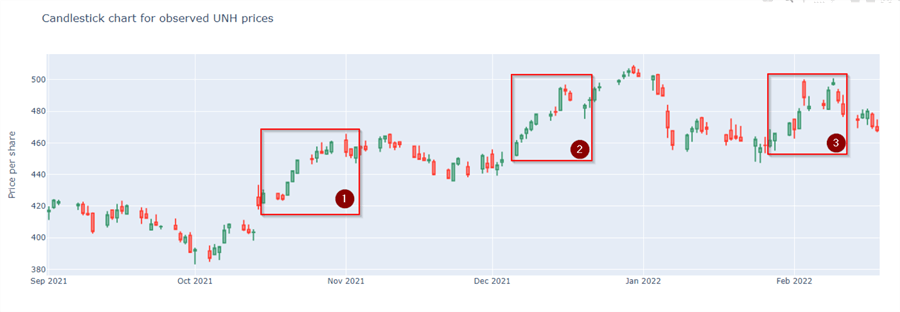
The following table has two candlestick charts for the UNH ticker symbol. The top chart is for observed prices, and bottom chart is for Heikin Ashi values. Each chart contains three rectangles – one for each of three buy-sell cycles.
- The left-most candlestick within each rectangle is for either the buy date
or buy price.
- The buy date is in the bottom chart.
- The buy price is in the top chart.
- The right-most candlestick within each rectangle is for either the sell
date or the sell price.
- The sell date is in the bottom chart.
- The sell price is in the top chart.
- For the three boxes highlighted in the charts, the sell price is consistently higher than the buy price. These results indicate buy-sell dates determined by Heikin Ashi values are worthy of more research to determine the average magnitude and reliability of the gains shown below across more tickers and other pairs of buy-sell dates.

Another way to visually compare observed prices to Heikin Ashi values is to let buy-sell cycles overlap within one another. Instead of having multiple buy-sell cycles that do not overlap, this approach has one buy date with two or more sell signal dates. If a trader or a data science model ignores the first sell signal date and the price starts to rise after the sell signal date, then the observed prices can rise above the first sell price value on the way to a second sell signal date. The security can be sold at the second sell signal date or held again. This strategy of ignoring sell signal dates can continue until the estimated gain of not selling in response to a sell signal is less than the estimated loss from not selling in response to a sell signal.
- This kind of trading strategy is likely to be most effective when the price gains for successive blocks of green candlesticks are relatively steep.
- Also, there should be relatively few red candlesticks between successive green candlestick runs.
- Furthermore, the losses for red candlestick runs should be less on average than the gains during green candlestick runs.
The following pair of screen shots illustrates this kind of application of Heikin Ashi values for the ADBE ticker. The range of dates starts at the beginning of January 2009 and runs through late May 2009.
The bottom chart shows the Heikin Ashi values, and the top chart shows the observed prices. Recall that markers for Heikin Ashi values can indicate the buy signal and sell signal dates for a security.
- Notice that the rectangles in the bottom chart overlap one another starting with the buy date at maker number 1. The buy date is the x-axis value for marker number 1.
- At the right edge of the first rectangle, there is no gap before the start of a second rectangle. This is to represent the ignoring of the sell signal at the right edge of the first rectangle for the first buy-sell cycle. The x-axis value of marker number 2 denotes this date.
- The sell signal for the second buy-sell cycle is denoted by marker number 3. Notice the second rectangle includes the first rectangle. At the right edge of the second rectangle, there is no gap before the start of a third rectangle. This is to represent the ignoring of the sell signal at the right edge of the second rectangle for the second buy-sell cycle.
- The sell signal for the third buy-sell cycle is denoted by marker number 4. The rectangle for the third buy-sell cycle overlaps the prior two rectangles for the first and second buy-sell cycles. At the end of the third rectangle, there are no more overlapping rectangles. This is to signify that there is a sell for the security at the sell signal for the third buy-sell cycle.
The top chart shows the observed prices instead of Heikin Ashi values at key points in the buy-sell cycles.
- The y-axis value for marker number 1 indicates the buy price for the first buy-sell cycle.
- The y-axis value for marker number 2 indicates what the sell price would have been if the position holder sold the security at the sell signal date for the first buy-sell cycle.
- The y-axis value for marker number 3 indicates what the sell price would
have been if the position holder sold the security at the sell signal date denoted
at the right edge of the second rectangle.
- It is relevant to note that the y-axis value for marker number 3 is greater than the y-axis value for marker number 2.
- This outcome indicates that the gain grew from the end of the first buy-sell cycle through the end of the second buy-sell cycle.
- The y-axis value for marker number 4 indicates what the sell price is as result of selling a security at the sell date for the third buy-sell cycle. The gain grows from the end of the second buy-sell cycle through the end of the third buy-sell cycle.
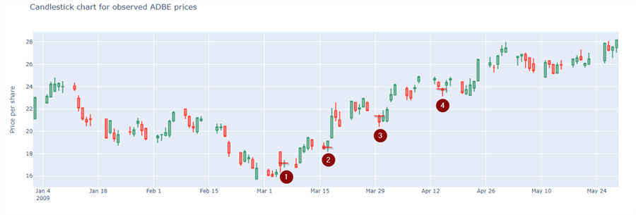

While the preceding example is for actual data, the example is not meant to imply that prices will always rise as a result of ignoring a sell signal. Additional research is needed to assess when the strategy of ignoring sell signals is likely to yield superior results to selling a position in response to a sell signal.
Next Steps
This tip describes the main steps for preparing candlestick charts with SQL Server and Python for open, high, low, close observed prices and Heikin Ashi values. By computing the Heikin Ashi values in SQL Server, you have easier access to the values than with those from a charting package at Yahoo Finance or Stooq.com. For example, this tip includes coverage of the differences between Heikin Ashi values and open, high, low, close observed prices as well as different ways of evaluating trading strategies via observed prices and Heikin Ashi values.
The download for this tip aims to give you the opportunity for a first-hand feel about how to develop the code and screen shots displayed in this tip.
- There is one sql script file. It contains all the T-SQL code included
or referenced in this tip. The specific items are
- A script excerpt for creating the stored procedure for extracting observed prices and computing Heikin Ashi values based on the observed prices for a ticker symbol
- The stored procedure requires three input parameters
- One parameter is for a ticker symbol
- A second parameter is a string value for the start date for a ticker
- A third parameter is a string value for the end date for a ticker
- Ten code batches – one each for invoking the stored procedure for each of the ten ticker symbols tracked in this tip
- There are 21 csv files.
- One csv with historical data from the beginning of January 2000 through February 18, 2022 for all ten ticker symbols referenced in this tip.
- Ten pair of csv files for the ten ticker symbols referenced in this
tip with their corresponding start dates and end dates specified in the
table towards the top of the " Processing data for this tip" section.
These data are for processing by the Python script files to create candlestick
charts.
- One member of each pair is for observed prices
- The second member of each pair is for computed Heikin Ashi values
- There are two Python script files
- One script file is for creating a candlestick chart for observed prices
- The other script file is for creating a candlestick chart for computed Heikin Ashi values
After duplicating the three pairs of charts displayed in the tip, you can create seven additional pairs of charts based on the csv files supplied in this tip's download file. You can also create fresh results sets with matching csv files for the same tickers with other timespans or for other tickers with historical data supplied in this tip's download file. Then, you can graph the newly created csv files as candlestick charts for observed prices and Heikin Ashi values. In performing these kinds of additional steps, you will grow your abilities for processing and analyzing time series data with SQL Server and Python.
About the author
 Rick Dobson is an author and an individual trader. He is also a SQL Server professional with decades of T-SQL experience that includes authoring books, running a national seminar practice, working for businesses on finance and healthcare development projects, and serving as a regular contributor to MSSQLTips.com. He has been growing his Python skills for more than the past half decade -- especially for data visualization and ETL tasks with JSON and CSV files. His most recent professional passions include financial time series data and analyses, AI models, and statistics. He believes the proper application of these skills can help traders and investors to make more profitable decisions.
This author pledges the content of this article is based on professional experience and not AI generated.
View all my tips
Article Last Updated: 2022-05-24


