By: Aubrey Love | Updated: 2022-09-16 | Comments | Related: > TSQL
Problem
Recently, I was asked to do a real off-the-wall task. My client wanted to see a bar chart of the "averaged" values in a SQL table. My first thought was, "why?" But then I thought, what a challenge. As a DBA, I encourage you to accept such challenges enthusiastically. They provide a great experience and practice for you to grow your skill set.
Solution
In this SQL tutorial, we will walk through the steps to create a bar chart, just as my client asked. We will create a test table and some data and with that, we will produce an actual bar chart that can be viewed in a SQL query or even be used in a view based on the SQL SELECT query we will build in this tutorial.
Create Test Table
We want to create a bar chart that represents the average grade of each of our four students. The following code block will create the table we will work with.
CREATE TABLE StudentScore (
     student VARCHAR(20)
   , class VARCHAR(20)
   , score INT
   );
GO
Add Sample Data
INSERT INTO StudentScore(student, class, score)
VALUES('John', 'math', 98)
    , ('John', 'history', 76)
    , ('John', 'science', 80)
    , ('John', 'chemistry', 78)
    , ('Suzie', 'math', 70)
    , ('Suzie', 'history', 78)
    , ('Suzie', 'science', 70)
    , ('Suzie', 'chemistry', 70)
    , ('Jim', 'math', 50)
    , ('Jim', 'history', 50)
    , ('Jim', 'science', 50)
    , ('Jim', 'chemistry', 50)
    , ('Cheryl', 'math', 90)
    , ('Cheryl', 'history', 82)
    , ('Cheryl', 'science', 80)
    , ('Cheryl', 'chemistry', 70)
GO
Querying the SQL Table
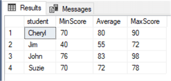
Now that we have our test table and data set, let's run a simple query to return each student's minimum, maximum, and average grades. We need to use the GROUP BY clause since we are using the min, max, and avg aggregate functions.
SELECT student
   , MIN(Score) AS 'MinScore'
   , AVG(Score) AS 'Average'
   , MAX(Score) AS 'MaxScore'
FROM StudentScore
GROUP BY student;
Results:

Now that we know the average scores, let's work on producing a column that shows a simple bar that reflects that average score for each student.
Building the Bar Chart
Let's start with learning how to create a simple bar using the SQL REPLICATE() function.
SELECT REPLICATE('_', 50);
Results:

Notice that we returned 50 underscores to form a single line. Of course, you can use whatever character you like. For example, you could use the asterisk (*) to simulate an old Dot Matrix printout.
Simple Bar Chart Example
To simply show the bar for the data, we can use the following query. Since we know the top test score would be 100, we know the most the bar would be is 100 underscores.
SELECT student,
       AVG(Score) AS AvgScore,
       REPLICATE('_', AVG(Score)) AS Graph
FROM StudentScore
GROUP BY student;
GO

Scaling the Bar Chart
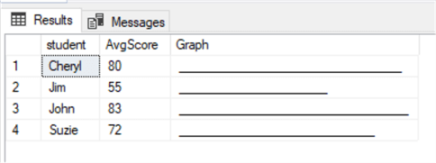
For other data where the top value might be in the thousands or millions, we would need to scale the size of the bar otherwise it would be too large to display. To do this for our example, we could find the MAX score (which is 98 for our sample data) and use this as the top level value and divide the average score with this value. To then scale up or down the output we could use a multiplier between 1 and 100 (1% and 100%).
Here's the final query that pulls it all together. In this example the bar will be 40% of the size (using a value of 40.0) if we are using a scale from 1 to 100.
SELECT student,
       AVG(Score) AS AvgScore,
       REPLICATE('_', ROUND(CAST(AVG(Score) AS float) * 40.0 /
          CAST((SELECT MAX(SCORE) FROM Studentscore) AS float),0)) AS Graph
FROM StudentScore
GROUP BY student;
GO
Results:

Lines 3 and 4 in the code block above are where the "graph" is constructed. Reading through the two lines of code lets you see what is going on. Here's a simple breakdown.
In line 3, we grab the average score for each student (one at a time), rounding it as a float and multiplying by 40. Line 4 grabs the maximum score of all student scores as a float. Next, we use the REPLICATE() function to display a series of underscores. The quantity of underscores is determined by the average and maximum numbers as rounded floats based on our multiplier.
Wrap Up
In this tutorial, we used the following SQL functions along with GROUP BY to produce a simple bar chart graph on the values of a column.
Next Steps
- Try replacing the underscore with other special characters.
- Also, check out the following articles.
About the author
 Aubrey Love is a self-taught DBA with more than six years of experience designing, creating, and monitoring SQL Server databases as a DBA/Business Intelligence Specialist. Certificates include MCSA, A+, Linux+, and Google Map Tools with 40+ years in the computer industry. Aubrey first started working on PC’s when they were introduced to the public in the late 70's.
This author pledges the content of this article is based on professional experience and not AI generated.
View all my tips
Article Last Updated: 2022-09-16


