By: Hadi Fadlallah | Updated: 2024-05-08 | Comments | Related: > Python
Problem
Time-series data analysis is one of the most important analysis methods because it provides great insights into how situations change with time, which helps in understanding trends and making the right choices. However, there is a high dependence on its quality.
Data quality mistakes in time series data sets have implications that extend over a large area, such as the accuracy and trustworthiness of analyses, as well as their interpretation. For instance, mistakes can be caused by modes of data collection, storage, and processing. Specialists working on these data sets must acknowledge these data quality obstacles.
Solution
In this tutorial, we delve into several critical aspects of data quality management within the context of time-series data. We will use Python in this article to demonstrate working with time-series data.
Data Set for Time Series Analysis
The data set is a comma-separated values (CSV) file that contains the evolution of fuel prices in Lebanon from 11-8-2021 until 5-9-2023, collected from the Lira Rate website. We ignored the values before 11-08-2021, as this date is when the Lebanese government removed fuel subsidies.
Our data set has the following structure:
- DateTime: The timestamp
- OCTANE 95 (LBP)
- OCTANE 98 (LBP)
- DIESEL (LBP)
- GAS (LBP)
- BRENT CRUDE OIL (USD)
- USD to LBP: The market rate of the Lebanese Lira compared to 1 USD.
Visualizing the Fuel Prices and Lira Rate using Matplotlib
Planning for the Visualization
At the first glance, we see three categories of the data set:
- Lebanese Fuel Prices: Values in LBP
- Brent Crude Oil: Values in USD
- Lebanese Lira Rate: Values in LBP
When planning for data visualization, it is necessary to understand the structure of the data so that we can provide answers to questions such as:
- Which values should be plotted together?
- Do we need to use subplots?
- Is a secondary Y-axis required?
This tutorial will show how to create the following data visualization:
- The line plot will show Lebanese fuel prices.
- Brent crude oil prices will be depicted on another subplot.
- The third subplot will feature Lebanese Lira rates.
Preparation Steps
First, we should first import the Pandas and Matplotlib libraries:
import pandas as pd
import matplotlib.pyplot as plt
Next, we should read the CSV file into Pandas DataFrame.
data1 = pd.read_csv('fuel-LBP-rates.csv')
In case you are reading the CSV file from the Google Drive link, you can use the following code:
url = 'https://drive.google.com/file/d/1aAEfu8j3QAXVdduFo2NZWq63ltlkJ22U/view?usp=drive_link'
url=  'https://drive.google.com/uc?id=' + url.split('/')[-2]
data1 = pd.read_csv(url)
We need to create the Matplotlib figure with three subplots sharing the same x-axis using the following code:
fig, axes = plt.subplots(nrows=3, ncols=1, figsize=(12, 8), sharex=True)
Plotting Lebanese Fuel Prices
Matplotlib expects datetime values to be in a specific format, and converting the datetime column to a TimeStampSeries object ensures that these values are correctly interpreted as datetimes.
By doing this conversion, you enable Matplotlib to handle datetime formatting, tick labeling, and scaling on the x-axis automatically.
datetime1 = pd.to_datetime(data1['DateTime'])
We need to plot the Lebanese fuel prices series on the first subplot. Instead of repeating the code four times, we created a loop to plot these series on the same line chart.
lbp_columns = data1.columns[1:5]
for column in lbp_columns:
    axes[0].plot(datetime1, data1[column], label=column)
Next, we need to customize this subplot by adding a title, legend, and y-axis label.
axes[0].set_ylabel('LBP Values')
axes[0].set_title('Fuel prices (LBP) from 2021-08-11 till 2023-09-05')
axes[0].legend(loc='upper left')
Plotting Brent Crude Oil Price
To plot the Brent crude oil prices on the second subplot, we need to customize the second subplot and plot the data using the following code:
axes[1].plot(datetime1, data1['BRENT CRUDE OIL (USD)'], color='darkred', label='BRENT CRUDE OIL (USD)')
axes[1].set_ylabel('BRENT CRUDE OIL (USD)')
axes[1].set_title('BRENT CRUDE OIL price (USD) from 2021-08-11 till 2023-09-05')
Plotting the USD to LBP Rates
Next, we need to plot the USD to LBP rate values on the third plot using the following code:
axes[2].plot(datetime1, data1['USD to LBP'], color='purple', label='USD to LBP')
axes[2].set_xlabel('DateTime')
axes[2].set_ylabel('USD to LBP')
axes[2].set_title('USD to LBP Market Rates from 2021-08-11 till 2023-09-05')
Display the Line Charts
Finally, we can display the three subplots using the following code:
plt.tight_layout()
plt.show()

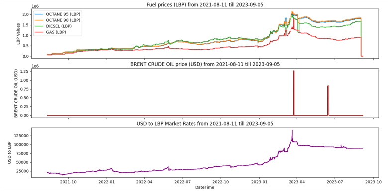
Several issues exist in the visualized data:
- The first two subplots are almost empty and do not show any data.
- The second subplot y-axis values are irrelevant.
Handling Missing Values
The Reason Behind the Missing Values
Visualizing the information in the dataset, we can see that the first two subplots are almost blank, with the exception of some vague data points. For this reason, we need to trace the reasons behind data missing and try to fill such gaps.
Missing values arise simply because each category identified earlier exists as a discrete entity and comes from various sources:
- Lebanese Fuel Prices: The Lebanese government
- Brent Crude Oil: International values
- Lebanese Lira Market Rate: Lira-rate website itself
Consequently, it is likely that rows will only include the Lira market rate while others remain empty when there is significant variation in their figures.
Treatment of These Values
Normally, at least between two data points, fuel prices, Brent crude oil price, and the Lira market rate do not change much; thus, it is advisable to use the LOCF (Last Observation Carried Forward) method to fill gaps.
One thing I like about the Pandas library is that you can do this in one line of code. After reading the CSV file into a Pandas DataFrame, we should use the fillna() method immediately.
data1.fillna(method='ffill', inplace=True)
Now, execute the updated Python script.
After executing the script, we can note that the second subplot remains the main issue in our visualized data. All values are mostly zeros except two peaks.
Supported Methods to Fill the Gaps
Before starting the next section, it is good to have a brief overview of the popular method that handles missing values in Pandas. The pandas.DataFrame.fillna() function in Pandas supports several methods for filling or imputing missing values in a DataFrame. These methods are specified using the method parameter. Here are some of the commonly used methods:
- Forward Fill (ffill): This method fills missing values with the previous non-null value in the column. It propagates the last valid observation forward.
df.fillna(method='ffill')
- Backward Fill (bfill): This method fills missing values with the next non-null value in the column. It propagates the next valid observation backward.
df.fillna(method='bfill')
- Fill with a Specific Value: You can specify a constant value to fill missing values using the value parameter.
df.fillna(value=0)
- Interpolation: You can use interpolation methods like linear, quadratic, etc., to fill in missing values based on the values of neighboring points. The method parameter can be set to various interpolation methods like 'linear', 'quadratic', etc.
df.interpolate(method='linear')
- Limit the Number of Consecutive NaNs Filled: You can limit the number of consecutive missing values filled using the limit parameter.
df.fillna(method='ffill', limit=2)
- Fill with Mean, Median: You can fill missing values with summary statistics of the column, such as the mean and median, using methods like mean() and median().
df.fillna(df.mean())
df.fillna(df.median())
Outliers
Identifying Outliers and Noisy Data
After handling missing values, the first chart looks way clearer than before; still, perceiving the data variation within the second chart is hard. Mostly, all values are plotted near the zero values, while two peaks are at the end of the graph.
This situation requires more investigation to check whether these values are accurate or if some outliers and noisy data are causing this issue.
The basic method to check if our data series contains outliers is by extracting summaries: min, max, mean, and median.
For this reason, we will add the following lines of code after filling in the missing values.
print('Minimum value: '  + str(data1['BRENT CRUDE OIL (USD)'].min()))
print('Maximum value: '  + str(data1['BRENT CRUDE OIL (USD)'].max()))
print('Mean value: '  + str(data1['BRENT CRUDE OIL (USD)'].mean()))
print('Median value: '  + str(data1['BRENT CRUDE OIL (USD)'].median()))
Now, execute the script and interpret these summaries.
From the printed values, we can conclude that our data contains some outliers affecting the data chart.
Minimum value: 68.75
Maximum value: 1263000.0
Mean value: 4232.46343587971
Median value: 85.72
The maximum value is erroneous as it is inconsistent with the Brent crude oil price of 1263000 USD. Also, the wide difference between the Mean and Median indicates that extreme values may exist.
Replacing Noisy Data
In this tutorial, we will use IQR () to detect and replace outliers.
First, we need to calculate the 25% and 75% quantiles to calculate IQR.
Q1 = data1['BRENT CRUDE OIL (USD)'].quantile(0.25)
Q3 = data1['BRENT CRUDE OIL (USD)'].quantile(0.75)
IQR = Q3 - Q1
Then, we define a threshold for extreme outliers.
threshold = 1.5 * IQR
Next, we identify extreme outliers.
outliers = (data1['BRENT CRUDE OIL (USD)'] < (Q1 - threshold)) | (data1['BRENT CRUDE OIL (USD)'] > (Q3 + threshold))
Finally, we replace extreme outliers with the average of the previous and next observations.
for i in range(1, len(data1) - 1):
    if outliers[i]:
        data1.loc[i, 'BRENT CRUDE OIL (USD)'] = (data1.loc[i - 1, 'BRENT CRUDE OIL (USD)'] + data1.loc[i + 1, 'BRENT CRUDE OIL (USD)']) / 2
After adding these lines of code before the forward fill operation, let's try to execute the Python script.
The second subplot is now visualized correctly. Still, there is an issue in the first subplot, where the last values suddenly decrease to near zero, which requires more investigation.
Handling Numerical Precision Issues
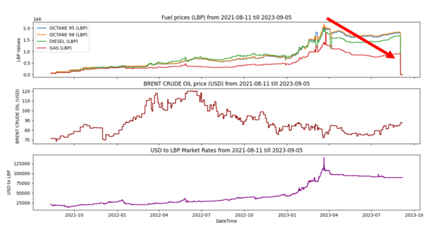
The last data appearing in our visualization is the tail or the line charts plotted in the first subplot, where suddenly all values decrease to a very low value. This strange behavior requires some investigation.
To get more details, we need to use the DataFrame.tail() method to retrieve the last entries in our data. Let's check the last 25 rows by adding the following line of code right after the fillna() method.
print(data1.tail(25))
Now, execute your Python script. Note: There is a precision issue in the last values as they need to be multiplied by 1000 to present the actual prices in Lebanese Pounds.
Detecting Precision Issues
To detect and fix precision issues in your dataset where certain columns need to be multiplied by 1000 to match the other values, you can follow these steps using Python and the Pandas library:
- Detect Precision Issues: You can identify precision issues by checking if the values in the columns that need to be multiplied by 1000 are significantly smaller than those in other columns. A common approach is to check if the values are smaller than a certain threshold, which indicates that they are likely in a different unit of measurement. For example, if you expect the values in those columns to be in the thousands, you can set a threshold like 100 to detect the precision issue.
- Fix Precision Issues: Once you've identified the rows with precision issues, multiply the values in the affected columns by 1000 to correct them.
Let's try to add the following lines of code:
threshold = 10000
# Identify rows with precision issues
precision_issues = data1[(data1['OCTANE 95 (LBP)'] < threshold) & (data1['OCTANE 98 (LBP)'] < threshold) & (data1['DIESEL (LBP)'] < threshold) & (data1['GAS (LBP)'] < threshold)]
# Multiply values in the affected columns by 1000 to correct precision
affected_columns = ['OCTANE 95 (LBP)','OCTANE 98 (LBP)','DIESEL (LBP)','GAS (LBP)']
data1.loc[precision_issues.index, affected_columns] *= 1000
Now, execute the Python script.
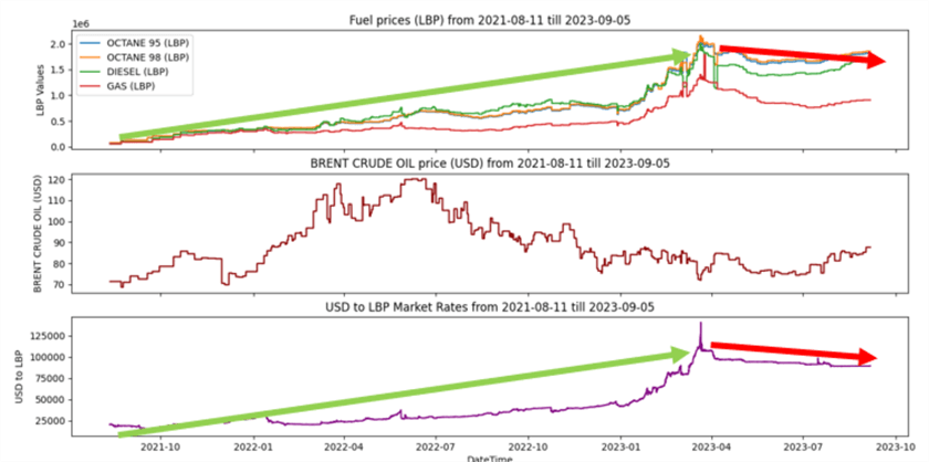
Congratulations! There is no main issue remaining in our plot. We can conclude the correlation between the fuel prices and the Lebanese Lira market rate as the line trends look very similar. The correlation with the crude oil price needs more statistical investigation and cannot be concluded from the visual perception.
Next Steps
- You can learn more about visualizing time-series data using Matplotlib in the following tip: Visualize Application Log Data with Python Matplotlib Charts


About the author
 Hadi Fadlallah is an SQL Server professional with more than 10 years of experience. His main expertise is in data integration. He's one of the top ETL and SQL Server Integration Services contributors at Stackoverflow.com. He holds a Ph.D. in data science focusing on context-aware big data quality and two master's degrees in computer science and business computing.
 This author pledges the content of this article is based on professional experience and not AI generated.
View all my tips
Article Last Updated: 2024-05-08