By: Hadi Fadlallah | Updated: 2024-11-06 | Comments | Related: > Power BI
Problem
In a previous tip, we provided a data profiling script for SQL Server to collect information. The script was intended to collect information about the structure and data in a specific database. Still, the large number of columns in the result table made it harder to investigate and analyze the output.
Solution
In this tip, we will briefly talk about the importance of data profiling and data quality monitoring. Then, we will provide a step-by-step guide to create a Power BI dashboard in order to visualize the output of our previously provided script when executed over the Stack Overflow 2010 database.
Why reading this tip is important?
Universal data quality issues, such as missing data, duplicate records, inconsistent formats, inaccuracies, outliers, poor completeness, redundancy, and lack of data integrity, can significantly impact the reliability of data-driven decisions and processes. It encompasses manual data entry incidents, data integration issues, and even erudition, making the problem of harassment of correct and consistent databases.
Data profiling is a powerful technique for tackling such problems. It assists in locating and rectifying these inaccurate, contradictory, and unattainable data points at an early stage in the life of the data. It entails the examination of data histories/output, searching for the presence of data outliers, grasping what values were held in view, and uncovering concealed associations among different components of data. This helps in achieving some level of data cleansing and standardization, closing performance gaps due to fragmentation of data across systems, and adherence to data governance standards within the organization.
Executing the Script
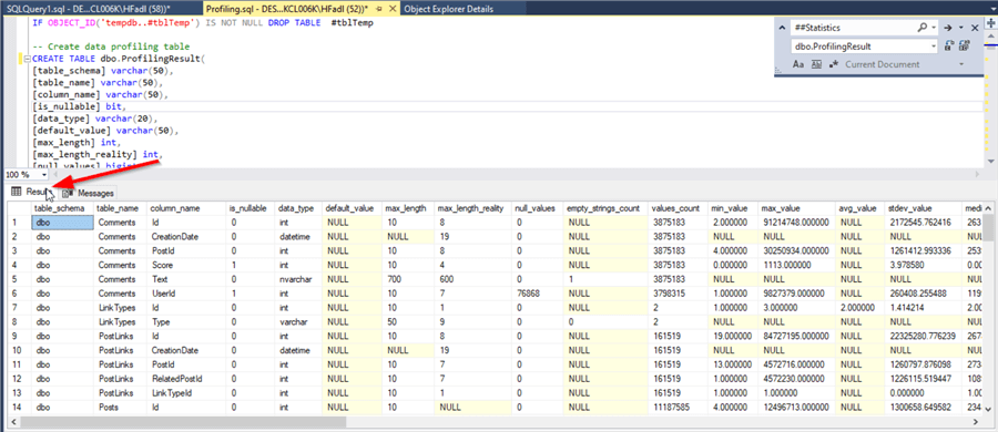
In the previous tip, the provided script stores the result in a temporary table called ##Statistics. In this tutorial, since we aimed to visualize the data using Power BI, we edited the script and stored the output within a table called dbo.ProfilingResult.
An Important Note
I received several comments on the profiling script that mentioned it throws several data type errors and warnings. This occurs when columns with unmeasurable types exist (i.e. varbinary).
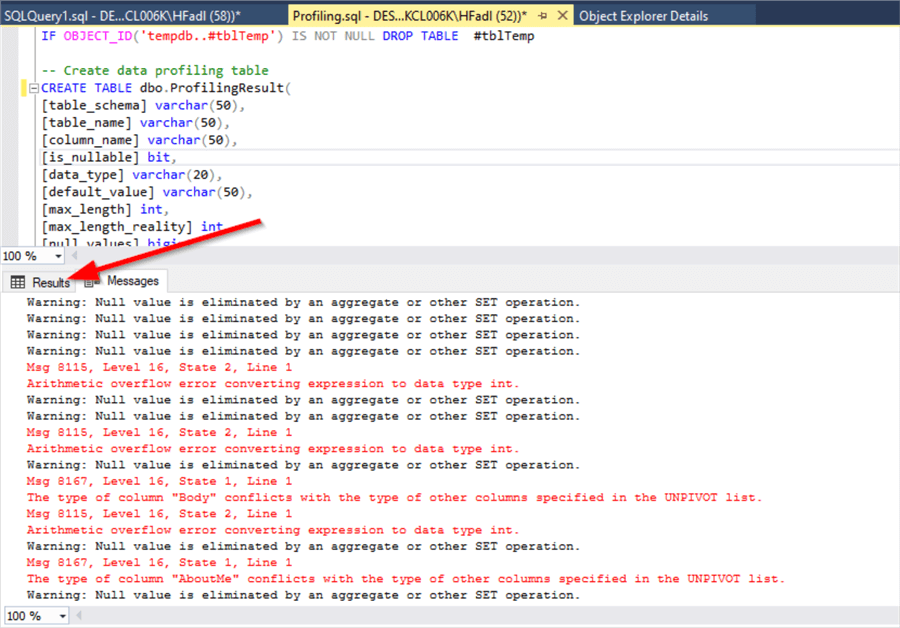
It is ok to ignore those errors and check the results tab.
Connecting to the Data Source
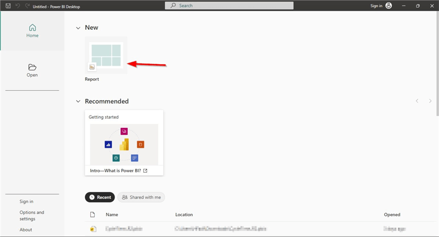
Now, let's open Power BI Desktop and create a new blank report.
In the top menu bar, in the "Data group", click SQL Server.

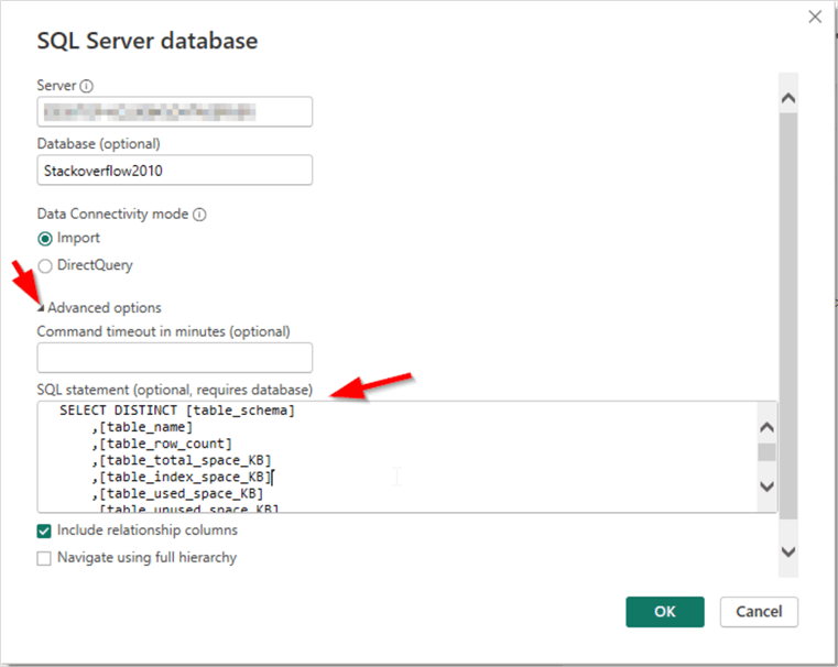
The SQL Server connection configuration dialog will appear. Fill in the Server and Database names. (In our tutorial, the database name is "StackOverflow2010".) Keep the Data Connectivity mode to "Import", expand the Advanced Options, and use the following code to fill in the SQL statement before clicking OK:
SELECT DISTINCT [table_schema]
      ,[table_name]
      ,[table_row_count]
      ,[table_total_space_KB]
      ,[table_index_space_KB]
      ,[table_used_space_KB]
      ,[table_unused_space_KB]
      ,[table_space_warning]
      ,[table_indexes_count]
      ,[table_has_primary]
      ,[table_has_clustered_index]
      ,[table_partitions_count]
FROM [StackOverflow2010].[dbo].[ProfilingResult]
Next, in the Data Preview dialog, check the "Load" button. Now, the first table data is imported to the Power BI Desktop project file.
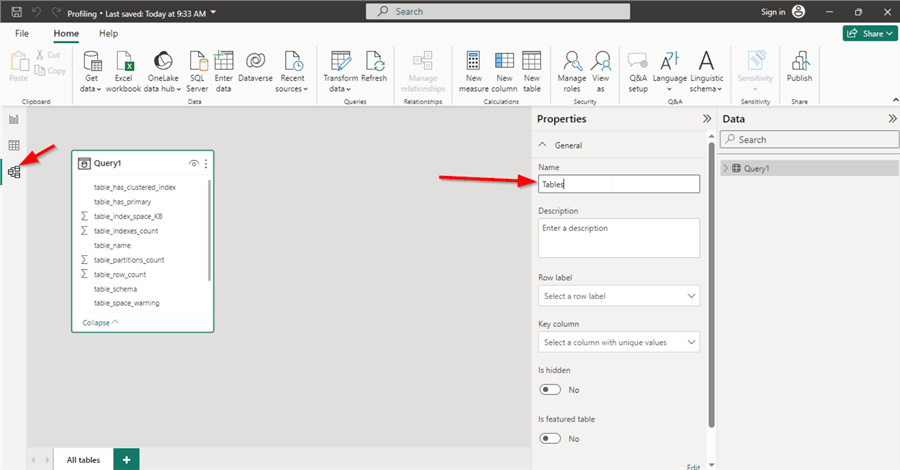
Now, go to the Data Model View, click on the "Query1" table and change the name to "Tables", as shown below.
Repeat the previous steps with the following query:
SELECT [table_schema]
    ,[table_name]
    ,[column_name]
    ,[is_nullable]
    ,[data_type]
    ,[default_value]
    ,[max_length]
    ,[max_length_reality]
    ,[null_values]
    ,[empty_strings_count]
    ,[values_count]
    ,[min_value]
    ,[max_value]
    ,[avg_value]
    ,[stdev_value]
    ,[median_value]
    ,[date_before_1902]
    ,[date_after_current]
    ,[date_type_warning]
    ,[time_type_warning]
    ,[length_warning]
    ,[column_is_primary]
    ,[column_has_constraints]
    ,[column_is_foreign]
    ,[column_is_indexed]
    ,[column_is_identity]
    ,[column_is_partitioned]
    ,[table_row_count]
FROM [StackOverflow2010].[dbo].[ProfilingResult]
And change the imported table name to "Columns".
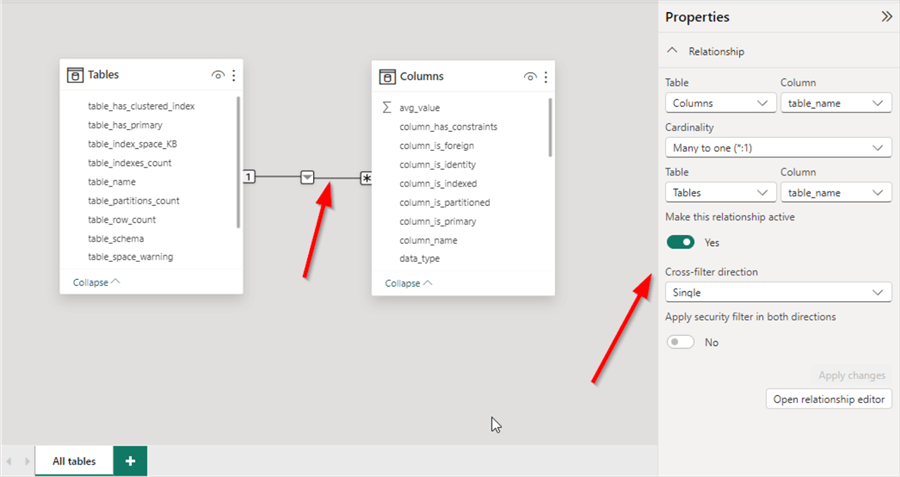
After importing the "Columns" table, we will notice that the Power BI data model automatically created a one-to-many relationship using the "table_name" column that exists in both tables. Since only the "dbo" schema exists in the StackOverflow2010 database, we can keep this relationship. Otherwise, we need to create a computed column that concatenates the schema and table names and use it to create the relationship to avoid redundancy.
In the data model view, let's add two new columns to "Tables" with the following formulas:
ClusteredIndexWarning = IF([table_has_clustered_index] = FALSE, 1, 0)
PrimaryKeyWarning = IF([table_has_primary] = FALSE, 1, 0)
PhysicalSpaceWarning = IF([PhysicalSpaceWarning] = True, 1, 0)
Moreover, we need to add the following columns to the "Columns" table:
NullValuesCount = [empty_strings_count] + [null_values]
DateTypeWarning = IF([date_type_warning] = TRUE, 1, 0)
TimeTypeWarning = IF([time_type_warning] = TRUE, 1, 0)
LengthWarning = IF([length_warning] = TRUE, 1, 0)
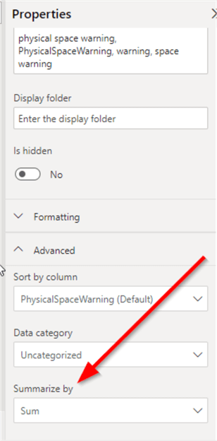
For all those columns, make sure that the summarization mode is set to "Sum".
Building the Dashboard
Before starting, let's think about what information we need to visualize and what is the most important. Let's categorize the script information as follows:
- Identifier: Table Schema, Table name, column name.
- Basic column information: Data type, is nullable, max length.
- Column facts: Real max length, null values count, empty string count, values count.
- Column summaries: Minimum value, maximum value, average, median, standard deviation.
- Column warnings: Invalid date values? Data type possible mismatch? Null values ratio?
- Table warnings: Has primary key? Has clustered index?
- Table information: Indexes count, used space.
In this tip, we will create a one-page dashboard that emphasizes the warnings information on the table level.
Let's start by adding several computed columns to count the number of tables without a clustered index, a primary key, high null ratio columns, and possible data type mismatches.

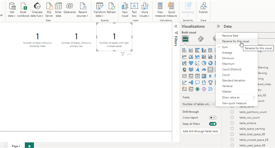
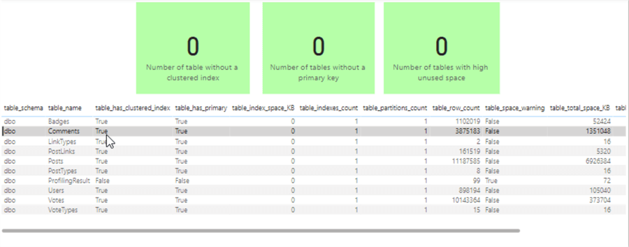
We will add some cards to visualize the table level warnings (Clustered Index, Primary Key and Physical Space).
For each card, we need to rename the field name to a meaningful statement. For instance, we need to change "Sum of ClusteredIndexWarning" to "Number of tables without a clustered index".
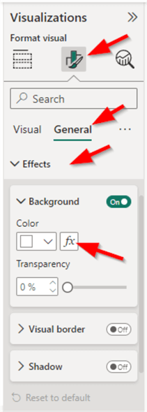
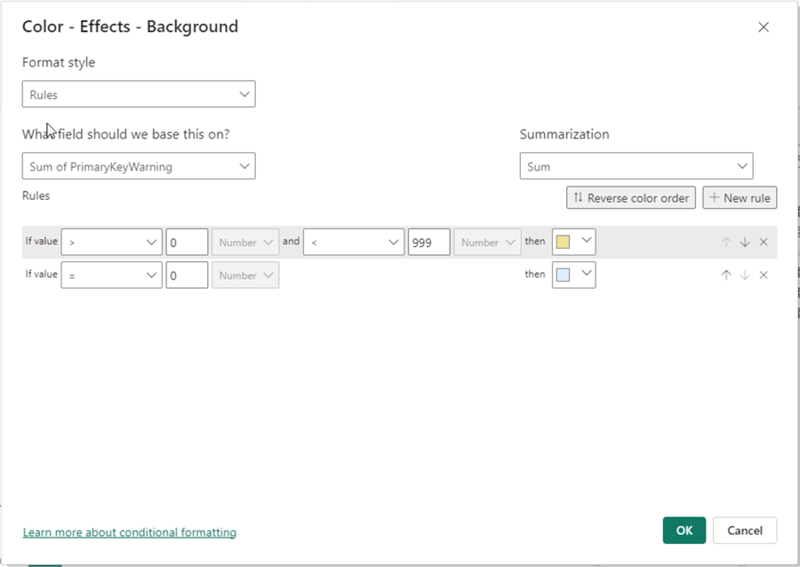
Next, we should add a conditional formatting for each card i.e., if the values are "zero", the card background should be colored with light green. Else, a light yellow background should be used.
To apply conditional formatting, select each card, go to the Format visual pane > General > Effects > Background, and click Fx near the color configuration.
Next, configure the conditional formatting as shown below. Click OK.
Below the three cards, we will add a grid visual showing the "Tables" columns.
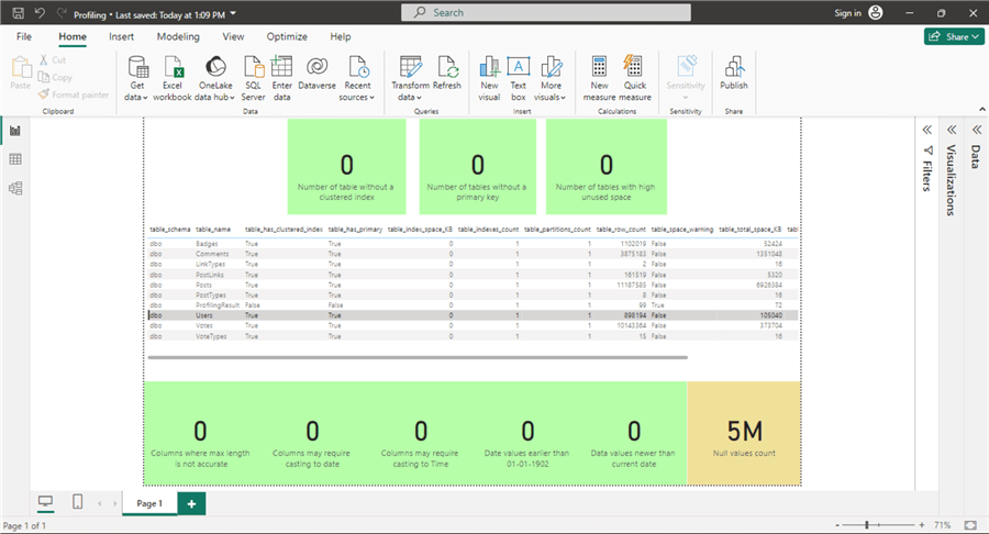
The final step in our single page dashboard is to add six cards below the grid visual to show the following facts:
- The number of columns with inaccurate "Max length" property
- The number of columns where the data type may need to be changed to date
- The number of columns where the data type may need to be changed to time
- The number of date values earlier than 01-01-1902
- The number of date values newer than the current date
- The number of null values.
As we did before, we need to apply conditional formatting for all six cards.
Summary
This tip shows how to simply visualize the result of the data profiling script that we previously provided. The focus was mainly on visualizing the warnings on the table level without delving into each columns' warnings and information.
Next Steps
- The reader should add another page to the report that allows the user to read the columns details of each table.
- Try to use more complex visualizations to enhance the dashboard.
Learn more about Power BI in this 3 hour training course.
About the author
 Hadi Fadlallah is an SQL Server professional with more than 10 years of experience. His main expertise is in data integration. He's one of the top ETL and SQL Server Integration Services contributors at Stackoverflow.com. He holds a Ph.D. in data science focusing on context-aware big data quality and two master's degrees in computer science and business computing.
 This author pledges the content of this article is based on professional experience and not AI generated.
View all my tips
Article Last Updated: 2024-11-06


