By: Hristo Hristov | Updated: 2024-11-18 | Comments | Related: > Power BI
Problem
At times when using Power BI, you want to combine your data to produce an aggregated value. The aggregation is performed over some criteria – frequently this may be time (year, month, date) or a categorical value. Some popular aggregation functions to apply can be Sum, Average, Maximum, Minimum, or Count. Typically, Power BI applies certain aggregations by default when adding data fields to visualizations. What if you wanted to create your own data aggregations? To achieve better understanding of the underlying data, how can you attain fine-grained control over the aggregations?
Solution
Considering we do not have pre-aggregated data as part of the source data model or Power BI Semantic Model, one powerful way to make our own aggregations is by using data analysis expressions (DAX). DAX aggregation functions allow us to produce expressions that represent data insights specific to our needs.
Report Set-up
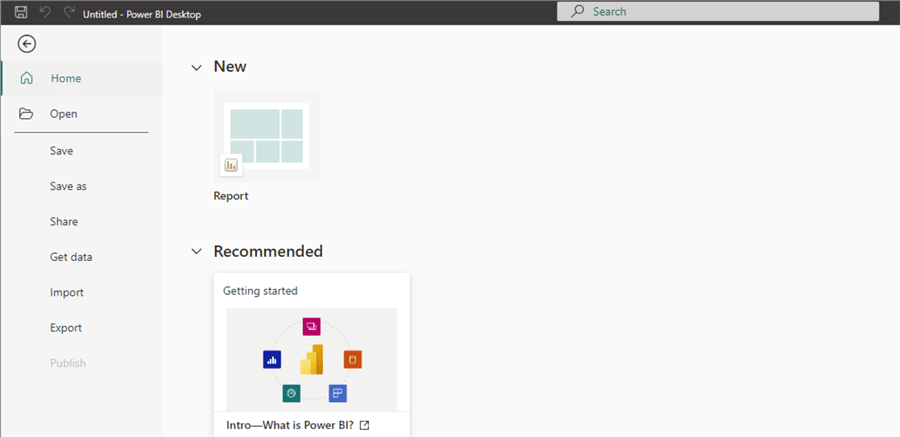
Let us start by importing our sample data. From the Power BI Desktop start-up screen, click Report.
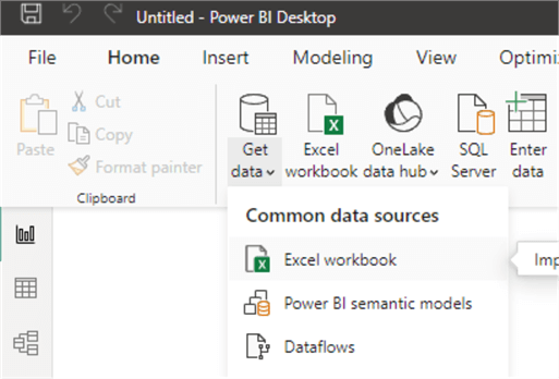
Next, click Get data > Excel workbook.
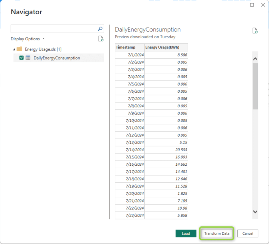
For this article, I will be using electrical energy consumption data recorded every day for a three-month period. I have downloaded the data from a smart home device already:

From the Power BI Desktop Data Navigator, select the single sheet contained in the file and click Transform Data.
This action will open the Power Query interface. There is only one thing we need to do here: create a custom column based on the timestamp to show only the day of the week. To do so, click Add Column, then Custom Column.
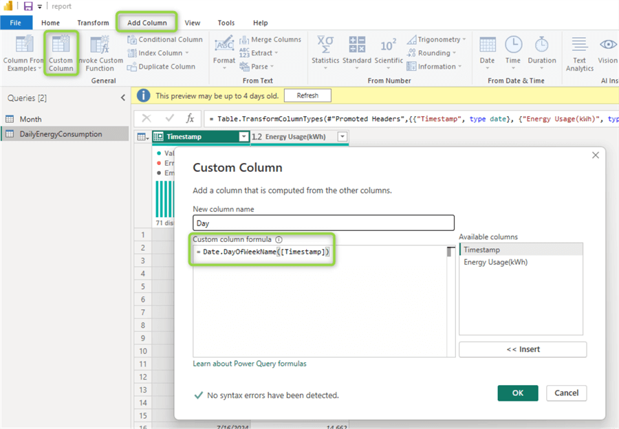
Fill in the following details:
- New column name:
Day - Custom column formula:
Date.DayOfWeekName([Timestamp])
Now click OK. This formula will create and populate a new column with the day of week only.
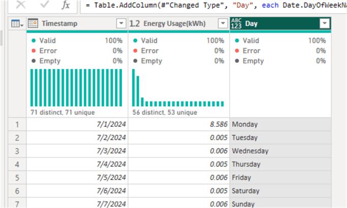
Finally, click Close & Apply at the top left-hand corner of the window to close the Power Query editor and return to the report authoring canvas.
Creating DAX Formulas
To create a custom DAX measure, click New measure from the ribbon:

This action will open the DAX formula editor:
You can expand the editor using the chevron to right and also increase or decrease the font size using Ctrl + Scroll. Use the New measure button for each of the suggested measures. Paste or type the code. Then press Enter or click the checkmark icon to the left.
Total Consumption
Let us begin with a simple aggregation measure – sum of consumption:
Total Energy Consumption (kWh) =
SUM ( 'DailyEnergyConsumption'[Energy Usage(kWh)] )

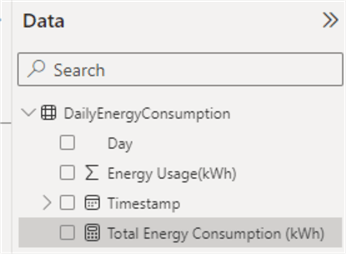
If everything is okay, a new field with a calculator icon will appear under the table name in the data pane:
What this Measure Does:
- Sums up all the values from the Energy Usage column across all rows.
How to Use:
- Directly in charts without further configuration. (Later, we will see this and other measures in action.)
Running Total
Next, let us expand by creating a measure that can provide insight into the running total of the consumption.
Running Total (kWh) =
CALCULATE(
    SUM('DailyEnergyConsumption'[Energy Usage(kWh)]),
    FILTER(
        ALLSELECTED('DailyEnergyConsumption'),
        'DailyEnergyConsumption'[Timestamp] <= MAX('DailyEnergyConsumption'[Timestamp])
    )
)
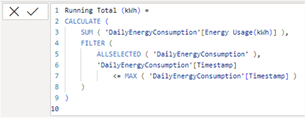
What this Measure Does:
- Identifies the latest date in the current context using
MAX(). - Applying FILTER creates a subset of the table using all rows, starting at the beginning through the current row’s date.
- Using CALCULATE sums up the energy usage over the filtered subset.
How to Use:
- Alongside the basic summation to show the growth over time.
Running Average
Next, let us look at another popular aggregation – the average. However, let’s calculate it over a “running” or continuously evolving context.
Cumulative Avg (kWh) =
AVERAGEX(
    FILTER(
        ALLSELECTED('DailyEnergyConsumption'),
        'DailyEnergyConsumption'[Timestamp] <= MAX('DailyEnergyConsumption'[Timestamp])
    ),
    [Energy Usage(kWh)]
)
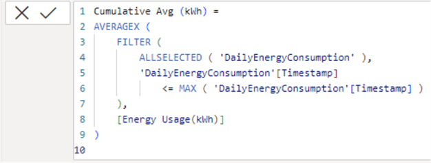
What this Measure Does:
- Identifies
the latest date in the current context using
MAX(). - Applying FILTER creates a subset of the table using all rows, starting at the beginning through the current row’s date.
- Using AVERAGEX sums up the energy usage over the filtered subset.
How to Use:
- Alongside the basic summation to show the consumption trend over time.
Unlike the previous measure for running total, here we do not use
CALCULATE. Instead, we use
the AVERAGEX variant of
the AVERAGE function.
AVERAGEX is designed to
support filtering directly. While we could rewrite the measure with
CALCULATE and
AVERAGE just like the previous
one, AVERAGEX is deemed
more performant and makes it clear we iterate over each row of the subset.
Having already the total consumption, running total, and running average calculated, we can build an overview of our energy consumption per day.
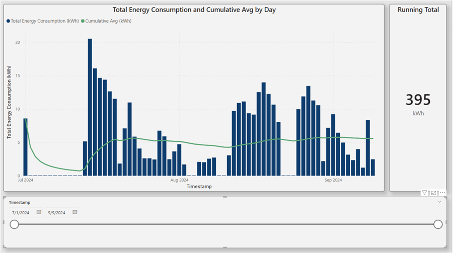
The columns in the column chart and line chart use the total energy consumption, while the green line uses the cumulative (running) average calculated. This plot provides a helpful overview of daily energy usage. The running average line helps put things into perspective. Typically, these running averages start uneven (the period until August 2024), then gradually flatten as more input data is available for the average calculation. Additionally, to the right, we have the running total as an indicator.
Maximum and Minimum
Next, let us look at the minimum and maximum. We can define the minimum and peak
energy consumption similarly to each other – using the
MIN and
MAX formulas.
Minimum Energy Usage
Min Energy Usage (kWh) =
MIN ( 'DailyEnergyConsumption'[Energy Usage(kWh)] )

Peak Energy Usage
Peak Energy Usage (kWh) =
MAX ( 'DailyEnergyConsumption'[Energy Usage(kWh)] )

What These Measures Do:
- Return the minimum and maximum value for energy usage, respectively.
How to Use:
- For example, in a gauge visual to compare to the average.
Days with High and Low Energy Usage
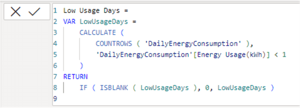
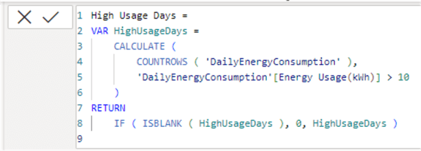
Now, how about counting? By combining COUNTROWS with a simple filter according to a condition, we can get a calculated overview of the days with low (less than 1 kWh) and high (over 10 kWh) energy usage.
Low Energy Usage
Low Usage Days =
VAR LowUsageDays =
    CALCULATE (
        COUNTROWS ( 'DailyEnergyConsumption' ),
        'DailyEnergyConsumption'[Energy Usage(kWh)] < 1
    )
RETURN
    IF ( ISBLANK ( LowUsageDays ), 0, LowUsageDays )
High Energy Usage
High Usage Days =
VAR HighUsageDays =
    CALCULATE (
        COUNTROWS ( 'DailyEnergyConsumption' ),
        'DailyEnergyConsumption'[Energy Usage(kWh)] > 10
    )
RETURN
    IF ( ISBLANK ( HighUsageDays ), 0, HighUsageDays )
What These Measures Do:
- Return the count of rows that corresponds to the count of days with low energy usage (less than 1kWh) and high energy usage (greater than 10 kWh).
- An important detail is that if there are no matching rows, the measure will
return
Blank. To account for these cases, we wrap the result of the expression in anISBLANK()check and return zero if there are no matching rows, i.e., days.
How to Use:
- For example, in a card visual to provide further insight into the data.
Day-over-Day (DoD) Change
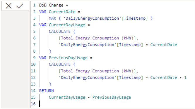
Next, we have a more complex measure that will shape the data appropriately for a waterfall chart. In such a chart, we can examine the day-over-day (DoD) change. Thus, we can spot certain trends – for example, the days our consumption tends to increase.
DoD Change =
VAR CurrentDate =
    MAX ( 'DailyEnergyConsumption'[Timestamp] )
VAR CurrentDayUsage =
    CALCULATE (
        [Total Energy Consumption (kWh)],
        'DailyEnergyConsumption'[Timestamp] = CurrentDate
    )
VAR PreviousDayUsage =
    CALCULATE (
        [Total Energy Consumption (kWh)],
        'DailyEnergyConsumption'[Timestamp] = CurrentDate - 1
    )
RETURN
    CurrentDayUsage - PreviousDayUsage
What this Measure Does (line by line):
- 2: Define a variable holding the latest date in the dataset.
-
4 – 8: Define a variable for the current day usage
CurrentDayUsage: usingCALCULATE, reuses the previously defined measure for Total Energy Consumption where the timestamp is today. - 9 – 13: Define
a variable for the previous day usage
PreviiousDayUsage: similarly, by reusing the sum and filtering, we get a value for the previous day. - 14: Finally returns the difference between the current and previous days.
Now we can add a new page to our report and see the consumption evolution on a day-over-day basis:
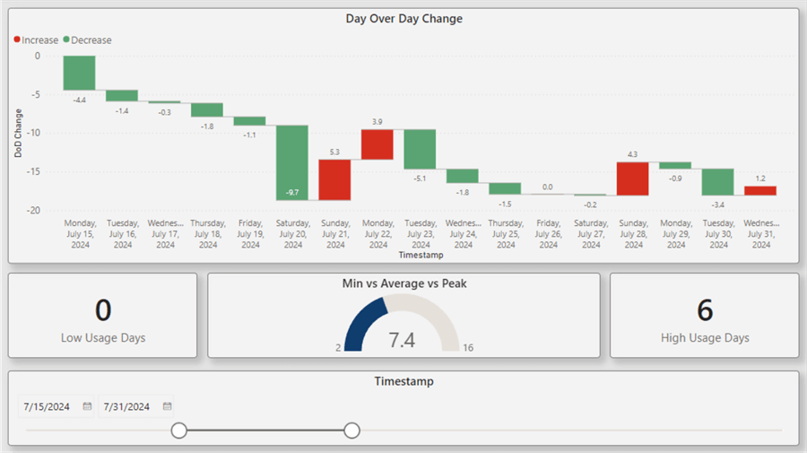
The visual at the top is the waterfall chart enabled by the DoD calculation. To the left and right, we have two card visuals showing the number of days with high and low usage. In the middle, we have used a KPI visual that shows together the minimum consumption (2 kWh), the running average (7.4 kWh) and the peak consumption (16 kWh) for the selected period (July 15 – July 31,2024).
Bonus – Summary Table
As an extra suggestion for how to approach aggregations in Power BI, here is
an example that makes multiple aggregations and places them in a single consolidated
table by the power of the single DAX formula
SUMMARIZE.
Monthly Summary By Day =
SUMMARIZE (
    'DailyEnergyConsumption',
    'DailyEnergyConsumption'[Day],
    "Total Consumption", SUM ( 'DailyEnergyConsumption'[Energy Usage(kWh)] ),
    "Average Consumption",
        AVERAGEX (
            FILTER (
                'DailyEnergyConsumption',
                'DailyEnergyConsumption'[Timestamp]
                    <= EOMONTH ( 'DailyEnergyConsumption'[Timestamp], 0 )
                    && 'DailyEnergyConsumption'[Timestamp]
                         > EOMONTH ( 'DailyEnergyConsumption'[Timestamp], -1 )
            ),
            'DailyEnergyConsumption'[Energy Usage(kWh)]
        ),
    "Peak Day Usage",
        MAXX (
            FILTER (
                'DailyEnergyConsumption',
                'DailyEnergyConsumption'[Timestamp]
                    <= EOMONTH ( 'DailyEnergyConsumption'[Timestamp], 0 )
                    && 'DailyEnergyConsumption'[Timestamp]
                        > EOMONTH ( 'DailyEnergyConsumption'[Timestamp], -1 )
            ),
            'DailyEnergyConsumption'[Energy Usage(kWh)]
        ),
    "Day Index",
        SWITCH (
            DailyEnergyConsumption[Day],
            "Monday", 0,
            "Tuesday", 1,
            "Wednesday", 2,
            "Thursday", 3,
            "Friday", 4,
            "Saturday", 5,
            "Sunday", 6
        )
)
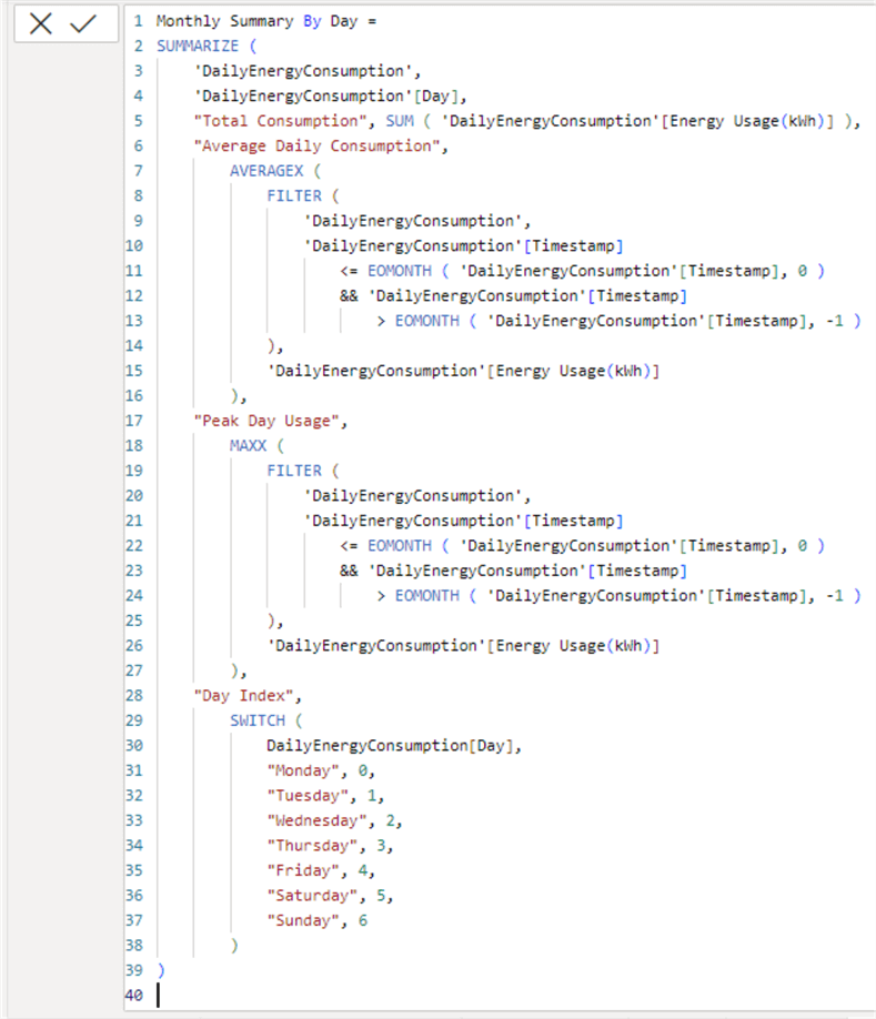
Using the SUMMARIZE function, we get a detailed overview of the average and maximum consumption for each day of the week. Here is a breakdown of the formula, line by line:
- 3: Define the table to aggregate on.
- 4: Define the column to group by. More than one column can be specified.
- 6 – 16: Define the first grouping expression.
- 6: Name of the expression, will end up as the column name.
- 7 – 16: Calculate the average energy consumption for the past month.
- 17 – 27: Following the same expression structure of name and expression, define the expression for taking the max energy consumption for each day of the week.
- 28 – 39: Add a utility column that will hold the index of the day so we can sort the days properly from Monday to Sunday by using the index.
This is what the resulting table looks like:

Now we can add an extra page to our report providing further insight and energy consumption breakdown per each day of the week:
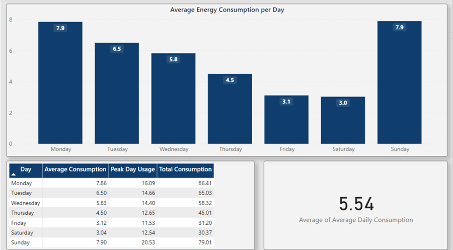
On the top, we have a simple column chart plotting the average energy consumption over each day, using the newly aggregated table. The table in the bottom left shows an overview of the daily data. Finally, on the right, we have a card where we can either use the cumulative measure defined previously or the average of the averages of daily consumption.
Conclusion
Using some powerful DAX aggregation functions, we were able to delve deeper into a dataset containing electrical energy consumption data. This simple dataset is a good example to learn the features of aggregation functions in Power BI DAX.
Next Steps
- Download files for this article
- Power BI Training for Beginners
- DATESINPERIOD
- SUMMARIZE
- EOMONTH
- Power BI Funnels and Waterfalls
Learn more about Power BI in this 3 hour training course.
About the author
 Hristo Hristov is a Data Scientist and Power Platform engineer with more than 12 years of experience. Between 2009 and 2016 he was a web engineering consultant working on projects for local and international clients. Since 2017, he has been working for Atlas Copco Airpower in Flanders, Belgium where he has tackled successfully multiple end-to-end digital transformation challenges. His focus is delivering advanced solutions in the analytics domain with predominantly Azure cloud technologies and Python. Hristo's real passion is predictive analytics and statistical analysis. He holds a masters degree in Data Science and multiple Microsoft certifications covering SQL Server, Power BI, Azure Data Factory and related technologies.
This author pledges the content of this article is based on professional experience and not AI generated.
View all my tips
Article Last Updated: 2024-11-18


