By: Rajendra Gupta | Updated: 2024-11-25 | Comments | Related: > Python
Problem
Data analysis requires analysts to handle structured, semi-structured, or unstructured data. Small datasets with few rows and columns are easy to understand. However, as the data complexity increases with many interlinked variables, getting data insights from tabular formatted data becomes challenging. According to a recent study from MIT, the human brain processes an entire image in just 13 milliseconds. Therefore, it is helpful to learn Python and visualization together.
How do we use Python to generate plots from the data to analyze patterns, correlations, and trends? What plots are available, and how do we use them with customizations? Let's explore them in this tip.
Solution
Data visualization is an essential step in the data analysis process. We can see the breakdown of the data analysis process below:
- Data Collection
- Data Processing (Cleaning)
- Exploratory Data Analysis – EDA (Visualizations, Correlations, Statistics), Data Transformation
- Model Building and Analysis
- Reporting.
Data visualization, using graphs and charts, helps us understand complex datasets and is an effective tool for quick insights like:
- Handling data relationships.
- Identify patterns, seasonality, or outliers.
Python uses popular libraries such as Matplotlib, Seaborn, Plotly, Bokeh, and Altair. In this tip, we will explore Matplotlib with various supported plots.
Matplotlib Library in Python
Python uses the Matplotlib library for data visualization. It supports line charts, bar graphs, histograms, box plots, and scatter plots. It works well with the Pandas and Numpy libraries for EDA.
If you do not have the Matplotlib library installed in your Python environment, install it with the following command:
pip install pandas matplotlib
Before using this library, we must import them using the alias below.
import matplotlib.pyplot as plt
We can now generate different types of plots using the Matplotlib library.
Line Chart
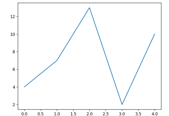
A line chart or plot shows data points over time. It connects these data points using a straight line or curve.
The following code has a numpy array with a few data points. Later, we use the plt.plot() function to draw a line chart.
import numpy as np
datapoints = np.array([4, 7, 13, 2,10])
plt.plot(datapoints)
plt.show()
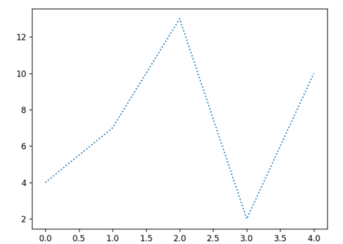
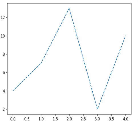
Dotted or dashed formatted line chart.
plt.plot(datapoints,linestyle='dotted')
plt.plot(datapoints,linestyle='dashed')
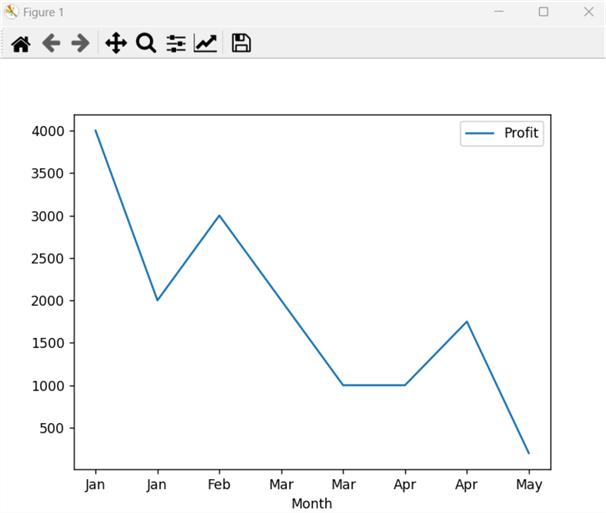
Let's use a Pandas dataframe with month and profit values. To draw a line chart using a pandas dataframe, Python has the functions below.
- df.plot():To draw a plot with given inputs. For the line chart, we give input from the x and y-axis.
- plt.show():To show the plot on the screen
The table below shows the line chart with the salesdata dataframe.
import pandas as pd
mydata = {
    'Month': [1,1,2,3,3,4,4,5],
    'Profit': [4000, 2000, 3000, 2000, 1000, 1000, 1750, 200]
}

df = pd.DataFrame(mydata)
df.plot(x='Month', y='Profit')
plt.show()
Customizations:
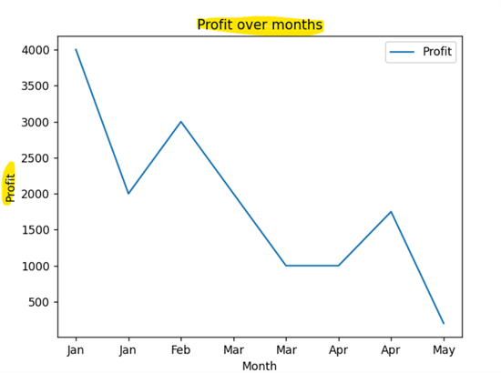
Adding y-axis and Chart Titles: By default, the line plot shows the x-axis label. As shown below, we can add the y-axis label and plot title using plt.ylabel() and plt.title().
df = pd.DataFrame(Salesdata)
df.plot(x='Month', y='Profit')
plt.ylabel('Profit')
plt.title('Profit over months')
plt.show()
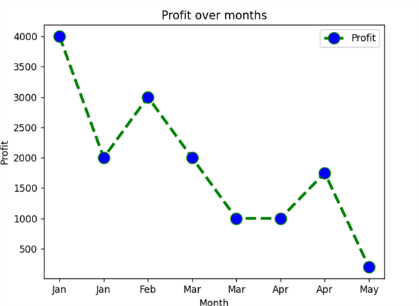
Adding Color, Linestyle and its Formatting: We can customize the line style, its color, data point marker, its color, and size while drawing the plot using df.plot() as shown below.
df.plot(x='Month', y='Profit',color='green', linestyle='dashed', linewidth = 3,marker='o', markerfacecolor='blue', markersize=12)
plt.ylabel('Profit')
plt.title('Profit over months')
plt.show()
Bar Chart
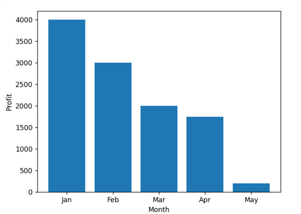
The bar chart represents data in vertical stacks or bars. The height of the bars represents the data value. We use the plt.bar() function to plot a bar chart with specified parameters as input.
This example plots Month (x-axis) and profit (y-axis) in the bar chart.
Month=  ['Jan', 'Jan', 'Feb', 'Mar', 'Mar', 'Apr', 'Apr', 'May']
Profit= [4000, 2000, 3000, 2000, 1000, 1000, 1750, 200]
plt.bar(Month,Profit)
plt.xlabel("Month")
plt.ylabel("Profit")
plt.show()
Customizations:
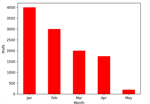
Customize bar charts such as bar color and width in the plt.bar().
plt.bar(Month, Profit, width = 0.5, color = ['red'])
plt.show()
Histogram
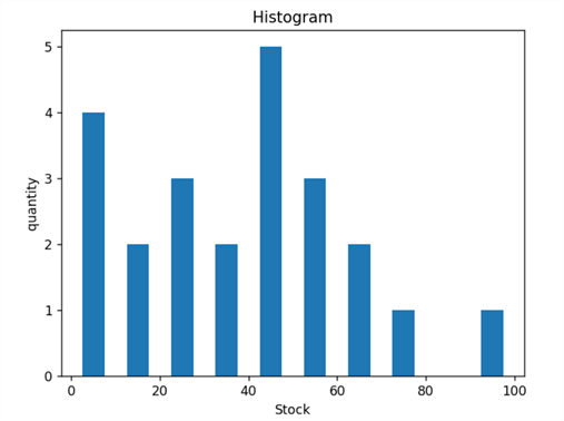
The histogram plot shows the distribution of (numerical) data as a series of bars:
- The x-axis shows the bin ranges.
- The y-axis shows the frequency.
It requires defining the range and number of bins for the histogram function plt.hist().
Stock = [1,4,5,60,30,20,45,50,45,43,40,44,
        60,7,13,50,28,90,77,32,21,10,50]
range = (0, 100)
bins = 10
plt.hist(Stock, bins, range,histtype = 'bar', rwidth = 0.5)
plt.xlabel('Stock')
plt.ylabel('quantity')
plt.title('Histogram')
plt.show()
Pie Chart
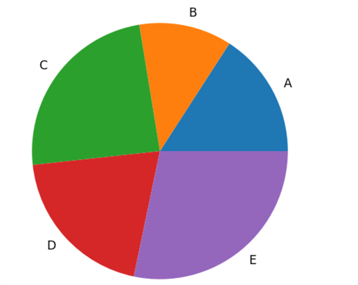
Pie charts are prevalent graphs that represent different slices in a circle. Each slice represents a fraction of the value. Pie charts make it easy to see the data set's composition and individual category contribution.
Products = ['A', 'B', 'C', 'D', 'E']
data = [23, 17, 35, 29, 41]
plt.pie(data, labels=Products)
plt.show()
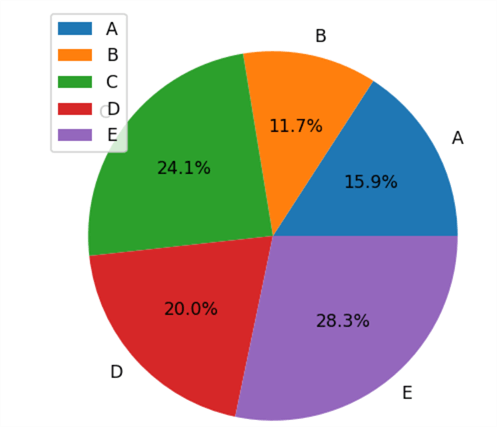
Customize the pie chart with the following:
- Autopct: To show the percentage with each category.
- Legend: To show the colour legends for each category.
plt.pie(data, labels=Products,autopct = '%1.1f%%')
plt.legend()
plt.show()
Scatter Plot
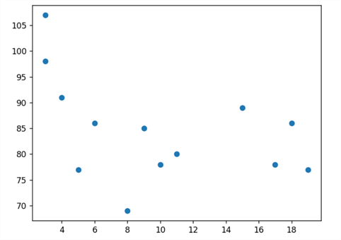
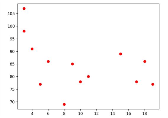
A scatter plot uses dots to represent the relationships between variables. We must use plt.scatter() in the Matplotlib library to draw a scatter plot.
The code below defines two data arrays for the x and y axis.
x =[15, 10, 5, 8, 3, 18, 3, 11,4, 17, 19, 9, 6]
y =[89, 78, 77, 69, 98, 86, 107, 80, 91, 78, 77, 85, 86]
plt.scatter(x, y)
plt.show()
Customize the color of the scatter plot dots.
plt.scatter(x, y,color='red')
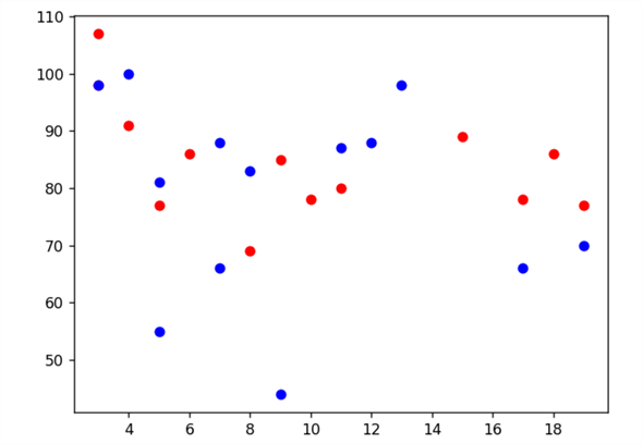
We can draw multiple data points on the same scatter chart. For example, below, we have defined two data sets with different colours, red and blue, in the same plot.
x =[15, 10, 5, 8, 3, 18, 3, 11,4, 17, 19, 9, 6]
y =[89, 78, 77, 69, 98, 86, 107, 80, 91, 78, 77, 85, 86]
plt.scatter(x, y,c ="red")

x =[13, 12, 7, 5, 9, 17, 4, 19,5, 11, 8, 7, 3]
y =[98, 88, 66, 55, 44, 66, 100, 70, 81, 87, 83, 88, 98]
plt.scatter(x, y,c ="blue")
plt.show()
Box Plot (Statistical Summary)
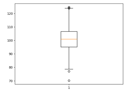
The box plot is famous for statistical analysis. It is helpful to display data with the minimum, first-quartile, median, maximum, and third-quartile values. A box represents the value from the first quartile to the third quartile.
import numpy as np
np.random.seed(10)
d = np.random.normal(100, 10, 200)
plt.boxplot(d)
plt.show()
Next Steps
- We will learn and explore more cases of Pandas dataframe use. Stay tuned for Python tutorials in the upcoming tips.
- Explore existing SQL Server Python tips on MSSQLTips.
- Check out these additional resources:
- Introduction to Treemap Charts for SQL Server Professionals
- Introduction to Python Bar Graphs and Line Graphs
- Power BI Animated Scatter and Bubble Charts
- Power BI Bubble Map, Shape Map and Filled Map Examples
- How to Create a Sunburst Chart in Power BI Desktop
- Comparing Power BI vs Tableau as Data Visualization Tools
- Power BI Dashboard vs Report vs Workbook
- Schedule analysis using Gantt chart in Power BI Desktop
- How to report Key Performance Indicators (KPIs) in SSRS Mobile Reports
About the author
 Rajendra Gupta is a Consultant DBA with 14+ years of extensive experience in database administration including large critical OLAP, OLTP, Reporting and SharePoint databases.
This author pledges the content of this article is based on professional experience and not AI generated.
View all my tips
Article Last Updated: 2024-11-25


