By: Rick Dobson | Updated: 2024-02-13 | Comments | Related: > Python
Problem
A prior tip presented and described how to use sample Python code for assessing if a dataset contained normally distributed values. The data science team I support recently requested Python code to assess if selected datasets contain lognormally distributed values. Please provide some Python code samples that I can easily adapt to satisfy the requests from the data science team.
Solution
Lognormally distributed values in a dataset imply that the natural log transformation of the dataset values is normally distributed. Normally distributed values in a dataset do not require a natural log transformation before an assessment of whether the dataset values are normally distributed. The log transformation reduces the right skew from the underlying dataset values. This, in turn, can cause the transformed values to have a normal bell-shaped distribution instead of a right-skewed distribution.
When dataset values are skewed to the right, the number of values greater than the mean is fewer than the number of values less than the mean. It is useful to understand that not all right-skewed distributions are lognormal. When dataset values are skewed to the right and the log transformation of the underlying dataset values are normally distributed, then and only then are the dataset values lognormally distributed.
As a result of these relationships, you can verify if the values in a dataset are lognormally distributed by assessing if the natural log transformation of the underlying dataset values is normally distributed. Python features include:
- Python has libraries that facilitate computing natural log transformations for dataset values and assessing if the natural log transformations are normally distributed.
- Additionally, another Python library is available to assess if the natural log values are normally distributed at a statistically significant level.
- Also, another Python library enables the generation of a lognormally distributed set of values given the mean and standard deviation of the natural log transformation values for the underlying values in a dataset.
- Finally, one more Python library facilitates charting results from these other Python libraries.
The Python code samples in this tip illustrate how to perform each of the preceding list of features for assessing if values are lognormally distributed and charting the results. The current tip draws heavily on a prior tip that demonstrates how to assess if dataset values are normally distributed.
Assessing the Distribution for a Dataset with Histogram and QQ Charts
The following Python script has two main parts:
- Processing dataset values without any transformations and
- Processing dataset values that are transformed to natural log values.
After referencing four Python libraries, the first part of the script reads a column of values from a file named spy_close_2021.csv with the read_csv function from the Pandas library. The column values are from the sample dataset values whose distribution is analyzed graphically with histogram and qq charts within this tip section. The values are deposited in a Pandas dataframe object named df before displaying the values with a Python print function.
The values in the df dataframe are charted as a histogram with the hist function of the pyplot collection of functions from the Matplotlib library. Next, the df dataframe values are displayed as a qq chart with the qqplot function.
The second part of the script begins by saving and printing the natural log of df values in a new dataframe object named df_ln.
Next, the mean and standard deviation of the log values are computed and printed. These mean and standard deviation outcomes, along with another pair of mean and standard deviation values, are referenced in this tip’s final section. The objective of this final section is to show how to generate samples of lognormally distributed values with known mean and standard deviation values.
Finally, the script displays, with the show function from the pyplot function collection, a histogram and a qq plot for the log-transformed values. These charts offer a graphical means of assessing if a set of values is normally distributed.
# Prepared by Rick Dobson for MSSQLTips.com
# import saved close values from csv file
# to Pandas dataframe in Python
import pandas as pd
import numpy as np
from matplotlib import pyplot
import statsmodels.api as sm
#for dataset values not transformed to natural log values
# import and display csv file for data from 2021 into dataframe
df = pd.read_csv('spy_close_2021.csv')
print (df)
# histogram plot
pyplot.hist(df)
pyplot.title('Close Values in a Histogram')
pyplot.show()
# qq plot
sm.qqplot(df, line='s')
pyplot.title('Close Values in a QQ plot')
pyplot.show()
#for dataset values transformed to natural log values
# convert close values in df to natural log values
df_ln = df.apply(np.log)
print (df_ln)
# compute and display the mean and the standard deviation
# of df_ln values
df_ln_mean = df_ln.mean()
df_ln_sd = df_ln.std()
print (df_ln_mean)
print (df_ln_sd)
# histogram plot
pyplot.hist(df_ln)
pyplot.title('Natural Log Transformed Close Values in a Histogram')
pyplot.show()
# qq plot
sm.qqplot(df_ln, line='s')
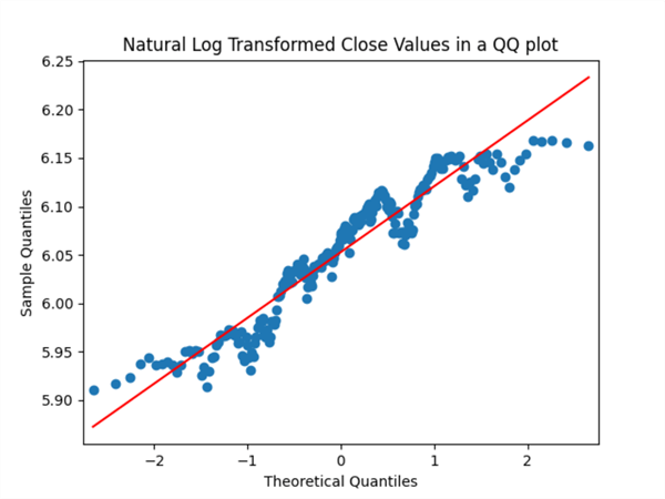
pyplot.title('Natural Log Transformed Close Values in a QQ plot')
pyplot.show()
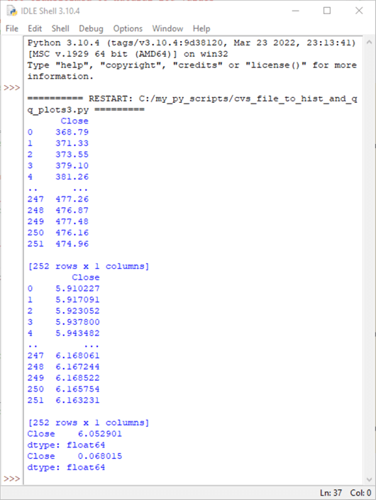
The following screenshot shows the three sets of values printed by the preceding script.
- The first and second sets of values are, respectively, from print statements for the original dataset values in df and the log-transformed dataset values in df_ln. The Python print function, by default, displays just the first and last five rows in a dataframe.
- The third set of values are, respectively, for the mean and standard deviation of the log-transformed dataset values.
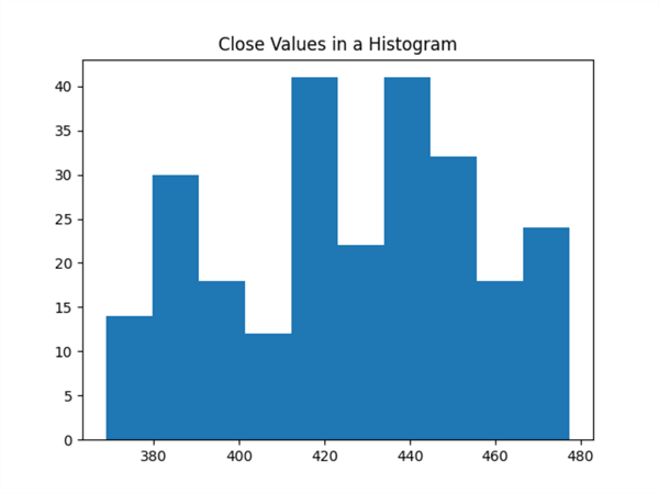
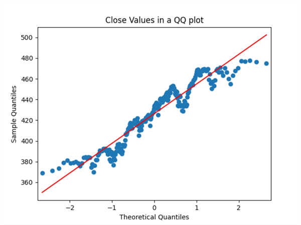
The following pair of screenshots show the histogram and qq charts for the original dataset values. Notice that the histogram shows that the original dataset values only marginally reflect a normal bell-shaped curve. Also, the points of the red diagonal line in the qq chart below the histogram reflect deviations from normality. The number of deviations from normality is numerous.
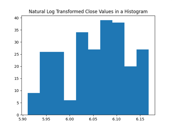
The next pair of screenshots show the histogram and qq charts for the log-transformed values. There is a slight tendency for the log-transformed values to appear more like a normal bell-shaped distribution than the untransformed values. Similarly, there is a slight tendency for the points in the qq plot to fall more closely to the red diagonal line. However, neither of the charts for the log-transformed values strongly indicate the underlying set of values are lognormally distributed. This is because:
- the histogram charts do not appear bell-shaped and
- the qq charts have many points that deviate substantially from the red diagonal line.
A Statistical Test for Assessing Whether a Distribution Is Lognormal
It is convenient to have the option of graphically assessing if the original or log-transformed dataset values are normally distributed. However, the graphical assessment of whether original or log-transformed values from a dataset are normally or lognormally distributed can be somewhat subjective.
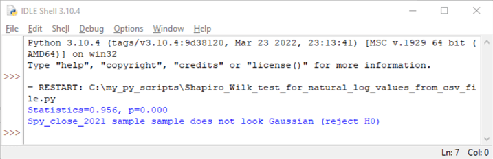
The Shapiro-Wilk test provides an objective means of assessing if a distribution of values is normally distributed or not at a specified alpha level, such as .05. When you apply this test to a set of log-transformed values in a dataset, you can determine objectively whether a sample of values are lognormally distributed.
The following script shows how to implement the Shapiro-Wilk test in Python for the values in a dataframe. The values in the df_ln dataframe depend on the values from the df dataframe, which are derived from the spy_close_2021.csv file. The values in the df_ln dataframe are log-transformed values for the original values in the spy_close_2021.csv file.
Python can implement the Shapiro-Wilk test via the Shapiro function in the scipy.stats library. The Shapiro function can take an input parameter, such as the df_ln dataframe in the following Python script. The function returns a statistic (stat) value as well as the probability (p) of the statistic being large enough to reject the null hypothesis.
- When p is greater than alpha, the dataframe values are from a normal distribution.
- Otherwise, the sample values referenced by the Shapiro function are not objectively consistent with a normal distribution.
# Prepared by Rick Dobson for MSSQLTips.com

# compute Shapiro_Wilk test based on csv file

import pandas as pd
import numpy as np
from scipy.stats import shapiro

# update statement with name of csv file
# for values to test for normality
df  = pd.read_csv('spy_close_2021.csv')

# convert close values to natural log values
df_ln = df.apply(np.log)

# normality test
stat, p = shapiro(df_ln)
print('Statistics=%.3f, p=%.3f' % (stat, p))

# interpret
alpha = 0.05
if p > alpha:
 print('Spy_close_2021 sample looks Gaussian (fail to reject H0)')
else:
 print('Spy_close_2021 sample sample does not look Gaussian (reject H0)')
The following screenshot shows the output from the preceding script.
- The returned statistic value is .956.
- The probability (p) of getting this statistic value is 0.000.
- As a result, the script displays a return value of "Spy_close_2021 does not look Gaussian (reject H0)". This means the values in the spy_close_2021.csv file are not lognormally distributed.
Generating a Lognormal Distribution from Mean and Standard Deviation Values
It may sometimes be useful to generate a lognormal distribution from a built-in Python function and then visually examine a chart of its probability density function. This approach allows you to know for certain that you are starting from a lognormal distribution. Next, you can compare the probability density function from an empirical dataset, such as the spy_close_2021.csv file, with the probability density function for a dataset generated from a built-in function for generating a lognormal distribution. This type of analysis can give you insights into how an empirical distribution fails to conform to a lognormal distribution. This section introduces fundamental techniques for implementing this kind of analysis by generating two different lognormal distributions.
- The first distribution is based on the mean and standard deviation of the natural log transformed values from the dataset in the spy_close_2021.csv file.
- The second distribution is based on the same mean value as the first distribution, but the standard deviation for the second distribution of values is six times greater than the standard deviation for the first distribution.
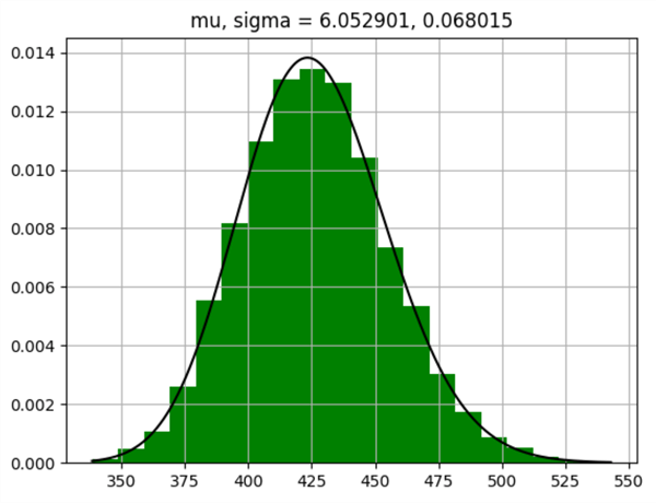
Here is a Python script for creating and displaying the values for the first distribution. Here are a few highlights to help you follow the code in the script.
- The script generates 10,000 random values to get a stable distribution of values.
- The random.lognormal function in the Numpy library can return a lognormal distribution of values based on the log transformed values of an underlying set of numbers with a mean value of mu and a standard deviation value of sigma.
- The values of mu and sigma in the following script correspond to the mean and standard deviation of the log transformed values from the spy_close_2021.csv file.
- Recall that the Matplotlib library is a graphics package for charting values, such as those returned from the random.lognormal function or an empirical distribution of values, such as those analyzed in the "Assessing the Distribution for a Dataset with Histogram and QQ Charts" section.
# Prepared by Rick Dobson for MSSQLTips.com

# generate 10000 random lognormal values from the np.random.lognormal function
# plot the lognormal function values as a line over a green bar chart

# import modules
import numpy as np
import matplotlib.pyplot as plt

# mean and standard deviation from log-transformed sample data
mu, sigma = 6.052901, 0.068015

# generate 10000 random values based on mu and sigma values
s = np.random.lognormal(mu, sigma, 10000)

# depict a bar chart of s values with 20 bins and area under the bar chart as 1
# bar chart color is green
count, bins, ignored = plt.hist(s, 20,
                                density=True,
                                color='green')

# specify x values for the bar chart as a set of evenly spaced numbers
# between min(bins) and max(bins)for values from s
x = np.linspace(min(bins),
                max(bins), 10000)

# pdf values for the lognormal distribution
pdf = (np.exp(-(np.log(x) - mu)**2 / (2 * sigma**2))
       / (x * sigma * np.sqrt(2 * np.pi)))

# black lognormal function line overlays green bar chart
#chart title indicates mu and sigma values for lognormal function line
plt.plot(x, pdf, color='black')
plt.title ('mu, sigma = 6.052901, 0.068015')
plt.grid()
plt.show()
Here is a screenshot displayed by the last line of code in the preceding script. The title of the chart reveals the mean and standard deviation of the values that are displayed in the chart. Although the mean and standard deviation of the values match those of the first empirical distribution in the "Assessing the Distribution for a Dataset with Histogram and QQ Charts" section, the values along the x axis of the two charts do not match each other. Also, the shape of the distribution in the two charts is not identical.
- The chart below is roughly bell-shaped with a relatively slight right skew. On the other hand, the first histogram in the "Assessing the Distribution for a Dataset with Histogram and QQ Charts" section is definitely not bell-shaped. This absence of normality is confirmed by the statistical analysis in the "A Statistical Test for Assessing Whether a Distribution Is Lognormal" section of this article.
- Also, the range of values along the x axis is different.
- The chart below has x axis values from around 340 to slightly less than 550.
- The first histogram chart in the "Assessing the Distribution for a Dataset with Histogram and QQ Charts" section has x axis values from around 350 through slightly less than 480.
- The larger values towards the high end of the following chart underly why it exhibits a right skew, which is not as apparent for the first histogram in the "Assessing the Distribution for a Dataset with Histogram and QQ Charts" section.
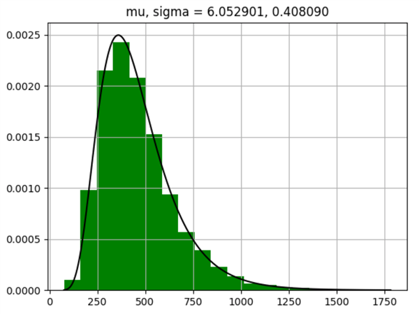
The next script generates a lognormal distribution and a probability density chart based on a standard deviation, which is six times larger than the standard deviation for the preceding script. Otherwise, the code for the preceding chart and the code for the following chart are identical.
# Prepared by Rick Dobson for MSSQLTips.com

# generate 10000 random lognormal values from the np.random.lognormal function
# plot the lognormal function values as a line over a green bar chart

# import modules
import numpy as np
import matplotlib.pyplot as plt

# mean and six-times larger standard deviation than log-transformed sample data
mu, sigma = 6.052901, 0.408090

# generate 10000 random values based on mu and sigma values
s = np.random.lognormal(mu, sigma, 10000)

# depict a bar chart of s values with 20 bins and area under the bar chart as 1
# bar chart color is green
count, bins, ignored = plt.hist(s, 20,
                                density=True,
                                color='green')

# specify x values for the bar chart as a set of evenly spaced numbers
# between min(bins) and max(bins)for values from s
x = np.linspace(min(bins),
                max(bins), 10000)

# pdf values for the lognormal distribution
pdf = (np.exp(-(np.log(x) - mu)**2 / (2 * sigma**2))
       / (x * sigma * np.sqrt(2 * np.pi)))

# black lognormal function line overlays green bar chart
#chart title indicates mu and signma values for lognormal function line
plt.plot(x, pdf, color='black')
plt.title ('mu, sigma = 6.052901, 0.408090')
plt.grid()
plt.show()
Here is the chart from the preceding script. Notice that the sigma value for the following chart is six times larger than the sigma value for the preceding chart (0.408090 versus 0.068015). One obvious consequence of this larger standard deviation value is that the right skew of the following chart is much more evident than the right skew of the preceding chart. A chart like the following one is more commonly shown than the preceding chart for lognormal distributions, but both charts illustrate lognormal distributions. This comparison of the two charts makes it obvious that the amount of right skew in a lognormal distribution is related to the size of the standard deviation in the underlying values.
Next Steps
Whenever datasets in your work environment have a long right tail, they are good candidates for analysis of lognormal distributions. Seek these datasets in your work applications to uncover cases that can benefit from analysis by lognormal distributions.
Wikipedia includes a large set of lognormal distribution use cases in its article on the lognormal distribution. Selected use cases listed in the article include
- Length of internet discussion forums
- Blood pressure for adult humans
- Surgery durations in hospital operating rooms
- Monthly and annual maximum values of daily rainfall
- Income of 97% – 99% of the population
- City populations
- Sizes of text-based emails
- Amount of network traffic per time unit


About the author
 Rick Dobson is an author and an individual trader. He is also a SQL Server professional with decades of T-SQL experience that includes authoring books, running a national seminar practice, working for businesses on finance and healthcare development projects, and serving as a regular contributor to MSSQLTips.com. He has been growing his Python skills for more than the past half decade -- especially for data visualization and ETL tasks with JSON and CSV files. His most recent professional passions include financial time series data and analyses, AI models, and statistics. He believes the proper application of these skills can help traders and investors to make more profitable decisions.
This author pledges the content of this article is based on professional experience and not AI generated.
View all my tips
Article Last Updated: 2024-02-13