By: Scott Murray | Comments (2) | Related: > Power BI
Problem
How do I add animation and movement to a Power BI Scatter or Bubble Chart?
Solution
Power BI has many neat visualizations, and one of the neatest is seeing animations in action. Scatter charts provide a great way to compare data points versus each other. A scatter chart contains two axes each containing a numeric set of values. Each plotted point on the chart is the intersection of those two values, and those plotted points are often in the form of a circle or sphere. Taking this process one step further, we can create a bubble chart which allows the ability to see the size or intensity of a 3rd set of values for each intersecting point. Both the scatter and bubble charts are successful alternatives to a normal line chart; the bubble chart certainly gives you the ability to add a third dimension to the data being viewed. As such, scatter and bubble charts often leave off a time or date dimension on either axis. However, we can easily add this fourth dimension to our bubble chart and ultimately set this the chart into motion over a period of time.
In order to work with Power BI and Power BI Desktop, you need to do a few things to get everything setup for access. First, you need to go to the Power BI web site and sign up to access Power BI. Note that you must use a work or school address to sign up for Power BI. Gmail, Yahoo, and similar accounts will not work. Next, you need to download the Power BI Desktop (PBID) tool. Once you have your account setup and your Power BI Desktop application installed, you can setup your animated bubble chart!
Scatter / Bubble Chart
The first steps to completing a scatter / bubble chart is to open Power BI Desktop; then we will need to connect to a data source which contains the data to use as our source. For this example, we are using the SQL 2016 Wide World Importers databases which were recently made available for SQL Server. These databases are available on github at: https://github.com/Microsoft/sql-server-samples/releases/tag/wide-world-importers-v1.0. Koen Verbeeck completed an excellent tip on installing theses new data sets and you can see Koen tip at: https://www.mssqltips.com/sqlservertip/4459/install-sql-server-2016-sample-database-wide-world-importers-data-warehouse.
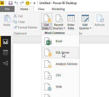
To connect to the data source, you first select Get Data from the ribbon, and then in our case SQL Server.
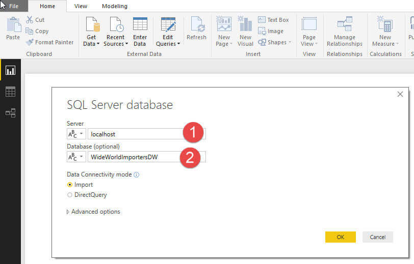
Next, we add in the Server and Database details.
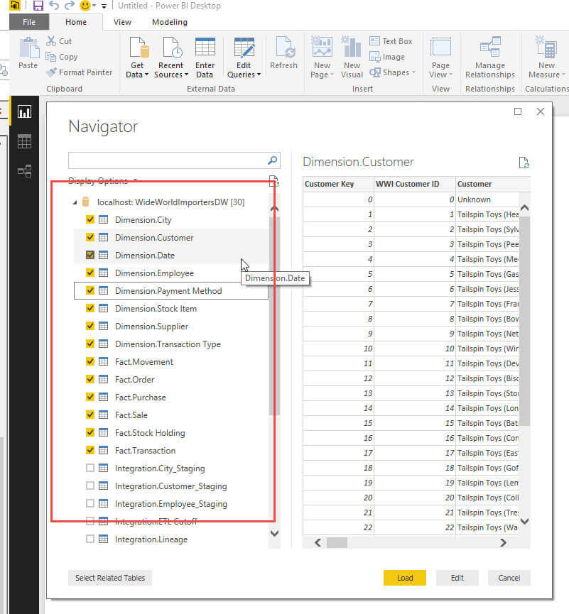
Finally, as shown below, we select all the tables needed for our report which includes all the fact and dimension tables.
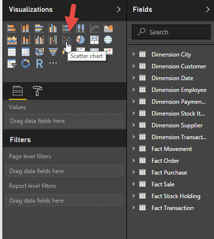
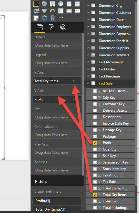
Once the data is loaded, we are returned to the main design window. From this screen, we select the Scatter Chart from the visualization list.
Subsequently, we now will begin to add our X and Y axes values.
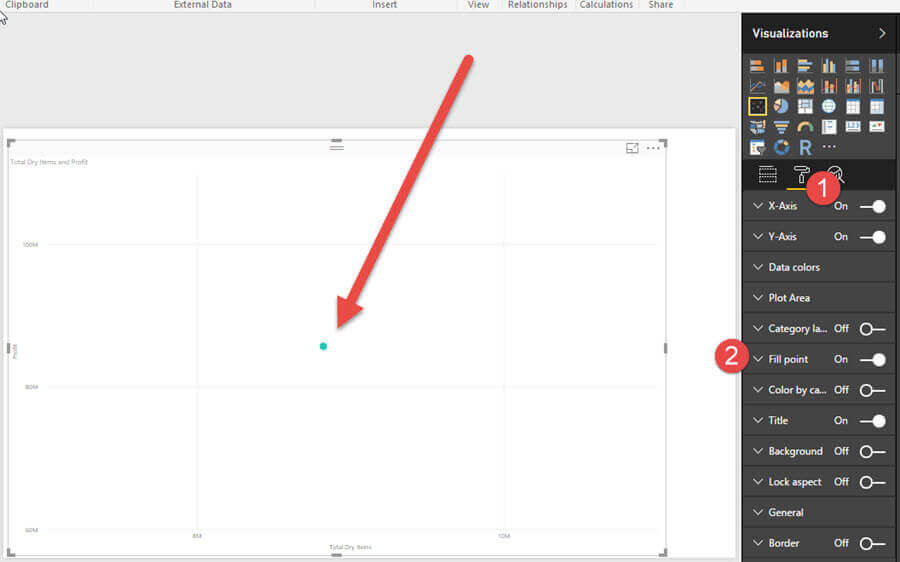
In the below screen print, you will notice a few items. First, the chart just shows a single data point; that item will be fixed momentarily. Second, the data point circle is actually filled in; this fill color was achieved by moving to the format properties tab (paint roller button), and adjusting the fill point property to on. This change makes the circle much easier to identify. This fill will also make seeing all the different color circles much easier to see.
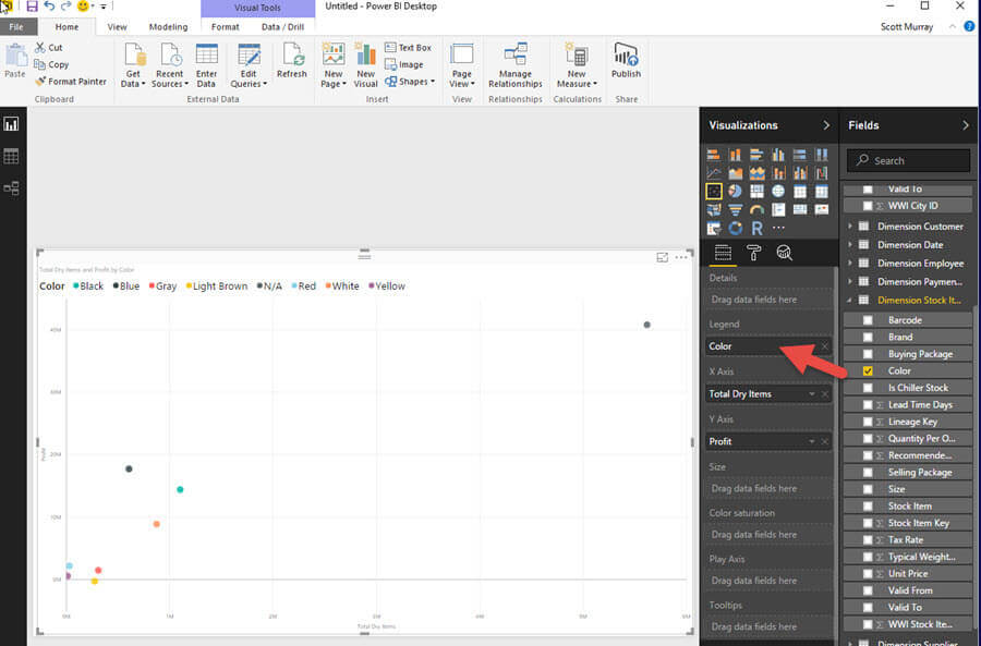
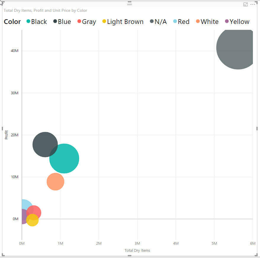
Jumping back to the Fields tab, open the Dimension Stock Item table, and then add the Color to the Legend property. Notice, now we have multiple dots representing the intersection of the Profit, the Total Dry Items, and the Color.
Finally, we want to associate the size of the dot with the Unit Price of the product.
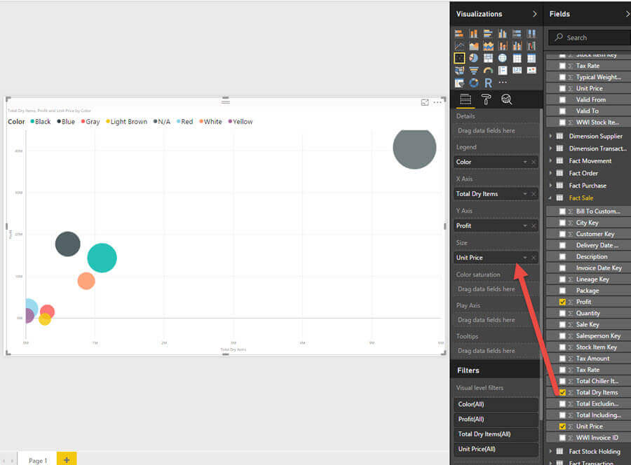
Reviewing the below chart, you can quickly see the profit and total number of dry goods versus the unit price, all per each product color.
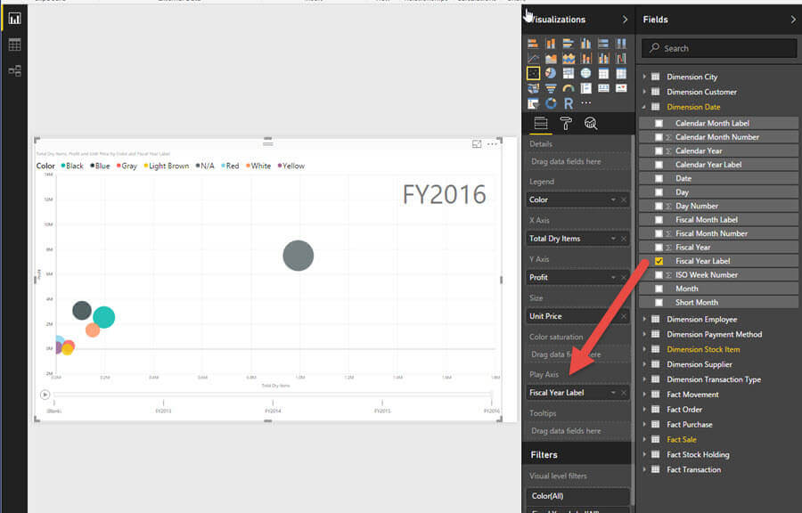
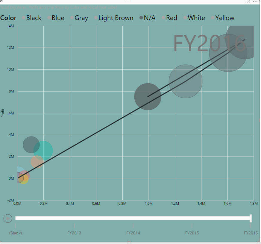
I find this chart very appealing to convey patterns, but we can add one more dimension to assist with spotting the pattern and trends, and that new dimension is time. This fourth dimension is called the Play Axis, and this area allows for us to add a moving or animated progression of the values from one time to the next. For this example, we added Fiscal Year Label the Play axis.
I adjusted the background color of our chart to allow us to see several key points about the play axis. You will notice we now have a slider scroll bar and a play button at the bottom of our chart and a time label at the top of the chart.
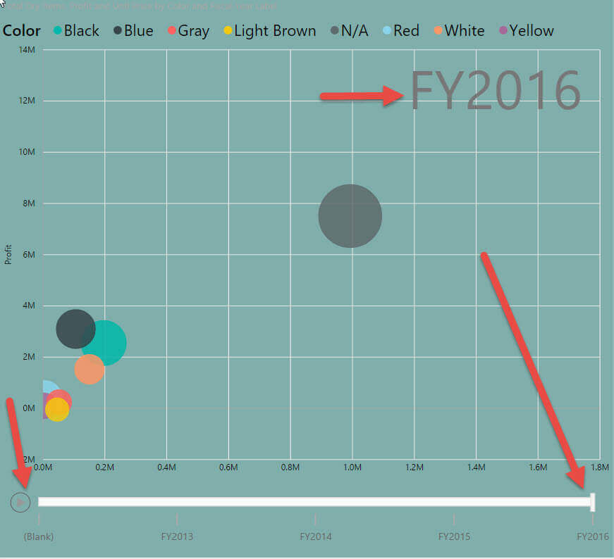
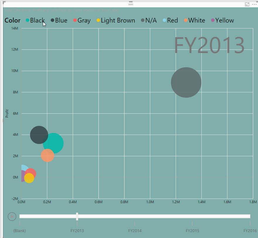
Using the slider and scroll bar, we can adjust what Fiscal Year data shows on the chart. Furthermore, pressing the play button brings the chart alive by moving and resizing each circle to show the progression ( or regression ) from year to year. Of course, we cannot show you the movement here, but you can try it out for yourself.
Finally, by clicking on one of the circles, we can show a linear trend line to display how the circle moves and resizes from year to year!
Conclusion
This tip provides a first-hand perspective on using the full 4 dimensional chart view that can be achieved by using a bubble chart. This chart provides a way to show the intersection of two numeric values while layering on a category segment and size base perspective of two additional data items. Furthermore, this chart allows for animating the placement and size of the bubbles based on a time series.
Next Steps
- Power BI Custom Visualizations: https://www.mssqltips.com/sqlservertip/4121/power-bi-desktop-custom-visualization/
- Power BI Chart Formatting Tips: https://www.mssqltips.com/sqlservertip/4583/power-bi-table-matrix-and-chart-formatting/
Learn more about Power BI in this 3 hour training course.


About the author
 Scott Murray has a passion for crafting BI Solutions with SharePoint, SSAS, OLAP and SSRS.
This author pledges the content of this article is based on professional experience and not AI generated.
View all my tips