By: Scott Murray | Comments (3) | Related: > Power BI
Problem
The tool tip functionality in Power BI has been enhanced significantly; what can we now do with tooltips?
Solution
When you think of tooltips, you almost always think of limited and mostly basic information that is shown when you hover over a particular value or point on a visual within Power BI. Certainly, Power BI allows for basic tooltip functionality, which will be included in this tip. However, that is just the starting point for what Power BI can do with a tooltip. Full Power BI visuals and reports can be used as the basis for a tool tip, which provides a significant amount of flexibility to allow end report consumers a quick way to drill into a value at a glance.
Let us see how we can use tooltips to provide additional information for Power BI users. However, before we get into the examples, you need to be sure to download the latest version of Power BI desktop. Additionally, we will be using the WideWorldImportersDW database as a basis for our data sources; this database can be downloaded from GitHub. If you need a refresher on bringing data into Power BI please see this tip. As this feature is in production, there is no need to turn on a preview feature/option at the application or report level.
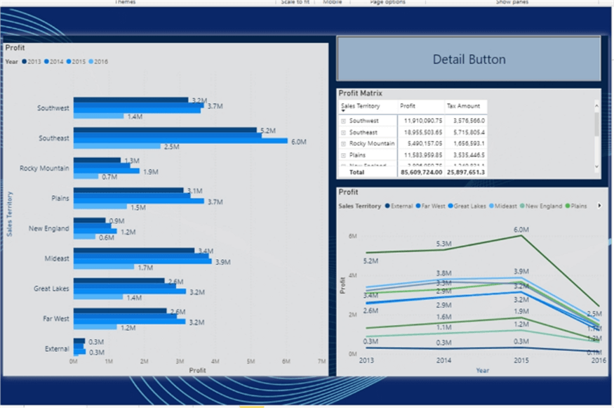
We will start with a simple report that includes a bar chart, a matrix, a line chart, and a button.
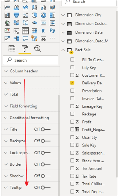
By default, when a new visual is added, the tooltip feature is turned off. In order to utilize tooltips, we must first toggle the tooltip option to on; otherwise no tooltips will be shown for that visual. As displayed below, this feature is found in the visualization pane, format tab, and can simply be turned on per visual.
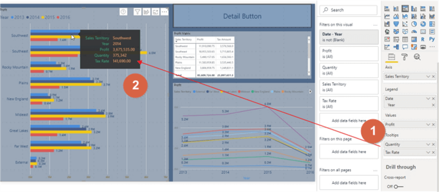
Our first look at tooltips will be in their simplest form, specifically a popup with specific values related to the data points you are hovering over. By default, when the tool tips property is set to on, the values that are shown would be any values that are included in the specific visual’s value, column, row, and category wells. For instance, in the below bar chart, three values are included: 1) sales territory on the axis 2) date (year) in the legend and 3) profit in the values
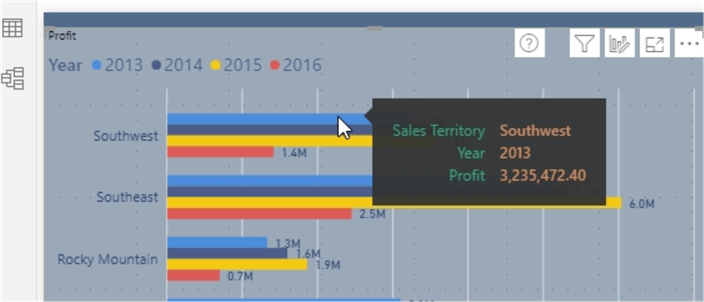
Thus, without any modification or adjustment, when we hover over a specific bar on the bar chart, we see the sales territory, the related date (Year) and the exact profit, as illustrated next.
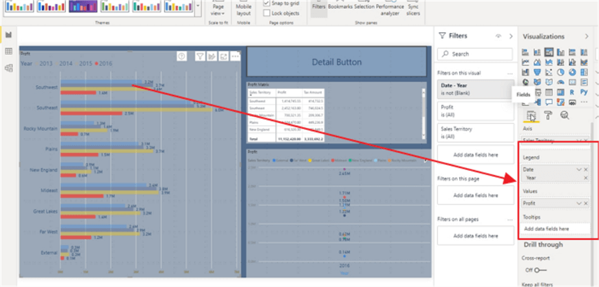
However, we can do so much more. For the visual above we can add other fields to the tool tip that are not part of the visual values, legend, or axis. Simply, drag and drop any fields into the tooltips well in the visualizations pane. By default, a numeric field will show a sum of the values. Also, you should note that the values shown are in context of the visual part or data point that is being hovered over. Thus, in the below example, the profit, quantity, and tax amount are a summation of the values for the Southwest sales territory for 2014. These values could easily be changed to a minimum, maximum, average, or standard deviation, among other aggregations.
If a non-numeric value is added, then the available aggregation methods are specific to first, last, and count (and count distinct).
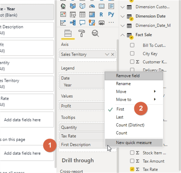
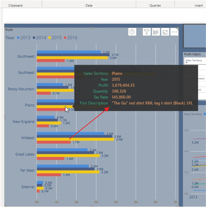
For this example, the first method is selected, so the tool tip shows the first description from the list of descriptions related to the hovered over value.
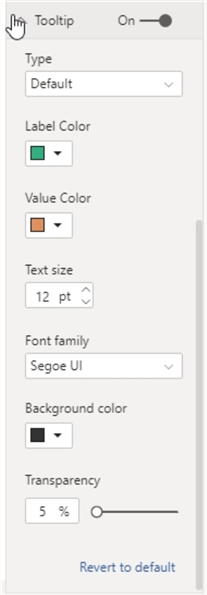
Before we move on to more complex tooltips, you will note that Power BI provides the flexibility to adjust the formatting used within the tool tip including changing the font, the font size, the label color, the background color, the value color, and the tooltip transparency. Remember, setting the transparency to 100% will basically show nothing (fully transparent) while setting it to 0% fully covers whatever is behind it.
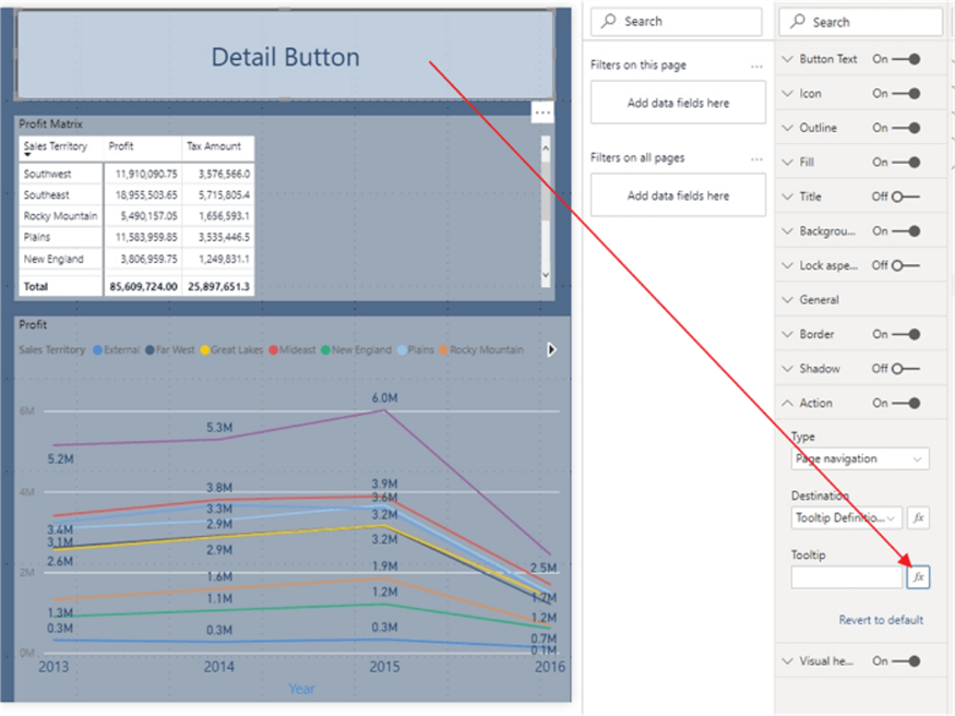
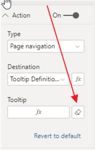
Let’s move into using tooltips on a button object. To be frank, the tool tip option for button is truly buried within the formatting options and likely you would not know it is there unless you really tried to find it. Additionally, the tooltip option looks somewhat different than the formatting option on the tooltips pane. The tooltip is found in the Action option, and then you must click on the fx to set the tooltip for the button as shown below.
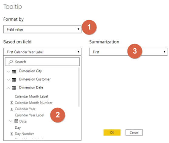
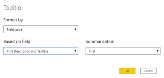
Subsequently, the tooltip dialog window then opens. The format by defaults to Field Value (the only option), then you select the field to show in the tool tip (Calendar Year is selected for this example), and then the Summarization to select is either First or Last.
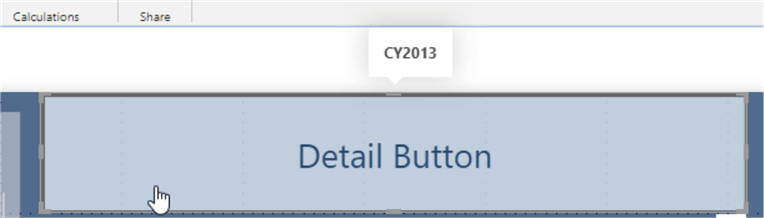
As you can see the tooltip is displayed as you hover over the button but does have limited abilities.
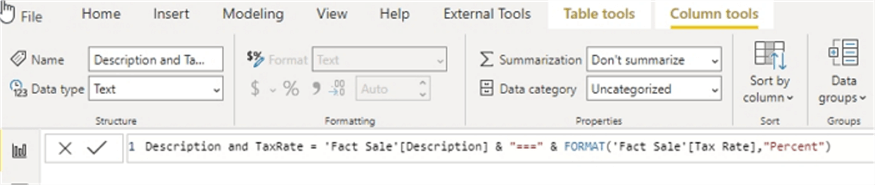
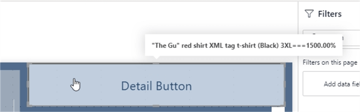
One option for being able to include multiple values in the selection is to actually create a field which concatenate two or more fields into a single value. Then that value can be used but remember that the tooltip would only show the first or last concatenated value. Thus, in the below example, a new concatenated column with the Description and Tax Rate is added.
Next, the existing tooltip is replaced with a new concatenated column.
Now the button tooltip shows as the first concatenated column value.
Finally, to remove the tooltip from the button, the eraser button can be clicked on to eliminate the tooltip.
Next, we can move into using full page (or better named tab) tooltips. That is correct; you can actually display a full set of visuals from another tab as a tooltip. In most cases the tooltip retains all the filter and context properties of the data point you are hovering over.
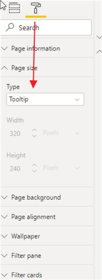
The first step in this process is to create a new "tooltip" tab in your Power BI file. Once the tab is created, the page size needs to be set as we do not want the tooltip to cover an entire page. Fortunately, as shown below, Power BI provides a preset page size type of Tooltip which creates a page with an appropriate size for a tooltip at 320 x 240 pixels. Note, it is not required to use this Page size type, and you can customize the size as needed.
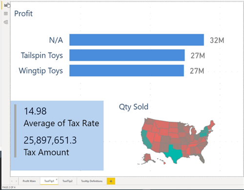
Then, a bar chart, a multi-row card, and a map are added to the page. These visuals are the items that will show within the tooltip.
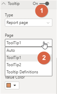
Now, we will need to navigate back to our main report tab and set the tooltip options. Within the format window, on the Tooltip pane, two properties need to be changed. First, the Type needs to be changed to Report page. Next, in the Page option, the appropriate tab name needs to be selected, Tooltip1 in this example.
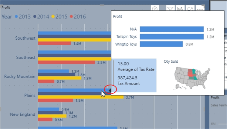
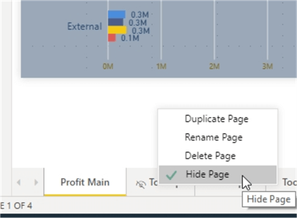
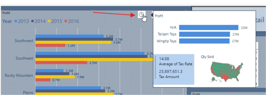
This part is the amazing result from our work. The tooltip in the below example shows the Tooltip1 tab in the context of whatever is hovered over; thus, the context will be Plains for 2013. In the tooltip we see the following details, often what I would consider to be drill down details:
- The buying group is broken out by N/A, Tailspin Toys, and Wingtip Toys.
- The average tax rate for the Plains sales territory for 2013 was 15.00 percent and the total taxes paid was approximate $987,000.
- Finally, the map shows us the states that make up the Plains territory and it also is setup to show the quantity of products sold by color saturation (red to green).
If you are unsure on what bar the tooltip represents, you will notice in the below illustration the red circle. Within the red circle shows a small triangle that points to the related bar.
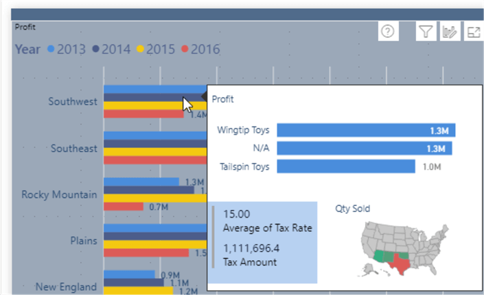
Showing another example, the below screen print displays the tooltip for the Southwest region for 2014. Notice how the map now shows the Southwestern United States.
To keep a report consumer from navigating to the tooltip tabs, it is generally a good idea to Hide the Tooltip page.
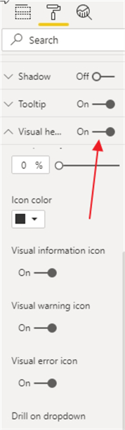
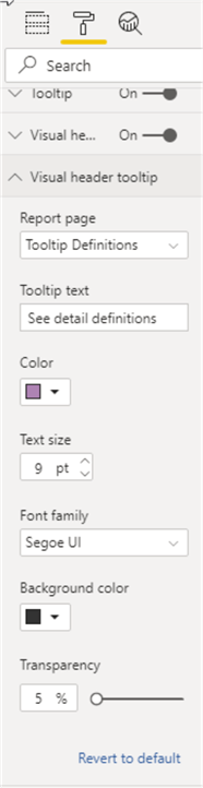
One final tooltip that can be added is to the visualization header. In order to use this tooltip, the Visual header must first be toggled to On for the visual.
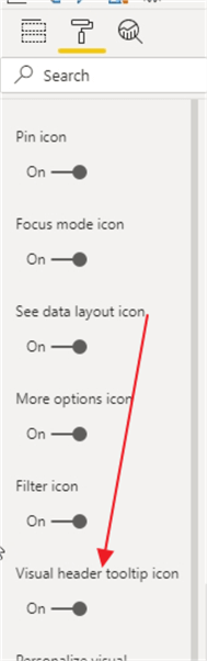
Then, the Visual header tooltip icon must be toggled to On.
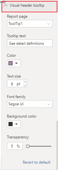
Upon turning on the Visual header tooltip, a new set of options is enabled under the Visual header tooltip title. In a similar way to our previous tooltip pages, we can select a page for this tooltip and also add text for the tooltip.
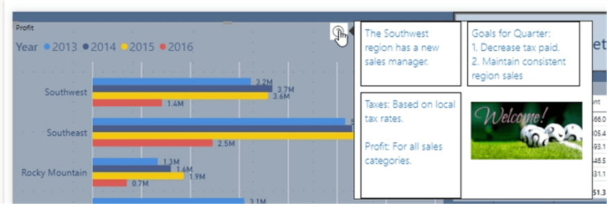
Now we have a new question mark icon on the Visualization header; hovering over this icon, our Tooltip1 page shows up; note that values shown are the total for the visual as we are not hovering over a specific value.
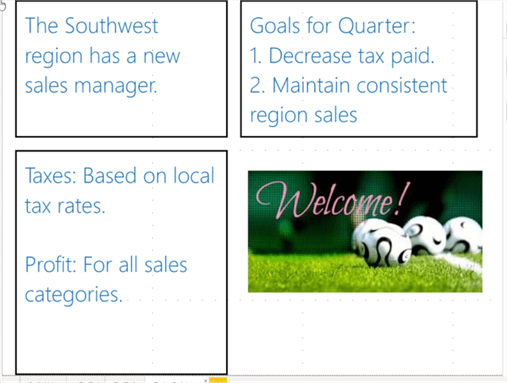
One other option for this tooltip is to actually display detail information about the visual in question; you can add items in textboxes such as definitions, goals, or other details about the visual. In the below example, I created a new tab called Tooltip Definitions and included 3 textboxes and one image.
Now, the tooltip page is set to the Tooltip Definitions tab.
Finally, our new tooltip shows our report definitions page.
In this tip we covered several of the various features and locations where tooltips can be fully utilized; the feature set provides quite a bit of drill down functionality including the simple addition of some measures to an existing tooltip all the way through the use of full pages / tabs as the basis for a tooltip. One caveat that Microsoft notes with the use of page tooltips is that the context filtering may not work when using line charts; generally, in that case, the figures shown are the total values and not the data points.
Next Steps
- Check out all of the Power BI tips on MSSQLTips.com
Learn more about Power BI in this 3 hour training course.


About the author
 Scott Murray has a passion for crafting BI Solutions with SharePoint, SSAS, OLAP and SSRS.
This author pledges the content of this article is based on professional experience and not AI generated.
View all my tips