By: Scott Murray | Comments | Related: > Power BI Formatting
Problem
How can I use Power BI Layouts and Custom Themes as a design template for Power BI Reports?
Solution
Many report designers (and users) have lauded the fact that “getting the data” is the easy part, but that presenting the data in a fully acceptable, readable, and clear fashion is the hardest part of any report design. Furthermore, many organizations request and / or require that a standard format be used for reporting to foster consistency in the color schema, formatting, and company logos and standards. One simple way to address these issues is through the use of a basic template; see this tip for some quick details on how to create a Power BI Template. These templates serve as a wonderful basis for creating consistency across an organization, but Mike Carlo and Seth Baker at Power BI Tips and Tricks have taken the whole template concept one step further with the use of a Power BI Layout. These layouts create a fairly simple way to have the bulk of spacing and formatting completed on your Power BI report; you just need to add your data. The layouts are truly a recipe for maintaining consistency from one report to another. However, the formats and setup are not locked; you do have the ability to make any and all changes needed for your report. One of the other changes that you may want to make could be to adjust the formatting patterns used for a Power BI report. These items can actually be adjusted via a theme import process which we will cover later in this tip.
Solution – Using Power BI Layouts
To get started you will need to download the most recent version Power BI Desktop from https://powerbi.microsoft.com/en-us/desktop/. Power BI Desktop is the client application that is available for you to design Power BI Dashboards on a local desktop. We are going to make use of the Financial Excel sample dataset that Microsoft made available for utilization with Power BI. This sample is available as an Excel workbook and can be downloaded from https://docs.microsoft.com/en-us/power-bi/sample-financial-download.
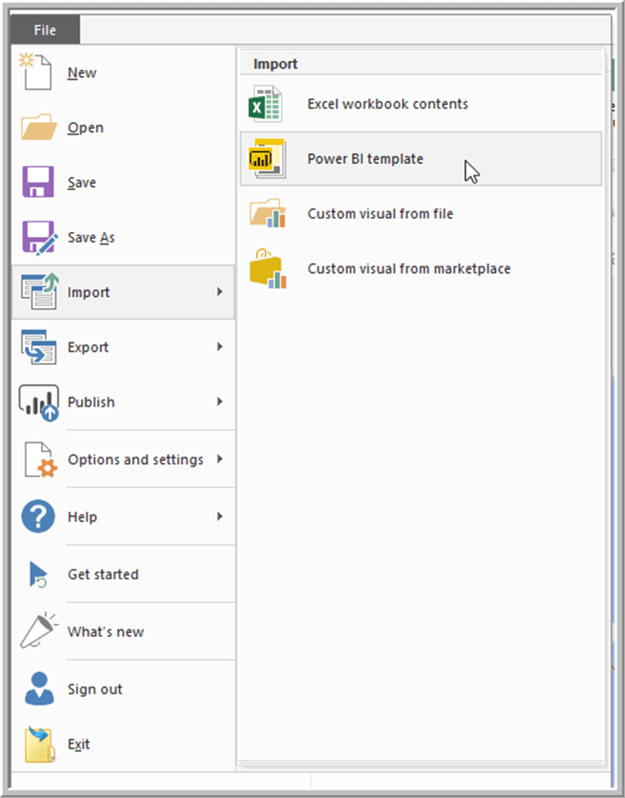
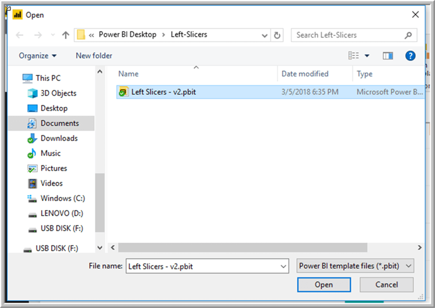
Once Power BI Desktop is installed and ready to use and we have our data set available (using Excel), we would want download one of the predefined layouts that the folks at Power BI Tips and Tricks have created: https://powerbi.tips/layouts/. For this example, we will be using the Left Slicers layout. After downloading and unzipping the files, the next step is to Import the template file, as shown below.
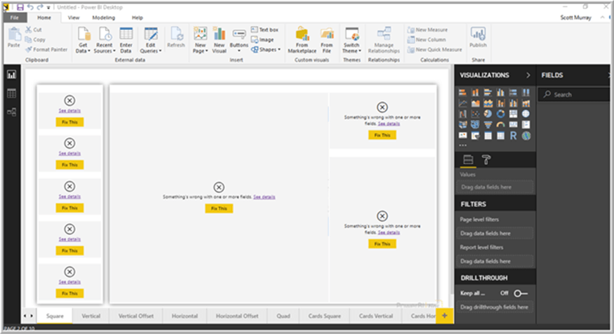
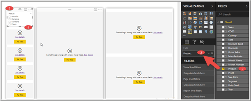
Once the Layout template is imported, Left Slicers for this example, we will have a screen similar to the below illustration. Errors appear for each visual as no data model exists, i.e. there is no data connected to the Power BI file. This situation is slightly different than normal templates which have the data model embedded, but no data is included.
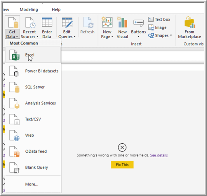
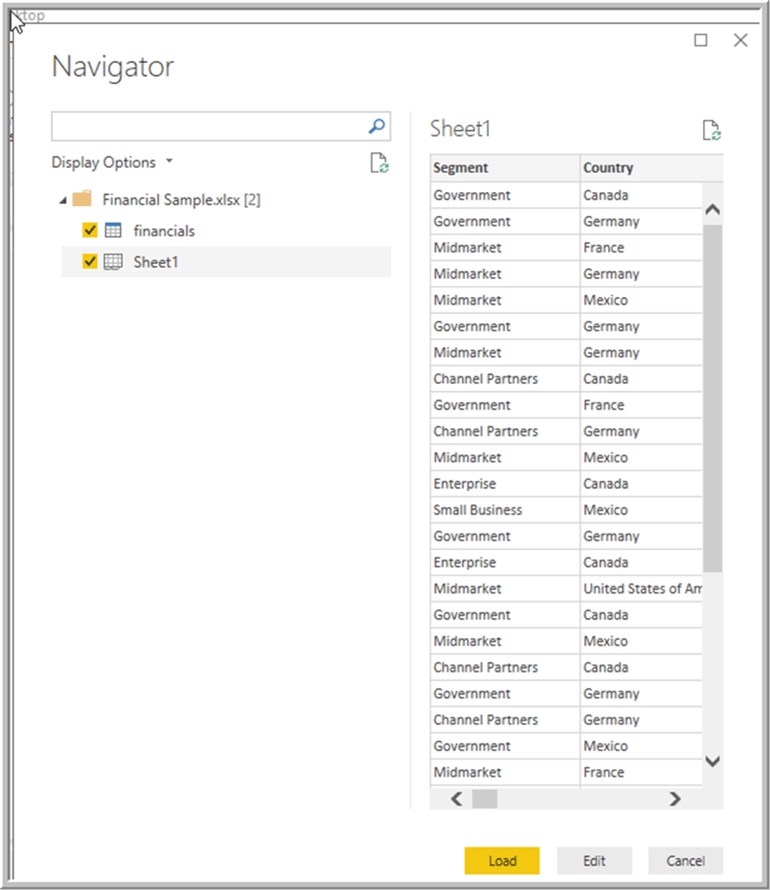
To begin to use each of the visuals, we must first “Get Data” for the data model by using the Get Data option. We will be using the Excel Sample noted in the introduction.
Sheet 1 within the Excel Workbook contains the data set for the model.
Once the data set is loaded we can now begin the process of adding the data fields to the appropriate visuals. Starting with upper left visualization, which is a slicer, we can quickly add one of the data fields, product in the below example, as the first slicer.
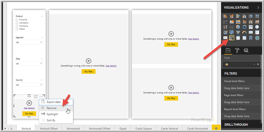
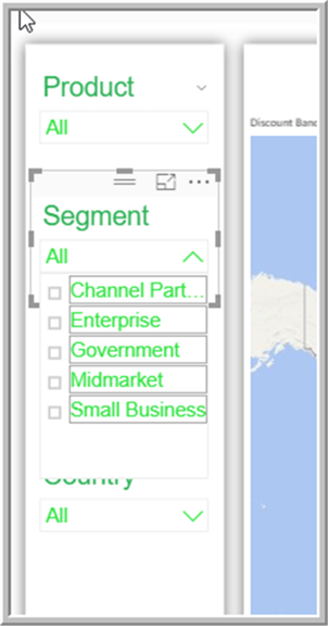
We can continue to add slicer filters by selecting each slicer visualization and then adding the appropriate data field to the field property of the slicer. If you are unsure what a particular visual is, you can always select the visual and then look to see what visual is outlined / highlighted in the Visualization list in the upper right side of the window. Furthermore, any unneeded visual can be deleted if necessary.
Next, we can add fields to the middle visual which is a map. First, we need to set the Data Category for the Country field to a geography category of Country / Region (which provides specific location services on a map).
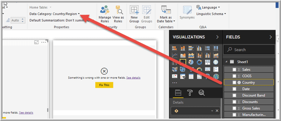
Now, we simply add country to the location field and profit to the size value. Although probably not the best visual, we finish by adding discount band to the legend band.
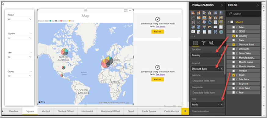
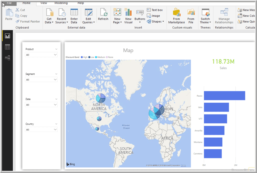
As you can see in the below illustration, we can finish off the report by adding fields to the card and bar chart visuals.
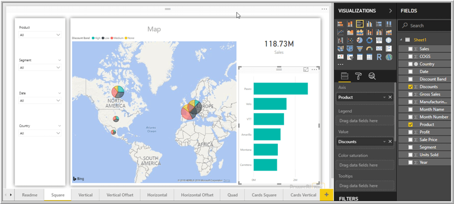
The layout truly allowed me to create a well formatted Power BI Report in just minutes; it permitted for the focus to be on the data instead of all the formatting.
Solution – Changing the Power BI Theme
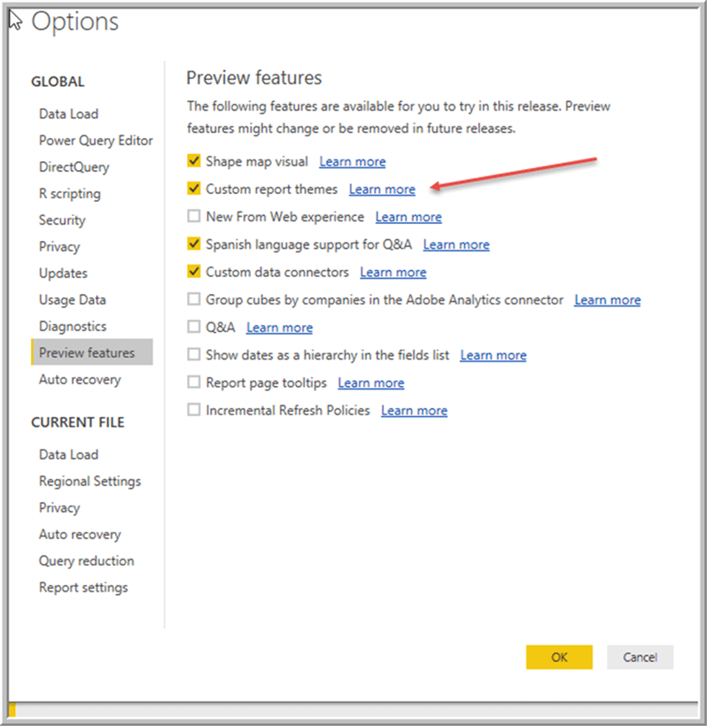
Themes in Power BI allow for the control of a whole sundry of different formatting options for a Power BI report or even an individual visualization. Generally, if an item is shown in the format area of a report or visualization, its properties can be set via a theme. Thus, we can not only set the color scheme that gets used, but also whether by default a border will surround an object or by default, the Title will be underlined and use Arial font. However, all this flexibility comes at a slight cost; the theme specifications and definitions must be created in an JSON file and, of course, use JSON tags. Once the JSON file is created then it must be imported into your Power BI report file. One item to note is that themes are currently only available in Preview mode, and thus must be turned on in the Preview Features area of the Power BI Options.
Therefore, the process for importing themes requires some pre-work to setup your theme and prepare it for import. The theme file uses a json format as shown below; a few specific tags are required such as name, dataColors, background, foreground, and tableAccent. Additionally, please be sure to use the proper case. The following is an explanation of each property tag:
- name: name of theme (that one is easy)
- dataColors: this list can contain one or more colors that will be available to the visuals on the report (in hex format)
- background: default background color for the various objects on the report such as a button
- foreground: default foreground color for the various objects on the report such as a textbox or even a table or matrix
- tableAccent: default coloring used by tables and matrix visualizations.
{
    "name": "Scott's Amazing Theme",
    "dataColors": ["#5677e7", "#245790", "#28cff5", "#e6c5e9", "#b9c300", "#31e342", "#89b3a0", "#30b259"],
    "background":"#FFFFFF",
    "foreground": "#a7dd37",
    "tableAccent": "#1dc080"
}
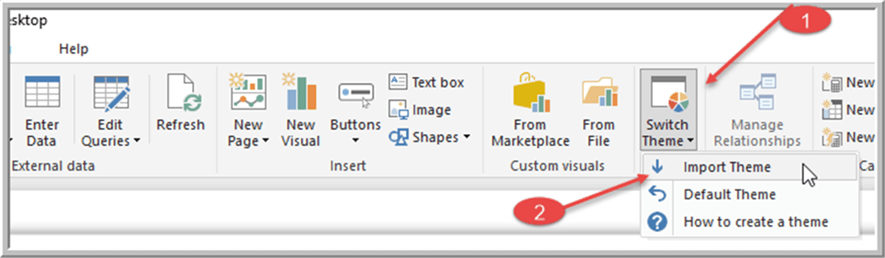
You would want to create this file in a text editor, and then save the file with a json extension. Next, back in Power BI Desktop, select the Switch Theme button, and then Import Theme. Last, you will select the json file that you have created.
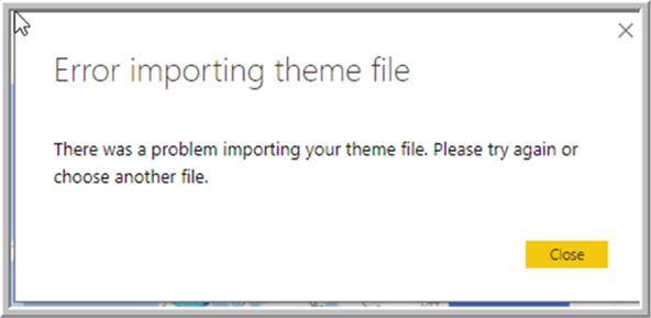
If Power BI cannot process the file, you will receive an error message similar to the below illustration. The error is not very descriptive, but also if an error does occur, then none of the changes will be applied. In my case, I produced this error by having two ## signs in one of the hex codes.
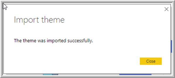
After correcting this issue and reimporting the file, the json theme file was imported successfully.
You will notice that several of the visualizations’ components changed colors to different blue or green colors.
Furthermore, when you go to adjust the color formatting for each of the visualizations, you will now notice that the available colors match the colors equivalent to the blues and greens hex codes that we used in the json theme file.
You can quickly see how some time invested in setting up your own organization’s theme can quickly provide benefits for all your future Power BI report development.
For the first theme file, we used just the bare minimum number of json elements as most of the tags are optional and only need to be included when changes are wanted for that property. Furthermore, since changes can be made to just specific visualization’s properties, the level of customization can be quite granular. However, this is also where things get trickier on what to include in your file. The above mentioned 5 elements must start off your file; then you will include the visualStyles tag using that exact wording. Next the following elements are need:
- VisualName: replace with the actual name of the visual here. You would use items such as card, pivot or slicer
- styleName: replace with * so it applies to all styles. To be frank, I have had trouble determining when this element applies or does not apply.
- cardName: the Category where the properties reside. Some examples would be title, header, and items
- propertyName and propertyValue: the actual items to be changed.
{
    "name": "Scott's Amazing Theme",
    "dataColors": ["#5677e7", "#245790", "#28cff5", "#e6c5e9", "#b9c300", "#31e342", "#89b3a0", "#30b259"],
    "background":"#FFFFFF",
    "foreground": "#a7dd37",
    "tableAccent": "#1dc080"

visualStyles: {
    visualName: {
        styleName: {
            cardName: [{
                propertyName: propertyValue
            }]
        }
    }
}
}
For this tip, we will update the slicer formatting that is being used for the slicer visualizations on our report. Specially, we change the font color, the outline (for the list items), the text size and the font itself. Again, we only need to include the elements we are interested in changing.
{
    "name": "Scotts Amazing Theme",
    "dataColors": ["#5677e7", "#245790", "#28cff5", "#e6c5e9", "#b9c300", "#31e342", "#89b3a0", "#30b259"],
    "background":"#FFFFFF",
    "foreground": "#a7dd37",
    "tableAccent": "#1dc080",
    "visualStyles": {
    "slicer": {
         "*":{
             "header": [{
               "show": true,
               "fontColor": { "solid": { "color": "#30b259"}},
               "background": { "solid": { "color": ""}},
               "outline": "None",
               "textSize": 20,
               "fontFamily": "Arial"
            }],
            "items": [{
               "fontColor": { "solid": { "color": "#31e342"}},
               "background": { "solid": { "color": ""}},
               "outline": "Frame",
               "textSize": 15,
               "fontFamily": "Arial"
               }]
            }
         }
   }
}
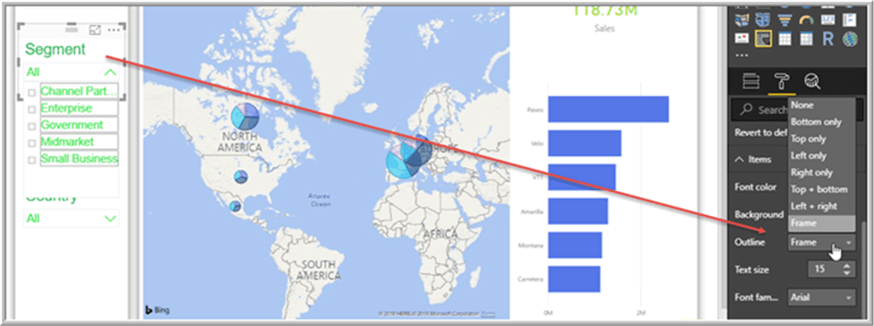
Upon completing the theme import, we can see that our slicers are all a beautiful and bright green color, with a font size of 20 for the header and 15 for the items. Additionally, they use the Arial font and the items list has a full frame border.
A list of all the json tags for each visualization can be found at: https://docs.microsoft.com/en-us/power-bi/desktop-report-themes#json-file-element-definitions . The list is almost overwhelming and some report developers have reported some elements are missing or are not clear. One item I have found helpful in deciding the actual property values to use in the json file is to select the visualization in questions (i.e. select a slicer to review the slicer elements) and then actually review the properties for the element you are interested in setting. For instance, for the Outline element, I saw that Frame was used to mean a full border around each item in the list.
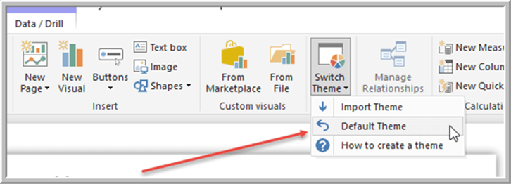
Finally, the custom theme format will only apply to properties which are using the default formatting for that element. If a modification has already been made to an element’s property (i.e. a color is set for a data point), that element will not adjust to the imported theme. You must first revert it to the default theme or setting. Furthermore, if you need to revert back to the default theme, this process can easily be completed from the tool bar by selecting Switch Theme and then Default Theme.
Using layouts and themes in conjunction with each other, allows Power BI report designers to quickly create a consistent look and feel for their organization’s reports.
Next Steps
- Power BI Tips: https://www.mssqltips.com/sql-server-tip-category/211/power-bi/
- Power BI Themes Gallery: http://community.powerbi.com/t5/Themes-Gallery/bd-p/ThemesGallery
- Add R to your Power BI Report: https://www.mssqltips.com/sqlservertip/5428/market-basket-analysis-in-r-and-power-bi/
Learn more about Power BI in this 3 hour training course.


About the author
 Scott Murray has a passion for crafting BI Solutions with SharePoint, SSAS, OLAP and SSRS.
This author pledges the content of this article is based on professional experience and not AI generated.
View all my tips