By: Rick Dobson | Updated: 2021-04-26 | Comments (2) | Related: > Python
Problem
Python offers many advantages when working with data. One of these is the ability to chart data with Python. In this article we look at some Python code to create line and bar charts.
Solution
This tip presents and briefly describes a couple Python scripts for composing, displaying, and saving line charts and bar charts with Python as well as retrieving and opening saved charts via Windows File Explorer. This tip is appropriate for SQL Server professionals who have little to no prior experience with charting data in Python and limited programming experience with Python. MSSQLTips.com offers a tutorial on Python as well as several tips that SQL Server professionals may find helpful for enhancing their understanding of Python (here, here, here).
The scripts in this tip are designed with the goal of you being able to create data visualizations simply by copying and pasting data from SSMS directly into Python scripts that are in this tip. This should provide a foundation for you preparing more advanced charts on your own.
Tools used in this tip
This introduction to charting data with Python focuses on daily time series data; additionally, some of the examples have broader applicability. Also, the tip focuses on the Matplotlib library for use with Python. If you want to run the samples in the tip, you will need Python and Matplotlib. Happily, this code and the scripts from this tip are available without charge so they can get you started plotting your SQL Server data for free.
The following links offer you one way to download and install Python as well as its external Matplotlib library. As with many computer topics, there are other ways to accomplish these goals. The datetime and numpy libraries are examples of Python internal libraries referenced and discussed in this tip. The datetime library is for representing and processing date and time data values, and the numpy library offers techniques for creating equally spaced intervals between two numeric values.
- You can download and install Python for Windows from Python.org. After installing Python from Python.org, you can create, edit, save, and run Python scripts from the IDLE application that downloads automatically with Python when it is downloaded from Python.org. If you have another integrated development environment for Python code, then use whichever you prefer. However, this tip describes and illustrates Python script development via IDLE.
- After downloading and installing Python, you can use a simple pip command to install the Matplotlib external library (link for downloading Matplotlib).
Matplotlib is a widely known charting library for Python. You may have read that Matplotlib can be hard to use. While this can be true, many features are easy to access and implement. This tip focuses on a subset of the features that are easy to access and use. Based on comments for this tip, I will be glad to follow up with additional tips for scripts that illustrate other Python data charting techniques.
Making Line Charts with Python
A line chart is a way to plot y axis values versus x axis values where there are lines between y axis values based on their consecutive horizontal axis values. The horizontal axis frequently represents some unit of time, such as days, months or quarters. Common use cases for a line chart are to plot vertical or y axis values, such as a stock’s closing price on trading days, or monthly product line sales, or daily minimum temperature.
The four examples in this section are all from a single Python file (line_chart_1,py). The Python code in the file starts with the specification of code libraries to facilitate creating and configuring a line chart as well as x axis and y axis datasets. It is possible to have more than one set of y axis values for a single set of x axis values. This section includes four sub-sections; each section shows the Python code for a different configuration of a line chart.
A basic line chart
The following screen excerpt shows the preliminary part of a Python script that generates a basic line chart. This part of the script begins by referencing the pyplot library of the Matplotlib library. The library is given an alias name of plt. The datetime module, which acts as an internal Python library, allows the specification and manipulation of datetime values as objects in a Python script.
After the library references, the code excerpt shows a set of selected date values from February 1, 2021 through February 23, 2021. This collection of date values with the object name of Date serve as x axis values. Weekend dates and holidays when stock markets are closed are excluded from the dates in the Date object.
The next two objects show close prices on stock trading dates for the KOPN and SPWR stock symbols. The KOPN_Close and SPWR_Close objects contain close prices, respectively for the KOPN and SPWR stock symbols. Notice that there are just 16 close prices for each symbol. The 16 close prices for each stock symbol correspond to the 16 dates in the Date object when the stock market is open to exchange shares.
import datetime
import matplotlib.pyplot as plt

#date data for x axis
Date = [
datetime.date(2021,2,1),
datetime.date(2021,2,2),
datetime.date(2021,2,3),
datetime.date(2021,2,4),
datetime.date(2021,2,5),
datetime.date(2021,2,8),
datetime.date(2021,2,9),
datetime.date(2021,2,10),
datetime.date(2021,2,11),
datetime.date(2021,2,12),
datetime.date(2021,2,16),
datetime.date(2021,2,17),
datetime.date(2021,2,18),
datetime.date(2021,2,19),
datetime.date(2021,2,22),
datetime.date(2021,2,23)
]

#KOPN close prices for y axis
KOPN_Close = [
5.20,
6.76,
6.40,
7.47,
7.63,
7.97,
8.54,
9.42,
9.36,
10.84,
13.56,
12.01,
10.12,
11.85,
10.74,
9.52
]

#SPWR close prices for y axis
SPWR_Close = [
48.69,
43.76,
44.79,
40.13,
43.53,
45.35,
49.12,
49.14,
49.96,
49.81,
46.54,
43.61,
36.33,
37.76,
33.53,
35.39
]
The next part of the script shows the Python code for an introduction to Python line charts. Notice that the code appears in bounded commented multi-line comment markers (#"""). The Python script file for line chart examples in the download file originally has all four Python line chart examples in multi-line comment markers ("""). Place a single-line comment marker (#) before the beginning and ending multi-line comment markers to run the code for an example.
- The code for the first example starts and ends with commented multi-line comment markers. The overall script file for line examples (line_chart_1.py) contains four sets of code – one for each of four line charts.
- The code showing in the next screen shot begins by denoting a line chart with date values from the Date object and close price values from the KOPN_Close object.
- The next code line assigns a title to the chart – namely, KOPN.
- The next two lines of code designate labels for the chart’s x and y axes, respectively.
- The script ends with a show method for plt, the alias for the pyplot library.
#"""
#basic line chart
plt.plot(Date, KOPN_Close)
plt.title('KOPN')
plt.xlabel('Trading Date')
plt.ylabel('Close Price')
plt.show()
#"""
The show method for pyplot library displays the chart in its default chart viewer (see below). The name of the KOPN symbol appears at the top of the line chart as its title. Clicking the last icon at the right end of the set of icons towards the top of the chart viewer allows you to designate a filename and path for the chart; the default format is .png. Other available graphic file formats for saving the line plot, include .jpg, .pdf, and .ps.
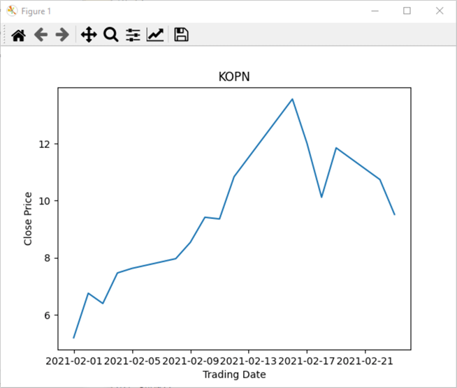
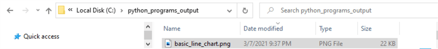
The next screen shot shows an excerpt for the Window File Explorer screen shot of the basic_line_chart.png file in the python_program_output folder of the C drive.
A line chart with line markers and a grid
The following script excerpt is for a line chart with markers and a grid to ease the identification of x and y axis value pairs associated with line points. The markers help to identify the trading dates on a line. Dates without a line marker are days for which the stock market is closed.
- The marker parameter in the plot method allows the specification of line markers. The code below designates an x character a line marker value. View other codes for designating line markers here.
- The grid method in the pyplot library is False by default. The following script resets the grid setting to True so that a grid appears on the line chart. You can learn more about other grid settings here.
- The show method displays the grid.
#"""
#line chart with markers and a grid
plt.plot(Date, KOPN_Close, marker = 'x')
plt.title('KOPN')
plt.xlabel('Trading Date')
plt.ylabel('Close Price')
plt.grid(True)
plt.show()
#"""
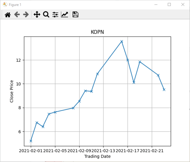
Here is the line chart image created by the preceding code. There are 16 markers on the line for KOPN – one for each trading date among the Date object values.
A chart for two lines with markers and a grid
A line chart can be for more than one series. This tip displays close prices for both KOPN and SPWR stock symbols. The prior two examples display results exclusively for the KOPN series. The example in this sub-section is for both the KOPN and SPWR time series.
The next code block creates two separate lines in a single chart – one for KOPN close prices and another for SPWR close prices. The code continues the use of line markers and a grid for the overall line chart. However, a legend is also added to the chart. When using a legend in a line chart, you need to invoke the legend method in the code for the chart. You also need to add one or more identifying features to the plot method for each line.
In the following code, the first two parameters for each plot method are for data – not identifying features. The third parameter is for labeling a line in the legend. The fourth parameter is to specify the marker for each line.
- The first parameter is for the x axis values in both lines. The x axis values are the same for both lines, which is why Date is the first parameter value for the plot method for both lines.
- The second parameter is for the y axis values in both lines. The y axis values for the first plot method is for the KOPN_Close object values, and the y axis values for the second plot method is for the SPWR_Close object values.
- The third parameter has the name label with some text assigned to the parameter. The text for the first line has a text value of KOPN, and the second line has a text value of SPWR for the label parameter.
- The fourth parameter has the name marker. This parameter is to denote
the line marker type for each line in the chart.
- The marker value for the KOPN line uses the character x to denote y axis values along the first line in the chart.
- The marker value for the SPWR line uses a diamond character to denote y axis values along the second line in the chart.
#"""
#chart for two different lines with markers and a grid
plt.plot(Date, KOPN_Close, label = 'KOPN', marker = 'x')
plt.plot(Date, SPWR_Close, label = 'SPWR', marker = 'd')
plt.legend()
plt.title('Close Price by Symbol')
plt.xlabel('Trading Date')
plt.ylabel('Close Price')
plt.grid(True)
plt.show()
#"""
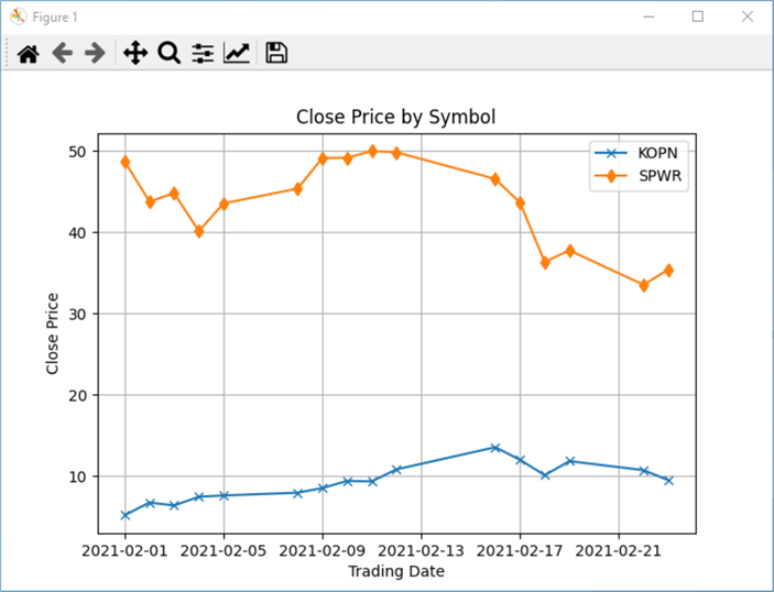
Here is the line chart from the preceding code sample in the pyplot chart viewer.
- The first thing to note is that there are two lines with markers in the chart.
- The next significant point to observe is that there is a legend in the top
right corner of the chart.
- The data labels in the legend match the label parameter assignments in each of the preceding two plt.plot statements in the preceding code segment.
- Also, the legend denotes the appropriate marker for each time series:
- x for KOPN symbol points
- a diamond for SPWR symbol points
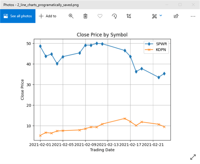
Two line charts programmatically saved
Saving chart images is relatively easy if you are just preparing one chart in a set. However, if you are preparing multiple charts in a script, you may care to programmatically save your chart files to a specific path. The following script shows how to achieve this goal.
To save a file with the image for a line chart, you can invoke the savefig method for the pyplot library. The next to the last line shows the syntax used for the savefig method in this tip. All this tip seeks to show is how to save the image for a line chart in file within a path. The showing for the savefig method specifies the path and filename for saved chart image.
- The "C:\\python_program_output\\" segment of the argument specifies
the path for the chart file.
- The path is on the C drive.
- The folder below the C drive has the name: python_programs_output
- The filename for the chart image is 2_line_charts_programatically_saved.png.
In this example, a show method for the pyplot library previews the chart so the analyst running the script can modify the script if the code does not generate the intended result.
#"""
#save and show a chart for two different lines
#both lines have markers, and they are on a grid
plt.plot(Date, SPWR_Close, label = 'SPWR', marker = 'd')
plt.plot(Date, KOPN_Close, label = 'KOPN', marker = 'x')
plt.legend()
plt.title('Close Price by Symbol')
plt.xlabel('Trading Date')
plt.ylabel('Close Price')
plt.grid(True)
plt.savefig('C:\\python_programs_output\\2_line_charts_programatically_saved.png')
plt.show()
#"""
You can also examine the outcome from the savefig method by examining the file from Windows File Explorer. For example, if you are using a .png file double-click the image from inside of File Explorer. The following screen shot shows the image from File Explorer for the 2_line_charts_programatically_saved.png file.
Making Bar Charts with Python
Like a line chart, a bar chart is also a way to plot y axis values versus x axis values. Vertical axis values specify values for the y axis, and horizontal axis values can be for the x axis. A key difference of a bar chart from a line chart is that y axis values are represented by the length of a vertical bar from the x axis. The bars can be for categories, such as region of the country without an inherent order, or the bars can be for an ordered sequence, such as calendar dates within a date range when the categories do have an inherent order.
As with the section on making line charts, this section on making bar charts requires a code segment for declaring library references and data values before specific code examples implementing different configurations of bar charts. A Python file (bar_chart_1.py) in the download for this tip has both the preliminary setup code and the code for implementing different configurations of bar charts.
The library references for the charts in this section include those for the line chart section plus one new library reference.
- The two library references that are the same as for the line charts are the Python datetime library and the pyplot library within the Matplotlib library with an alias of plt.
- The new library reference is for the Python internal numpy library, which has an alias of np. The numpy arange method can be used to create ordered values for category values that do not have an inherent order or for a set of shared category values by two sets of data series in the same bar chart.
For the bar chart samples in this tip, the data values and the code for specifying those values is the same as for the line chart section.
- There is a Date object for labeling the x axis. The range of datetime values are selected dates from February 1, 2021 February 23, 2021. Weekend dates and holidays when stock markets are closed are excluded from the dates in the Date object.
- There are also two sets of closing prices.
- One set is for the KOPN stock symbol closing prices on trading dates.
- The other set is for the SPWR stock symbol closing prices on trading dates.
The sub-sections in this section on making bar charts show the code for preparing specific bar chart displays. After a bar chart is generated, its layout is sometimes modified through the features of the Matplotlib chart viewer. All the code examples for generating bar charts start and end with multi-line comment markers (""") in a single Python script. By commenting out the multi-line comment markers (#""") at the start and end of a code example, you can run the code for just one bar chart example.
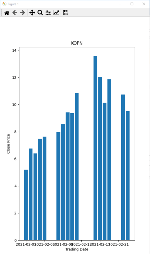
A basic bar chart
Here is an especially easy script that introduces how to create a bar chart. The initial outcome from the script illustrates a potential problem that you may encounter with the approach.
- The script starts by invoking the figure method for the pyplot library. The application of the method in the script is to declare a figure object named Fig. The format for using the figure method below is to set the figure’s size to 6 inches wide by 10 inches tall.
- Next, the bar method of the pyplot library specifies the values in the Date object for the x axis and the values in the KOPN_Close object as relative bar heights for trading dates.
- Then, the title, xlabel, and ylabel methods for the pyplot library designate text values, respectively for the chart’s title, x axis, and y axis.
- The script concludes with the show method for the pyplot library. As with line charts, this method displays a chart specified by the preceding code in a script. The chart appears in the Matplotlib chart viewer.
#"""
#default bar chart
#with the fig setting (6" by 10")
fig = plt.figure(figsize=(6,10))
plt.bar(Date, KOPN_Close)
plt.title('KOPN')
plt.xlabel('Trading Date')
plt.ylabel('Close Price')
plt.show()
#"""
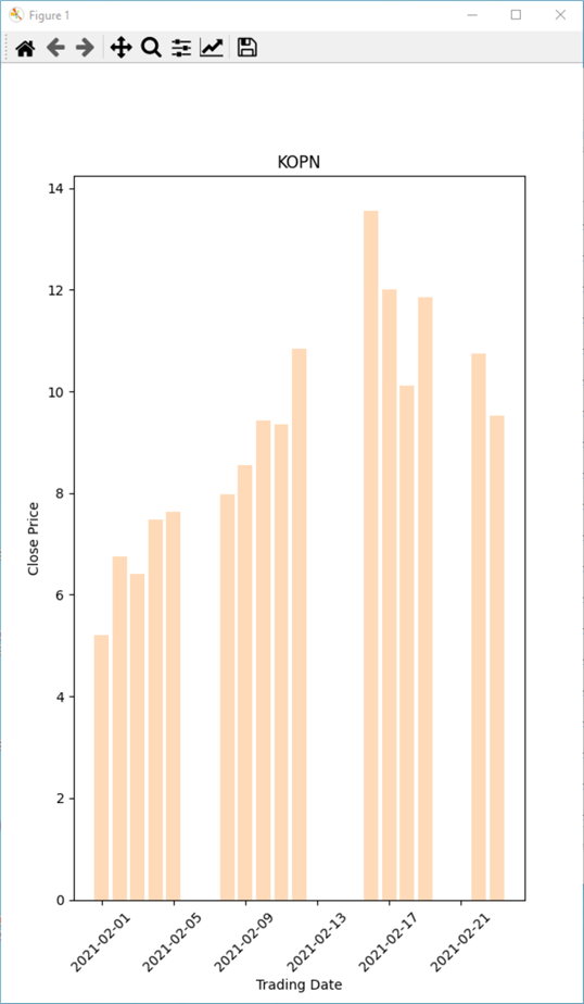
Here is the bar chart displayed by the preceding script. The height of the bars shows the closing price for the KOPN symbol on the trading dates from February 1, 2021 through February 23, 2021. When there is no bar for a calendar date, it means that the stock market is closed on that calendar date because it is a weekend day or a holiday during which the market is closed
There is a problem that can sometimes occurs with bar charts. Notice the x axis values overwrite one another. This occurs because the date values are too long to display within the designated setting for the bar chart’s width. If the Date values had an abbreviated format the x axis values would not overwrite one another.
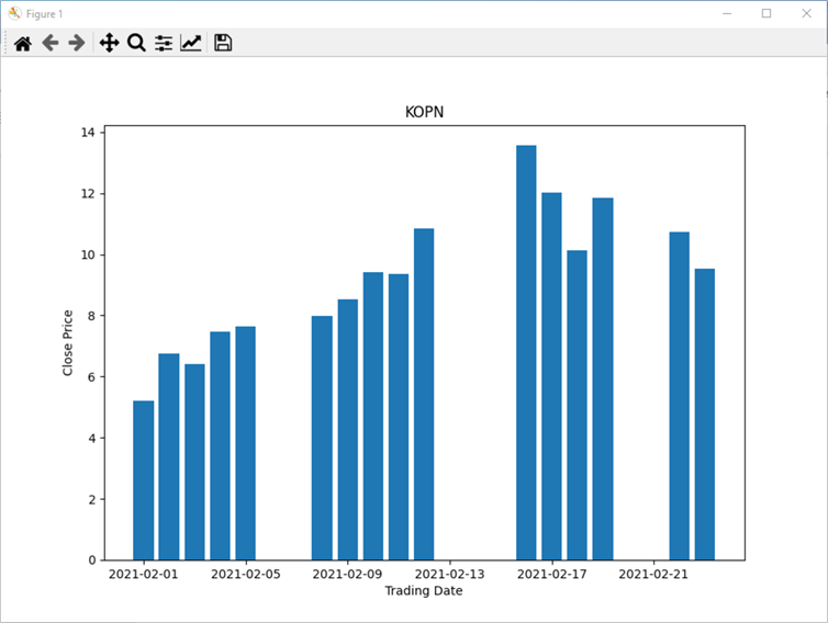
There are a couple of possible fixes to the problem of overlapping x label values for a bar chart. One fix is to re-shape manually the Matplotlib chart viewer. By dragging the lower right corner of the chart viewer so that the overall figure is wider, then the x axis label values will not overwrite one another because the overall display will be wider. The next screen shot shows the same bar chart as in the preceding screen shot after the chart viewer is re-shaped to be wider and shorter. Notice that the x axis label values no longer overwrite one another.
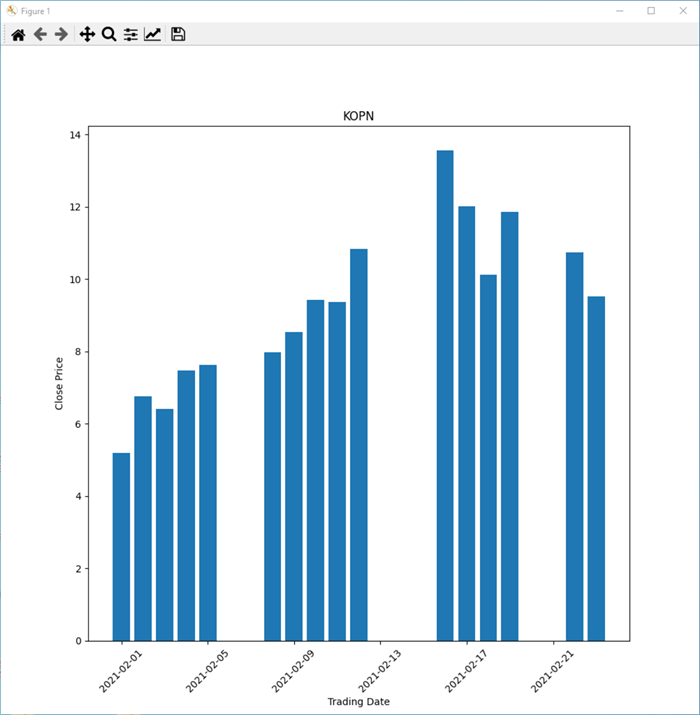
You can also enlarge the programmatically set width of a bar chart window. This kind of programmatic action can eliminate overwriting x label values if the setting for the width of a bar chart is sufficiently wide so that x label values no longer overwrite each other. Additionally, you can also programmatically control how the x label values display. For example, you can rotate the orientation for x label values within a bar chart. The following script illustrates how to implement both features.
In the following script, the figure method of the pyplot library resets the width of the bar chart from 6 inches to 10 inches. The height of the bar chart remains unchanged from the prior bar chart at 10 inches. Additionally, the xticks method of the pyplot library is invoked with a setting of rotation = 45. This setting re-orients the x label values from horizontal to rotation of 45 degrees. With modifications like these, you can circumvent the overwriting x label values in a bar graph.
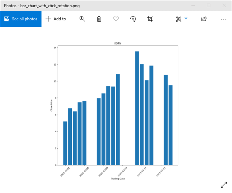
The next to last line of the following script example makes it easier to re-open a bar chart after initially running the code to create the chart. The application of the savefig method from the pyplot library can save a figure without the need to click the file icon in the chart viewer and having to designate a chart filename within a path. In the example below, the chart image is programmatically saved to a file named bar_chart_with_xtick_rotation.png in the C:\\python_programs_output path.
#"""
#bar chart with xtick rotation
#and edited figure size settings
fig = plt.figure(figsize=(10,10))
plt.bar(Date, KOPN_Close)
plt.title('KOPN')
plt.xlabel('Trading Date')
plt.ylabel('Close Price')
plt.xticks(rotation = 45)
plt.savefig('C:\\python_programs_output\\bar_chart_with_xtick_rotation.png')
plt.show()
#"""
Here is the image of the figure from the chart viewer.
If you omit the last script line with plt.show(), then the Matplotlib chart viewer will not open. However, the savefig method for the Matplotlib library will still make the file with the bar chart available via File Explorer. Here is the image of the bar chart obtained from File Explorer. To display the image, just double-click the filename with the file image in File Explorer.
Coloring the bars in a bar chart
It is not unusual for the bars in a bar chart to be colored. For example, you could have a set of four bar charts -- with each bar chart showing sales for the same set of product categories. Each of four different bar charts could be for a different sales region, such as the north, south, east, and west sales regions. In this kind of scenario, it may be useful to have the bars for each region show in a different color. This can make it easier to recognize which bars go with each region.
The Matplotlib library offers a rich diversity of formats for assigning colors to the objects (such as bars or lines) in a chart. This reference gives a relatively complete overview of the alternative formats for assigning colors to objects in a chart. However, if you are just getting started coloring the objects in charts and you do not care to become a coloring expert, then using color names may be best format for you. There are well over a hundred standard color names in the Matplotlib library; this reference offers a list of color names along with short bars showing the colors.
The following script illustrates how to show KOPN closing prices by date values in a color of your choice. All you must do is add a color parameter to the bar method in the pyplot library. Then, assign a color name, such as peachpuff, to the color parameter.
#"""
#basic bar chart with one of
#4 different colors for bars
fig= plt.figure(figsize=(6,10))
plt.bar(Date, KOPN_Close, color = 'peachpuff')
plt.title('KOPN')
plt.xlabel('Trading Date')
plt.ylabel('Close Price')
plt.xticks(rotation = 45)
plt.show()
#"""
Here is what shows in Matplotlib chart viewer from the preceding script. All the bars have the same color, but that is the objective for this chart. The script demonstrates how to assign a specific color to the bars in a chart.
As mentioned previously, there are well over one hundred color names available. Here are three different color names (darkgrey, darkturquoise, and fuschia). You can generate any of the charts just by replacing the peachpuff color name in the preceding script with one of the three alternative color names listed in this paragraph.
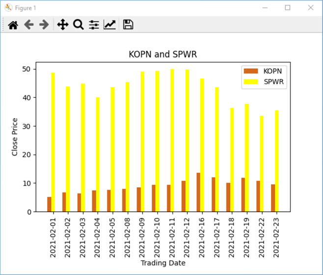
Plotting two different time series in a bar chart
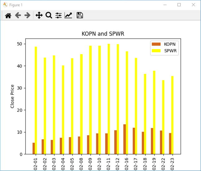
One of the most common bar chart designs is to plot two or more different series of values over a common set of categories. The following script plots daily closing price for two different stock symbols – namely, KOPN and SPWR. The bars for the SPWR have a yellow color, and the bars for the KOPN symbol have a chocolate color. The script illustrates several techniques in addition to assigning different colors to the bars for each stock symbol.
- The script starts out by assigning string values to the plot’s title, x label values, and y label values.
- The next block of code utilizes the arange method from the numpy library,
which is an internal Python library.
- Whenever you need an array of equally spaced numbers, the numpy arange method is a good candidate to consider.
- The arange method is easy to use at a conceptual level, but you may
want to look up a good reference for the details on how to invoke the method.
Here
is one that I found useful.
- The method has start, stop, step, and data type parameters options for specifying the first, last, step between numbers in the returned array of values.
- Furthermore, you can either name the parameters for the arange method when invoking it or you can just list the values for parameters in the order that the arange method expects them.
- Also, you do not need to specify all parameters when you invoke the arange method.
- In the script below, the arange method is used with just one parameter –
the stop value for the returned array.
- The value is the number of date values in the Date object. Recall that there are just 16 values in Date object after excluding dates on weekends and holidays in the date range from February 1, 2021 through February 23. 2021.
- Therefore, the Date object has 16 values, which is the number returned by len(Date). The len function can return the number values in an object.
- With the syntax used below, the arange method returns a sequence of integer values from 0 through 15 to the x_index array.
- After values are assigned to the x_index object, x_index is assigned
to the ticks for the bar chart via the pyplot xticks method. The
xticks method also
- Assigns values from the Date object as labels for ticks along the x axis
- Rotates the labels for xticks by 90 degrees
- Displays the xticks values for each pair of closing values on each trading date.
- The chart displays skinny bars so the width object value of .25. Then, the width object value is assigned to the width of bars by assigning its value to the bar method for the width parameter of the bars in the chart. This assignment is made separately for both sets of bars – namely, those for the KOPN and SPWR symbols.
- The legend method of the pyplot library copies the label parameter assignment to a legend box so that it is easy to tell which set of bars goes with which set of x axis values. The legend method also colors the legend bar according to the color name assignment to the color parameter in the plt.bar statement for each set of bars.
- The script concludes with a plt.show statement. This opens the bar chart in the Matplotlib chart viewer after the script concludes.
#"""
#bar chart for two time series
#with customized bar widths
#and custom colored bars

#text for chart title and axes
plt.title('KOPN and SPWR')
plt.xlabel('Trading Date')
plt.ylabel('Close Price')

#specify a set of index values for the x axis
#and use the index values with the pyplot xticks method
x_index = np.arange(len(Date))
plt.xticks(ticks = x_index, labels = Date, rotation = 90)

#designate a custom bar width
width = .25

#plot each time series on the bar chart
plt.bar(x_index-width, KOPN_Close, color = 'chocolate', width = width, label = 'KOPN')
plt.bar(x_index, SPWR_Close, color = 'yellow', width = width, label = 'SPWR')

#specify that the chart includes a legend
#for identifying its time series
plt.legend()

plt.show()
#"""
Here is the image for the bar chart that appeared after the bar chart concludes. Notice that with the default setting resulted in a truncated lower portion of the chart.
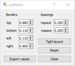
By clicking the third icon from the right edge of icons at the top of the chart viewer, you may be able to reclaim some unused border space and fix the truncation issue.
|
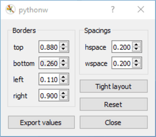
|
After adjusting the quantity in the bottom dialog box of the pythonw dialog from .110 to .260, an untruncated chart image appears in the chart viewer. The before bottom value appears in the left preceding image and the after bottom value appears in the right preceding image. Here is the modified chart’s appearance for your easy reference.
Next Steps
- You can verify this tip’s code by running the Python scripts in the download file for this tip.
- If Python is not currently installed on your workstation, you can download Python for Windows from Python.org.
- You will also require the Matplotlib library for Python, which you can install by following instructions from this reference.


About the author
 Rick Dobson is an author and an individual trader. He is also a SQL Server professional with decades of T-SQL experience that includes authoring books, running a national seminar practice, working for businesses on finance and healthcare development projects, and serving as a regular contributor to MSSQLTips.com. He has been growing his Python skills for more than the past half decade -- especially for data visualization and ETL tasks with JSON and CSV files. His most recent professional passions include financial time series data and analyses, AI models, and statistics. He believes the proper application of these skills can help traders and investors to make more profitable decisions.
This author pledges the content of this article is based on professional experience and not AI generated.
View all my tips
Article Last Updated: 2021-04-26