By: Rick Dobson | Updated: 2023-02-13 | Comments | Related: > Python
Problem
Python has the ability to create many different types of charts and graphs and in this article, we look at how to create animated line plots with Python.
Solution
We often hear the phrase that a picture is worth a thousand words. An animated line plot must be worth hundreds of thousands of words if that adage is true. An animated plot draws the viewer's attention by adding motion to a display. Just like animated gif files can draw attention to an icon and make it more noticeable, an animated plot can make the data in the plot more impactful to viewers.
This tutorial introduces the basics of creating animated line plots with Python and its Matplotlib library. MSSQLTips.com featured numerous prior tips using Python to create different static charts, such as bar, performance, pie, and treemap charts. This is the first tip covering making an animated line plot with Python and Matplotlib from MSSQLTips.com. Python is an especially attractive application because of its huge user community as well as the fact that it is free. Also, Python is a script-based language. T-SQL developers should be able to become proficient in Python quickly because both T-SQL and Python are script-based languages.
This tip uses Python 3.10.4. You can download this software along with the IDLE package from Python.org. IDLE is an integrated development environment for Python scripts that operates for Python, like SSMS for SQL Server. Other packages used in this tip include
- Matplotlib (3.5.2) -- an exceptionally full-featured charting package for Python
- Pandas (1.4.1) and Numpy (1.22.3) – two data processing packages
- Pandas features a dataframe structure for holding data
- Numpy features an array structure for holding data
- Both packages have analytical capabilities for manipulating stored data
Matplotlib, Pandas, and Numpy can be installed with a pip package – a standard install program for packages that work with Python.
This tutorial presents two animated line plot examples. The first example illustrates a data mining use case. The second example demonstrates a data modeling use case. If you ever work with data that changes over time and need to display impactfully how that data changes over time, then this tip is for you.
Dataset for this Tutorial
This tutorial's first demonstration creates and displays an animated line plot for SPY ticker prices. These prices follow price trends for the S&P 500 index. For easy reference, the data for the first demonstration are downloaded from a table (symbol_date) created in a prior tip.
Here's a T-SQL script to pull data for the SPY ticker. The script relies on two local variables (@symbol and @year) to let users extract close values for a ticker symbol during a year. The script pulls SPY close values from 2020.
-- declare variables
declare @year int, @symbol nvarchar(10)

-- process spy closes in 2020
select
 @year = 2020
,@symbol = 'SPY';

drop table if exists #temp_closes;

-- populate #temp_closes for @symbol and @year
select date, [Close]
into #temp_closes
from [DataScience].[dbo].[symbol_date]
where symbol = @symbol
and year(date) = @year

-- display temp table with pulled data
select * from #temp_closes
Here's an excerpt of the output from the preceding script. It shows the first five rows of a time series results set. There are two columns in the results set. Date denotes the trading date during which a close price was observed. In general, there are about 252 trading days in a year.
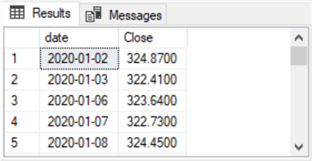
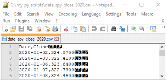
The list of date and close values is saved as a CSV file format in a Notepad++ session. Column headers for the date and Close columns from SQL Server are inserted into a Notepad++ window along with the column headers. The destination for the CSV file is c:\my_py_scripts\date_spy_close_2020.csv; this path is the same one in which the Python script file resides.
This tip is not particularly about the SPY ticker or even stocks. For example, the second demonstration in this tip is for simulated data generated by a computer program. Again, if you have data that changes over time, an animated line plot can highlight the changes irrespective of their source.
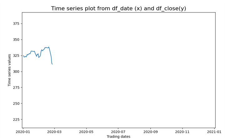
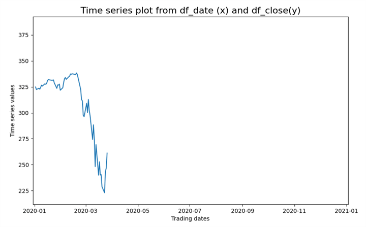
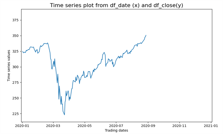
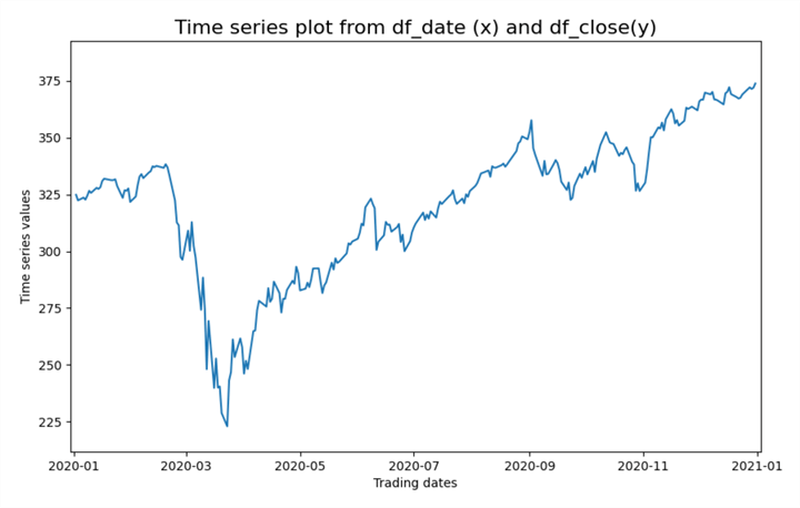
Four Excerpts from the Animated Line Plot for SPY Close Values during 2020
The plots within this section show excerpts from an animated line plot for SPY close values in 2020. An animated line plot is one in which data points are successively added to the line plot. This type of plot dynamically shows how y values change from a beginning x value through an ending x value where x denotes some time metric, such as a calendar day.
For the animated line plots shown in this section and coded in the next section, there are 253 trading days in 2020. Each of these trading days has a 2020-mm-dd value corresponding to the month and day of a trading day in 2020. There is also a close value for each trading day. The close value is the price for a security at the end of regular trading hours during a trading day. Consequently, the animated line plot for SPY close values in 2020 consists of 253 chart images that are successively presented, where the first image is for the first trading day in 2020, and the last image is for the set of all trading days through the last trading day in 2020. Python scripts implement animated line plots by successively showing a plot for each pair of x and y values through the current trading day in a year. After showing the last chart image for a year, Python starts over again from the first trading day in a year. You can stop the animated line plot from repeating by terminating the program that creates and displays the animated line plot.
For those who are not students of stock market price trends, it may be worth noting a few landmarks in the price trends for the SPY ticker during 2020.
- Prices were gradually rising from the beginning of 2020 through around two-thirds of the way through February.
- Prices declined precipitously starting in the last third of February for about a month into the last third of March. The steep declines were associated with the onset of the Covid pandemic in the US.
- After this, prices started to recover, but the recovery in prices was not nearly as rapid as the price declines.
- By the beginning of April, prices were in an obvious recovery.
- By late August, prices inched above the peak pre-pandemic levels.
- By the end of the year, prices exceeded peak pre-pandemic levels.
The following selection of screenshots reveals four chart images from the animated line plot of SPY close values in 2020. The following four chart images illustrate the progression of prices throughout 2020. When you run the program to create the animated line plot, you can see how prices change for each trading day throughout the year.
- The first screenshot shows prices from the start of the year through the beginning of the pandemic crash
- The second screenshot shows prices at the beginning of the recovery from the pandemic crash
- The third screenshot shows prices shortly after they begin to rise above the pre-pandemic peak level
- The fourth screenshot shows prices reaching new peak levels at the end of the year
BBelow are the four visualizations of the animated line plot as prices rise, fall, and recover throughout 2020.
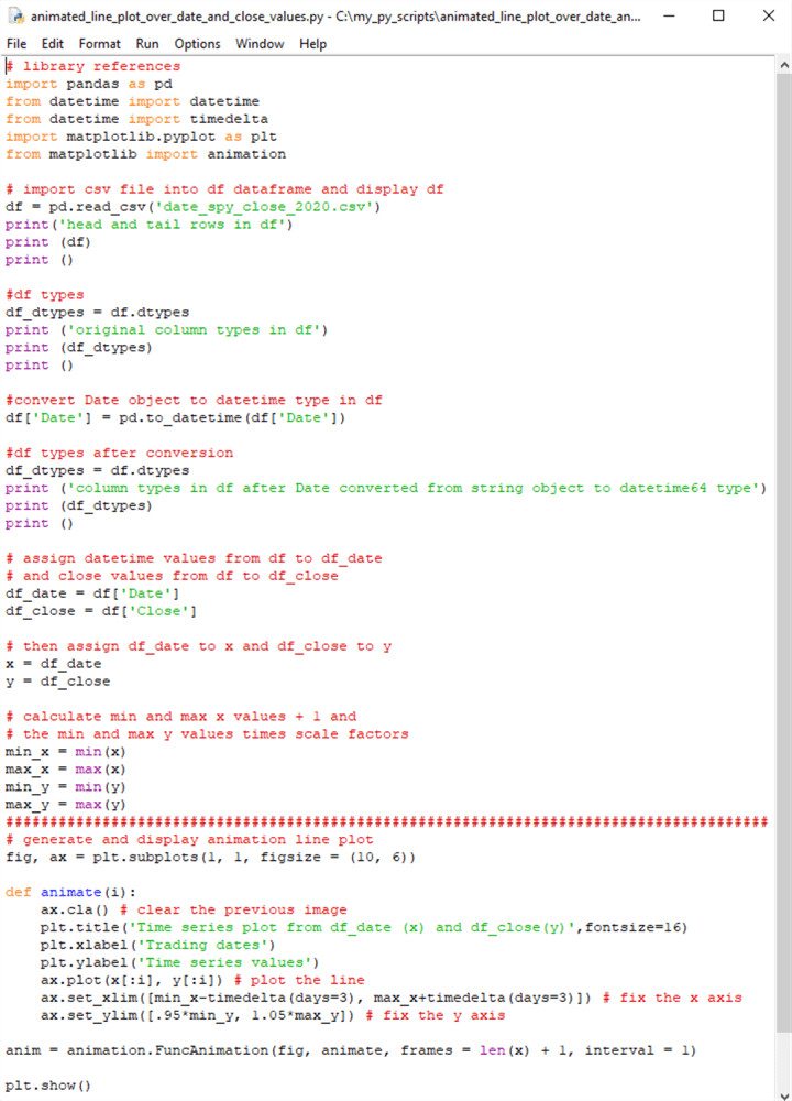
Python Script File for Data Mining Use Case
This section displays and discusses the script for creating the animated line plot, for which excerpts are shown in the preceding section. The use case demonstrated in this section is for data mining. The code for this section has two major parts. The two parts are separated by a line of hash marks (#).
- The script begins with some library references. These references establish links to external Python libraries
- The first major part continues by processing input (the CSV file in this example) to source data for some relatively standard code for creating an animated line plot
- The second part exposes the relatively standard code for creating and displaying the animated line plot
The steps in the first part are as follows:
- The read_csv function from the Pandas library reads the contents of the date_spy_close_2020.csv file; the CSV file is available in this tip's download. This function returns the file's contents to a pandas dataframe (df)
- The dtypes method for the df dataframe populates the df_types object
- A print method shows in the IDLE window the data types for the df dataframe
columns
- The Date column has an object type because the read_csv_file imports the column from the CSV file as a column of string values – not datetime values. Therefore, the Date column does not contain Python datetime values
- The Close column has a float64 data type. Best practices dictate the use of the Python decimal data type for currency values, just as the decimal data type (Dec(19,4)) is often recommended for use with currency prices in T-SQL. Because no calculations are performed with currency values in this use case example, there is no need to convert the float64 data type values to decimal data type values
The steps in the second part are as follows:
- The subplots function of the pyplot programming interface (plt) returns
a figure object and an ax object within the figure.
- The figure object can serve as a container for one or more axis (ax) objects
- An ax object corresponds to a plot, such as the animated line plot illustrated in the preceding section
- Figure objects can contain more than one ax object; the ax objects are
often referred to as subplots
- The 1, 1 following subplots reference a single ax object in the top row of the first column of the fig object
- The figsize parameter in the subplots function sets the figure's width and height, respectively, to 10 inches and 6 inches
- The animate and funcanimation functions coordinate with each other to create
a succession of animated line plot images. You can halt the succession
of line plot images by stopping the Python script
- The animate function is a user-defined Python function that creates a line plot image through i x values. The code within the animate function specifies the line plot for the x values in the plot. MSSQLTips.com offers an introduction to user-defined Python functions in this prior tip
- The funcanimation function is a Matplotlib function
- The first argument (fig) specifies where each chart image appears
- The second argument (animate) specifies the name of the user-defined function for creating a line plot chart image with i x values
- The third argument (frames) designates the number of x values in the current line plot chart image
- The fourth argument specifies a minimal amount of time in milliseconds to create a chart image. If your computer takes more time to create a chart image than the fourth argument value, then the funcanimation function does not relinquish control until the chart image is completed
- The show method displays the animated line plot in fig. The preceding four preceding animated line plot excerpts illustrate selected chart images displayed by the show method
# library references
import pandas as pd
from datetime import datetime
from datetime import timedelta
import matplotlib.pyplot as plt
from matplotlib import animation

# import csv file into df dataframe and display df
df = pd.read_csv('date_spy_close_2020.csv')
print('head and tail rows in df')
print (df)
print ()

#df types
df_dtypes = df.dtypes
print ('original column types in df')
print (df_dtypes)
print ()

#convert Date object to datetime type in df
df['Date'] = pd.to_datetime(df['Date'])

#df types after conversion
df_dtypes = df.dtypes
print ('column types in df after Date converted from string object to datetime64 type')
print (df_dtypes)
print ()

# assign datetime values from df to df_date
# and close values from df to df_close
df_date = df['Date']
df_close = df['Close']

# then assign df_date to x and df_close to y
x = df_date
y = df_close

# calculate min and max x values + 1 and
# the min and max y values times scale factors
min_x = min(x)
max_x = max(x)
min_y = min(y)
max_y = max(y)
#########################################################################################
# generate and display animation line plot
fig, ax = plt.subplots(1, 1, figsize = (10, 6))

def animate(i):
    ax.cla() # clear the previous image
    plt.title('Time series plot from df_date (x) and df_close(y)',fontsize=16)
    plt.xlabel('Trading dates')
    plt.ylabel('Time series values')
    ax.plot(x[:i], y[:i]) # plot the line
    ax.set_xlim([min_x-timedelta(days=3), max_x+timedelta(days=3)]) # fix the x axis
    ax.set_ylim([.95*min_y, 1.05*max_y]) # fix the y axis

anim = animation.FuncAnimation(fig, animate, frames = len(x) + 1, interval = 1)

plt.show()
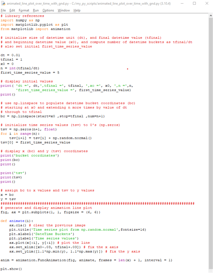
Python Script File for Data Modeling Use Case
This section presents an introductory use case example for data modeling. One way to implement data modeling is with a Monte Carlo simulation. This kind of simulation is a mathematical technique that predicts possible outcomes of an uncertain event. Examples of an uncertain event can be tomorrow's high temperature, the close price for a stock's share during tomorrow's trading day, or the winning team in a future sports event. Computer programs can implement Monte Carlo simulations to predict a range of future outcomes. For example, you can predict a set of time series values based on a starting value and a distribution, such as the standard normal distribution. The standard normal distribution can underlie changes over time periods for the values in a simulated time series.
Let's say we wanted to know if the distribution of stock prices over trading days or temperatures over calendar days were normally distributed. We could use the first temperature or stock price in a year and then see if the simulated temperatures or prices correspond to the actual values during the year. If the distribution of actual values matches the distribution of simulated values for a year, then this is one way of confirming that values are distributed according to a specific kind of distribution. This kind of example is easy to program with Python because the Numpy library has built-in pseudo-random number generators for many kinds of distributions (for example, standard normal distribution, log-normal distribution, uniform distribution, binomial distribution, the Poisson distribution, and more).
The code for this section introduces how to perform a Monte Carlo simulation with Python and its Numpy library. The following script shows how to simulate changes over time for a set of time series values based on a standard normal distribution. The distribution is for 100 sequential time buckets defined by 101 time bucket markers – one marker for the beginning period followed by a marker for the end of each sequential time bucket. With these constraints, the Monte Carlo simulation implemented by a Python script tracks changes in a time series variable (tsv) over 101 time bucket coordinates (bc) from a starting value at the beginning of the starting period. As with the script in the preceding section, there are two major parts to the script.
- The first part builds x and y values based on Python code that manipulates
Numpy functions
- The x values denote sequential bc values
- The y values denote values for a time series (tsv)
- The second part displays an animated line plot with a tsv value for each of the 101 bc values. The script also refers to tsv and bc values, respectively as y values and x values
- As in the previous section, a line of hash markers separates the two main parts of the script in this section
The overall script starts with three library references. The first reference is for the Numpy library, which receives an alias of np. The second reference is for the pyplot programming interface in the matplotlib library; the pyplot interface is assigned an alias of plt. The third reference is for the animation class in the matplotlib library.
After the library references,
- The first part starts with some assignments and performs a calculation for objects used throughout the rest of the script. The values for these objects are displayed with a Python print function
- The Numpy linspace function is invoked to define a normative set of time buckets. The bc values are normative in the sense that they are for 101 bc values over any range of datetime values, such as hours, days, months, or years
- After the bc values are defined, the code defines a set of time series values (tsv) in a Numpy array. The array values are defined by a calculation within a for loop, the first_time_series_value object, and a set of standard normal deviate values derived from the np.normal.random function. Each pass through the for loop generates a fresh simulated tsv value
- The first part of the script concludes with three steps
- The first and second steps display the bc and tsv values
- The third step assigns the bc array values and tsv array values, respectively to x and y arrays; this step helps to maintain some consistency in the second part of Python animated line plot applications
After the first part, the second part creates and displays a set of values normally distributed based on a start value and a succession of standard normal deviate values from the np.normal.random function.
- The assignment of objects to the fig and ax objects has the same structure as in the preceding section, but the figsize argument is different in this section than the preceding one. You can adjust the figsize argument values according to your personal preference for the size and shape of the displayed fig object
- Also, the animate user-defined function assigns different string values to the plot title as well as the x-axis and y-axis labels for the animated line plot in the ax object within the fig object. Additionally, slightly different function expressions are used for setting the limits of the x and y axes in the animated line plot. The expressions are created so that the x and y values for the animated line plot are not cropped by the ax object border
Recall that each run of the script generates a single animated plot that repeatedly appears until the current run of the script is terminated. However, if you re-start the script after designating x and y values for the line plots, you will get fresh tsv values. This is because the np.normal.random function designates a fresh sample of random normal deviate values each time the script is initially run. These normal value sets continue changing for each successive fresh script run.
# library references
import numpy as np
import matplotlib.pyplot as plt
from matplotlib import animation

# initialize size of datetime unit (dt), and final datetime value (tfinal)
# and beginning datetime value (x0), and compute number of datetime buckets as tfinal/dt
# also set initial first_time_series_value

dt = 0.01
tfinal = 1
x0 = 0
n = int(tfinal/dt)
first_time_series_value = 5

# display initial values
print( 'dt =', dt,',tfinal =', tfinal, ',xo =', x0, ',n =',n,
       'first_time_series_value =', first_time_series_value)
print()

# use np.linspace to populate datetime bucket coordinates (bc)
# starting at x0 and extending n more times by value of dt
# through to tfinal
bc = np.linspace(start=x0 ,stop=tfinal ,num=n+1)

# initialize time series values (tsv) to 0's (np.zeros)
tsv = np.zeros(n+1, float)
for i in range(n):
    tsv[i+1] = tsv[i] + np.random.normal()
tsv[0] = first_time_series_value

# display x (bc) and y (tsv) coordinates
print('bucket coordinates')
print(bc)
print()

print('tsv')
print(tsv)
print()

# assign bc to x values and tsv to y values
x = bc
y = tsv
#########################################################################################
# generate and display animation line plot
fig, ax = plt.subplots(1, 1, figsize = (6, 6))

def animate(i):
    ax.cla() # clear the previous image
    plt.title('Time series plot from np.random.normal',fontsize=16)
    plt.xlabel('DateTime Buckets')
    plt.ylabel('Time series values')
    ax.plot(x[:i], y[:i]) # plot the line
    ax.set_xlim([x0-.03, tfinal+.03]) # fix the x axis
    ax.set_ylim([1.1*np.min(y), 1.1*np.max(y)]) # fix the y axis

anim = animation.FuncAnimation(fig, animate, frames = len(x) + 1, interval = 1)

plt.show()
Script Results from the Data Modeling Use Case
The script in the preceding section is run twice to show the different outputs for successive runs of the script.
The script in the preceding section contains three print function statements. Each print function deposits its output in the IDLE shell window.
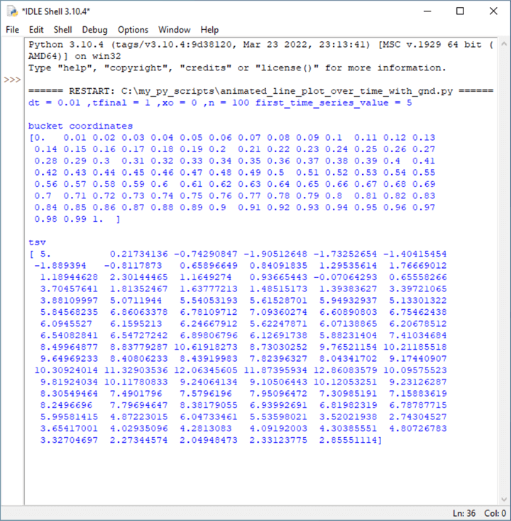
The following screenshot shows the IDLE shell window for the first run of the preceding script.
- The first print function displays initial settings and one calculated value,
n.
- The overall time scale for time bc values extend from an initial value of 0 (x0) through a final value of 1 (tfinal)
- The duration of a single time bucket is .01 (dt)
- Therefore, the total number of time buckets is 100
- The tsv values plot onto the y axis; they are set to start from a value of 5. You can adjust the starting tsv value according to your requirements
- The second print function displays the time bucket coordinates from a starting value of 0 through an ending value of 1. The difference between any two contiguous values is .01. There are 101 time bc coordinate values for the animated line plot
- The third print function displays the time series values, which plot relative to the y axis of the animated line plot
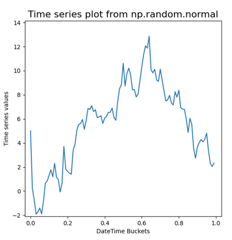
The next screenshot shows the animated plot line for tsv coordinates versus bc coordinates. The beginning tsv coordinate is 5, and the ending tsv coordinate is 2.85551114. These values correspond to the first and last tsv values in the preceding screenshot.
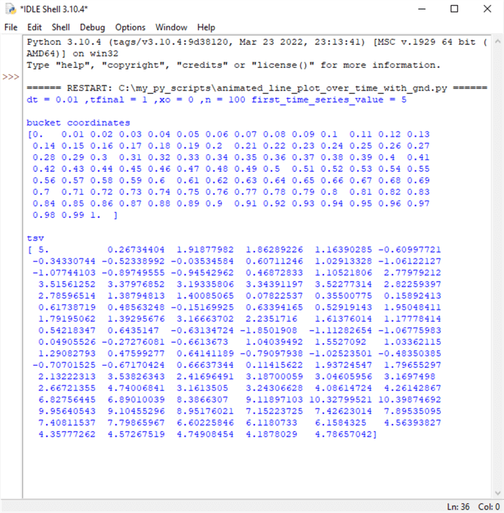
The next pair of screenshots show the IDLE shell window and the completed animated line plot from a second run of the preceding script. The main point to observe is that the tsv coordinates are different between the output for the first and second script runs (with one exception for the first tsv value). There are two reasons for this.
- First, the script for the animated plots always sets the first tsv coordinate value to 5.
- Second, the script extracts a different collection set of standard normal
deviate values in each run of the script. Therefore, the tsv values are
different in the first and second script runs.
- The ending tsv value for the first script run is 2.85551114
- The ending tsv value for the second script run is 4.78657042
Although the tsv values for the first and second runs differ, they are both from a normal distribution. You can verify this with the techniques demonstrated for assessing if a set of values are normally distributed in this prior tip An Introduction to Assessing Normality with Python. Also, both runs use the same np.random.normal function, but the returned values from the function are different for each run of the script.
The IDLE shell window and completed animated line plot for the second run of the preceding script.

Next Steps
The main thrust of this tutorial is to show how to make animated line plots. An animated line plot will typically be for time series data where the x axis values represent time units, and the y axis values change over time. Animated line plots are unique in that they show the path time series values follow instead of only showing the time series values as one static chart image.
This tutorial shows examples of two different use cases for implementing animated line plots with Python. The first use case is to perform some data mining of historical data. The second use case displays time series values from a Monte Carlo simulation. Both use cases introduce you to the basics of creating and displaying animated line plots with Python and its Matplotlib library.
The first use case example utilizes a CSV file with historical data for the SPY ticker symbol.
The second use case example has another Python script in this tip's download. The script for the second use case generates the data for the plot via a pseudo-random number generator function. Then, it creates and displays an animated line plot for the generated data. The data are generated for a very basic Monte Carlo simulation.


About the author
 Rick Dobson is an author and an individual trader. He is also a SQL Server professional with decades of T-SQL experience that includes authoring books, running a national seminar practice, working for businesses on finance and healthcare development projects, and serving as a regular contributor to MSSQLTips.com. He has been growing his Python skills for more than the past half decade -- especially for data visualization and ETL tasks with JSON and CSV files. His most recent professional passions include financial time series data and analyses, AI models, and statistics. He believes the proper application of these skills can help traders and investors to make more profitable decisions.
This author pledges the content of this article is based on professional experience and not AI generated.
View all my tips
Article Last Updated: 2023-02-13