By: Rick Dobson | Updated: 2022-07-21 | Comments (2) | Related: > Python
Problem
I am a SQL professional assigned to support a team of data science engineers. The data science engineers mainly program in Python. To better interact with them, I started to acquire basic Python programming skills. My fellow team members recently started urging me to grow my Python skills by displaying charts in subplot sets. Please provide some sample Python code with corresponding charts to help me get started on responding to these requests.
Solution
Python can work with any of several charting libraries. This tip focuses on the Matplotlib library and the subplots method within the pyplot application programming interface for the Matplotlib library. Matplotlib through pyplot offers a rich object-oriented interface for displaying many different chart types, such as line, bar, pie, scatter, box, heatmap, and treemap charts. Furthermore, each chart type can be displayed with a wide selection of property settings. Also, you can display related datasets or the same dataset with different chart types in a set of subplots that belong to a figure object.
In at least four prior tips (here, here, here, and here), these tips demonstrated different approaches to displaying SQL Server data with the Matplotlib library. These prior tips mainly demonstrate different approaches to creating, displaying, and saving charts for datasets from SQL Server; the focus was nearly always on one chart per dataset.
This MSSQLTips.com article goes beyond prior ones in that its focus is to introduce techniques for displaying multiple charts. When displaying multiple charts in a figure, you will need two or more subplot containers in a figure object. Within each subplot is a single chart.
This tip primarily focuses on figure objects comprised of subplots containing line charts, but some examples also show scatter and bar charts. Line charts are particularly well suited for showing how a collection of data values change over time. Scatter and bar charts are better suited for revealing relationships and differences with categorical data, such as showing the differences between several different data science models or data sources.
The tutorial technique for this tip is to present a Python script, explain how the code works, and then show the figure with its corresponding charts. Some script examples are very similar so that the tip sometimes presents slightly different, but hopefully highly informative, variations on a common theme for showing multiple charts in one figure. Another tutorial technique is to have one script with two key lines that perform complementary functions. The script in the article shows with one line uncommented and the other line commented. Figures are presented and described with each of the two key lines uncommented.
Creating a vertically stacked set of line charts
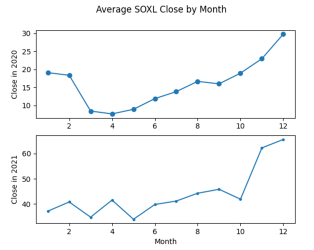
The first example is for two vertically stacked subplots in a figure. The figure shows average monthly closing prices by month for a securities ticker, namely SOXL. The top subplot is for data from 2020, and the bottom subplot is for data from 2021.
This example starts with a SQL script for pulling the source data for the dataset for each year and month from a SQL Server table. The results set from the SQL script are manually copied to a Python script for building and displaying the figure with two subplots.
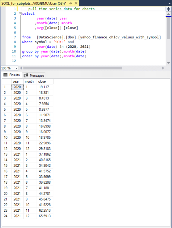
The following screenshot shows the SQL script and its results set for the example chart set in this section.
- The from clause specifies the yahoo_finance_ohlcv_values_with_symbol table in the dbo schema of the DataScience database. This table contains daily trading date close prices for many securities symbols.
- The select clause
includes three fields from the source table in the results set.
- The year and month columns are from source table fields.
- The close column is a computed field. It contains the average close price for each month within each year.
- The where clause indicates that results are just for the rows with a ticker symbol value of SOXL.
- The group by clause indicates that average close prices are computed by year and month.
- The order by clause ensures the results set is ordered by month within year.
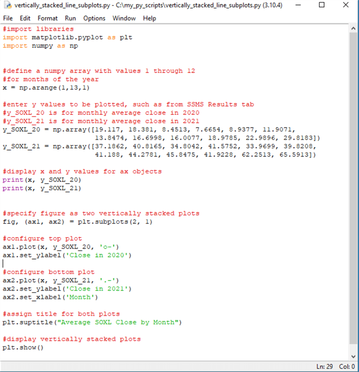
The next screenshot shows a Python script for the figure presented in this section. The script appears in an IDLE window. IDLE is an integrated development environment for Python that ships with the version of Python that you can download from Python.org. SQL developers can think of IDLE for Python in the same way they think of SSMS for TSQL. The top border of the IDLE window shows the Python file name and file path along with the version of Python being used (3.10.4).
The Python script starts with two import statements for referencing pyplot from the matplotlib library; the pyplot application programming interface has an alias of plt. The numpy library is another extension of the core Python code that offers mathematical functions, random number generators, linear algebra routines and more. Its alias in the script is np.
The numpy arange function can return an array of integer values from a starting value through an ending value with a fixed step size between array elements. The ending value of arange function is not included in the array of values from the function. In the script below, the integer values start at 1 and extend through 12 with a step size of 1. The integers 1 through 12 are to denote successive months in a year from 1 for January through 12 for December.
The numpy array function can hold a set of floating-point numeric values, such as the monthly average close values for a ticker symbol in a year. Two arrays are specified in the following script. The y_SOXL_20 array holds the monthly average close values for the SOXL symbol during the months of 2020. The y_SOXL_21 array holds the monthly average close values for the SOXL symbol during the months of 2021. By comparing the values in the script below with the values in the Results tab from the preceding screenshot, you can see that the Results tab values are copied in a comma-separated format to the Python script. A pair of print functions display in the IDLE shell window y_SOXL_20 and y_SOXL_21 array values.
Next, the subplots method in pyplot (plt) specifies two subplots within a figure object named fig. The first parameter value (2) for the subplots method designates the number of rows in an array of subplots. The second parameter value (1) designates the number of columns in an array of charts. Because the first parameter is 2, the two subplots each are vertically stacked. The subplot identifiers are designated by ax1 for the top chart and ax2 for the bottom chart. Because there is one chart per subplot, this tip sometimes refers to a chart by the identifier for the subplot in which the chart resides.
The next two code blocks configure the charts within the ax1 and ax2 subplots.
- The first code block designates the x and y coordinate values for the line
chart in the ax1 subplot. The plot function specifies the line chart.
- The first positional parameter for the plot function designates the x values for ax1 as those from the x array.
- The second positional parameter for the plot function designates the y values for ax1 as those from the y_SOXL_20 array.
- The third positional parameter designates how points are connected.
- The "o" value indicates y values along the line. The line markers appear as a filled circle. See this web page for a description of all the matplotlib line marker symbols.
- The "– " value indicates the character comprising the line between y values.
- This code block concludes by specifying a label (Close in 2020) for the y axis of the ax1 chart.
- The second code block designates the x and y coordinates for the line chart
in the ax2 subplot.
- The first positional parameter for the plot function designates the x values for ax2 as those from the x array. This is the same as for ax1.
- The second positional parameter for the plot function designates the y values for ax2 as those from the y_SOXL_21 array. This is different than for ax1.
- The third positional parameter for the plot function designates
how points are connected.
- The "." value indicates y values along the line. The "." symbol appears as a smaller filled circle than the "o" marker symbol designator.
- The "– " value indicates the character comprising the line between markers for y values.
- This code block also specifies a label (Close in 2021) for the y axis of the ax2 chart.
- This code block ends with a specification (Month) for the x axis label. Because the ax1 and ax2 subplots are vertically stacked, the label for the x axis in ax2 also applies to the x axis for ax1.
The pyplot suptitle method assigns a title to the pair of vertically stacked charts.
Finally, the pyplot show method displays the vertically stacked charts in fig.
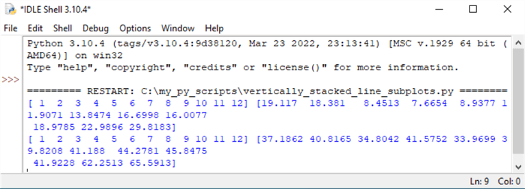
Here are the x and y coordinates in the IDLE shell window from the preceding script. These coordinate values are from the two print functions in the script. The ax1 coordinates appear above the ax2 coordinates. Within each coordinate set, the x axis values precede the y axis values.
Here are the two charts displayed by the show method. The top chart is for coordinate values from 2020 and the bottom chart is for coordinate values from 2021. The chart images are excerpted from a window inside a single matplotlib figure window that displays both charts. The figure window provides button tools for manually manipulating how chart images display. As a programmer, you will probably prefer to configure chart images with code, but if you are an end user who infrequently uses subplots in matplotlib, you may prefer to manipulate the chart images with the figure window.
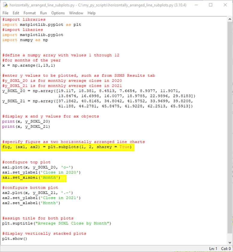
Creating horizontally arranged line charts
Instead of arranging the charts vertically in a figure, you can arrange them horizontally. This section presents and describes the Python script for achieving this goal. With a couple of minor exceptions, the code for this section is identical to the code in the preceding section.
Here is the Python script for displaying the line charts horizontally. The two highlighted lines are unique to this section.
- The first highlighted line designates a horizontal arrangement of the two
charts versus a vertical alignment of the charts.
- The first two parameters (1, 2) for the subplots function from pyplot designates one row of two charts arranged side by side. The first parameter value designates a single row or charts. The second parameter value specifies that there are two charts in the row.
- Because the charts are side by side, this means they can share a common set of y axis. The parameter assignment sharey = True causes the two charts to share a common set of y axis values.
- The charts in ax1 and ax2 require separate x axis labels because the ax1 and ax2 charts are not vertically stacked. The label has the value of "Month" for the x axis of each chart.
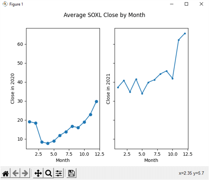
Here is the initial figure window from the preceding script.
- In the side-by-side chart display, it is easier than in the vertically stacked charts to discern that range of y values in 2021 are larger than in 2020.
- Unfortunately, some of the automatically set x axis tick mark values are for half-month points, such as 2.5, 7.5, and 12.5. In addition, there are only 12 months in a year. Therefore, there is no value such as 12.5 months in a year.
- If you look carefully at the following pair of charts, you can tell that the x axis value of 12.5 is for the right border of each chart frame. There are several different solutions to the half-month x axis values. One solution is to stretch the figure width until half-month values disappear.
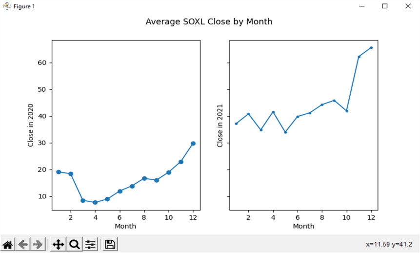
Here is an image with a stretched version of the preceding figure window. Notice how the x axis tick values are whole numbers in the range of 2 through 12. Another more precise solution for setting x axis and y axis values is presented in the next section.
Creating a two-by-two set of line charts
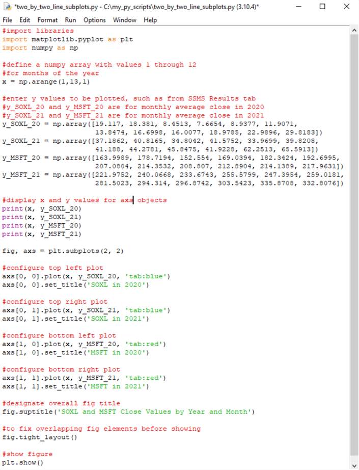
In addition to displaying a column or row of charts, you can also display charts in a rectangular grid. This section focuses on how to create and show a two-by-two set of line charts. The rectangular grid format for line charts can readily be extended easily to accommodate more charts in a grid, such as a two-by-three or a four-by-three set of line charts. This section reviews Python scripts for several settings available when displaying line charts in a rectangular grid.
The following script shows some Python code for a two-by-two set of line charts. There is one common set of x array values for each of the line charts in the two-by-two rectangular grid. Each chart has a different set of y coordinates values. The names for the y coordinate sets in the top two charts are y_SOXL_20 and y_SOXL_21. The names for the bottom two y coordinate sets are y_MSFT_20 and y_MSFT_21. The y_SOXL_20 and y_SOXL_21 coordinate sets are derived from the SQL script in the "Creating a vertically stacked set of line charts" section. The y_MSFT_20 and y_MSFT_21 coordinate sets are from a SQL script like the one in the "Creating a vertically stacked set of line charts" section except for the where clause referencing MSFT instead of SOXL.
The four print function statements towards the middle of the following Python script display each pair of x and y coordinates.
The subplots method for the plt alias appears in the line of code immediately following the four print function statements. The "2, 2" in the parentheses for the subplots method designates the number and layout of line charts in its rectangular grid. There are two charts in the top row of charts and two more charts in the bottom row of the rectangular grid. The rectangular grid of charts is in the fig object. Each subplot container for a chart is represented by an axs object.
- The top left chart is in the axs[0, 0] subplot.
- The top right chart is in the axs[0, 1] subplot.
- The bottom left chart is in the axs[1, 0] subplot.
- The bottom right chart is in the axs[1, 1] subplot.
After the four axs subplots containers are created, they are populated with x and y coordinate sets, and the line in each chart is assigned a color. The "tab:" prefix before color names indicates that matplotlib tries to match Tableau colors from the T10 categorical palette. Additionally, a title is assigned to each axs object with the set_title method for an axs object.
When creating chart sets with multiple chart elements per chart, matplotlib occasionally overwrites some chart elements on top of other chart elements. The tight_layout method for a figure object, such as fig, can often fix this kind of issue. You should invoke this method after all other plot element settings are made.
Finally, the show method for the plt alias is invoked to display the fig object.
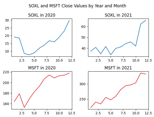
Here’s what the displayed fig object looks like when it is displayed. The two charts for the SOXL ticker symbol have blue lines. The two charts for the MSFT ticker have red lines. All four charts appear in the rectangular grid.
Notice that the x ticker values along the bottom axis of each chart has ticker values of 2.5, 7.5, and 12.5. The example after next in this section shows how to programmatically override the tickers that include .5 values.
It may be helpful to show you the effect of omitting the invocation of the tight_layout method in the next to last line of code in this script. You can accomplish this by re-running the code with a comment marker (#) in front of the line of code that appears as "fig.tight_layout()".
As you can see, the chart titles for bottom pair of line charts are overwritten by the ticker values from the top pair of charts. In addition, the title for the overall set of charts (SOXL and MSFT Close Values by Year and Month) crowds the titles for the charts in the top pair of subplots in the rectangular grid within fig.
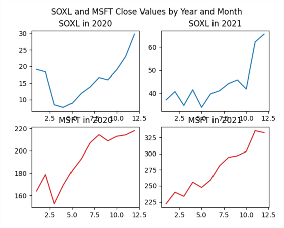
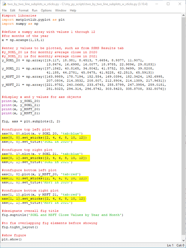
Here’s another Python script that illustrates a way to assign specific values for tickers along the x axis for each chart. All you need to do is invoke the set_xticks method for each axs object in fig. The set_xticks method assigns an array of x tick values to the chart within each axs subplot in fig. Aside from invoking the set_xticks method for each chart, the following script is identical to the preceding script. The four lines of code invoking the set_xticks method are highlighted in the script below for your easy identification.
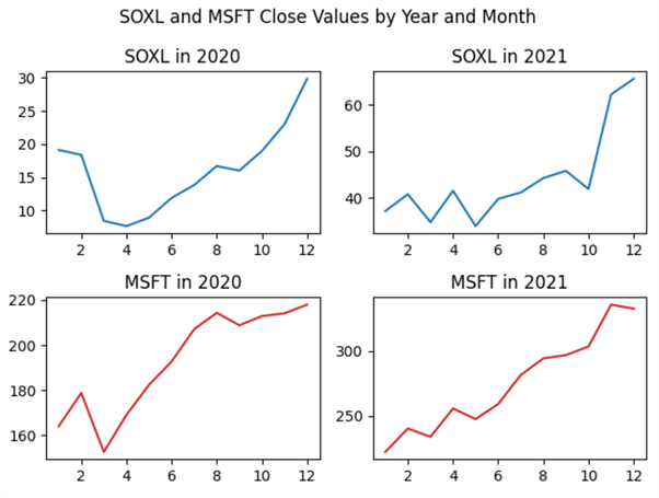
The following screenshot shows the set of line charts from the preceding script. As you can see, the x tick values for each chart have only whole integer numbers. This is because of the argument values for the set_xticks method.
Subplots for categorical data
The preceding three sections showed different ways of displaying continuous metrics (average monthly close values for SOXL and MSFT ticker symbols) versus the months within a year. The discrete monthly values have an inherent order.
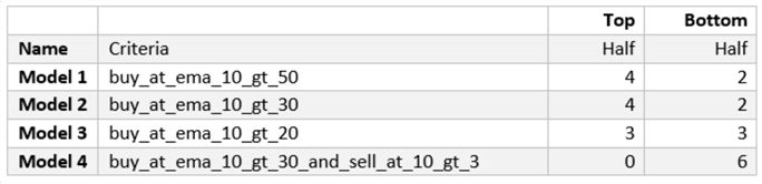
In contrast, this section shows how to plot counts for categorical data. The dependent variable is the count for each of four models in the top half of performance across six ticker symbols. By ranking the model-symbol pairs, there are twelve pairs in the top half and twelve more in the bottom half. The larger the count in the top half in average percentage change per trade, the better is the performance of a model at generating profits. Conversely, the larger the count in the bottom half, the worse is the performance of a model at generating profits. Whenever you have count or percentage data for categories that have no inherent order, you may want to compare the categories with either of the subplot examples in this section.
The use case for this section is derived from a prior tip that computes results for four different models that attempt to pick profitable trades for each of six different ticker symbols. Summary data from the use case example appear in the following table. The table has four columns.
- The first column is for the category names. As you can see, the category names are Model 1, Model 2, Model 3, and Model 4.
- The second column is for the model criteria for picking profitable trades. This column is not important for this tip. However, some readers may be interested in the criteria if they want to examine the model logic or use these models as a starting point for their own custom models.
- The third column is the count for the number of model-ticker symbol pairs that are in the top half of the outcomes across all four models for each of six tickers. This section develops subplots for the third column count values versus the model names in bar chart, scatter chart, and line chart format.
- The fourth column is the count for the number of model-ticker symbol pairs that are in the bottom half of comparisons across all four models. These data are not used in this tip, but they are made available in case you want to adapt the code for subplots with top half data to subplots with bottom half data. This exercise will confirm your understanding of the code for displaying categorical data with subplots in three different chart styles.
This section presents two pairs of chart sets. Each pair illustrates how to turn a feature on or off.
- The first pair of chart images is for a row of three subplots.
- The first pair member shows how to turn on the sharey feature across the three subplots.
- The second pair member shows how to turn off the sharey feature across the three subplots.
- The second pair of chart images is for a column of three subplots.
- The first pair member shows how to turn on the constrained_layout feature.
- The second pair member shows how to turn off the constrained_layout feature
- The sharey feature was previously introduced and demonstrated in the "Creating horizontally arranged line charts" section for continuous data in line charts. This section illustrates how to manage the feature for subplots of category data in bar, scatter, and line charts.
- The constrained_layout feature is similar to the tight_Layout method for figure objects, which was previously discussed and demonstrated for subplots with line charts in the "Creating a two-by-two set of line charts" section. The two features can address similar issues, such as overlapping axis labels, but the constrained_layout feature was introduced after the tight_layout method and uses a different body of code than the tight_layout method. See these two matplotlib documentation sections for more detail on each feature (Tight Layout Guide and Resizing axes with constrained layout)
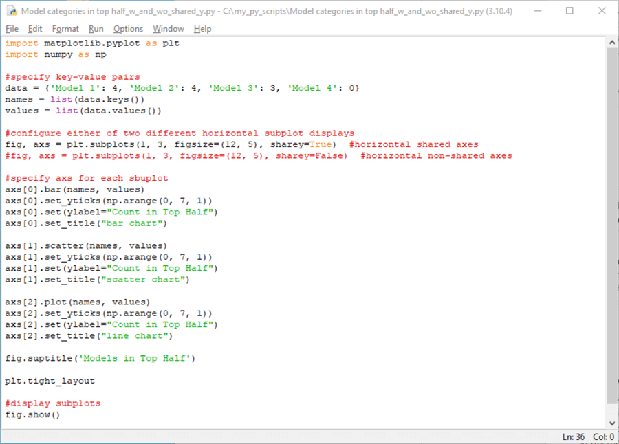
Here is a Python script for displaying bar, scatter, and line charts for categorical data in a row with three subplots and one of two assignments for the sharey parameter of the subplots method.
- The code starts out with a pair of import methods for pyplot within the matplotlib library and the numpy library.
- The data object is a Python dictionary object.
- Python dictionary objects are comprised of a series of keyword-value pairs contained in curly braces. This kind of object is like, but not identical to, JSON data. See this prior tip for an introduction to JSON data for use in SQL Server.
- In the script, there are four keyword values: Model 1, Model 2, Model 3, and Model 4. These four keyword values denote the category names for the charts in this section.
- Each keyword has an associated value (4 for Model 1, 4 for Model 2, 3 for Model 3, and 0 for Model 4). These associated values appear following a colon after each keyword.
- The keys method for a dictionary object extracts a list of keywords. The names object in the script below stores the list of keywords.
- The values method for dictionary objects extracts a list of values associated with keywords. The values object in the script below stores the list of values for the keywords.
- The next two lines of code in the script show two different versions of
how to create three subplots in a single row.
- The uncommented line of code creates the three subplots with the sharey parameter set to True.
- The trailing line of code starts with a comment marker (#) creates three subplots with the sharey parameter set to False.
- For any given run of the script, you only need one of the two lines of code uncommented.
- After the code to invoke the subplots method, the script assigns settings
to the axs object within each subplot. The axs objects are successively
designated with names of axs[0], axs[1], and axs[2].
- The first subplot chart has a bar chart format. Notice the application
of the bar method to axs[0].
- The numpy arange method within the set_yticks method for axs[0] specifies limits of 0 through 6 to the y ticks along the vertical axis in the chart.
- The set method for axs[0] assigns a value of "Count in Top Half" to its ylabel setting. This syntax designates the y axis label.
- The set_title method for axs[0] assigns a title to the chart in axs[0].
- The code for the second and third subplots follow the same pattern as
for the first subplot with two exceptions. The exceptions are for
the method used to designate a chart type and the title text for each subplot.
- The scatter method is applied to axs[1] within the second subplot. This method creates a scatter chart for the names and values list objects. The title for the chart in the second subplot is updated accordingly.
- The line method is applied to axs[2] within the third subplot. This method creates a line chart for the names and values list objects. The title for the chart in the third subplot is updated accordingly.
- The first subplot chart has a bar chart format. Notice the application
of the bar method to axs[0].
- Next, the suptitle method is invoked for the fig object. This method assigns a single title ("Models in the Top Half") for the set of three subplots in the fig object.
- The next-to-last line of code invokes the tight_layout method for the plt alias.
- The final line of code shows the set of three charts in the three subplots within the fig object.
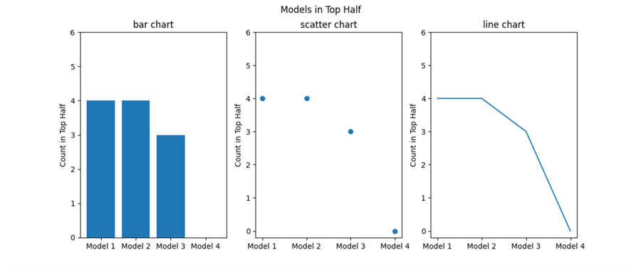
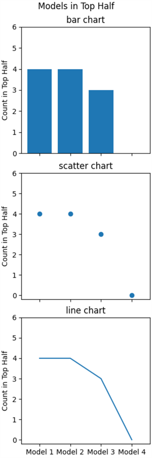
Here is a screenshot of the image from the preceding script with sharey=True.
- There are three charts in a single row of charts.
- The first one is a bar chart.
- The second one is a scatter chart.
- The third one is a line chart.
- All three charts plot the names list along the x axis and the values list along the y axis.
- The range of y axis tickers starts at 0 and extends through 6. This range follows from the set_yticks method argument.
- Only the first chart displays ticker values. This is because sharey is set to True in the subplots statement that creates the subplots.

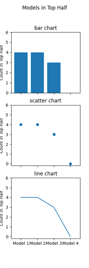
Here is a screenshot of the image from the preceding script with sharey=False. Recall that to run the code with sharey equal to False, you need to insert a comment marker (#) before the first subplots statement and clear the comment marker from the second subplots statement. Notice that the only difference between the following chart and the preceding chart pertains to the ticker values for the charts in the second and third subplots.
- The preceding screen image only has y ticker values for the chart in the first subplot.
- The following screen image has y ticker values for the charts in all three subplots.
- This difference stems from the fact that
- the code for the preceding screen image has sharey equal to True, and
- the code for the following screen image has sharey equal to False
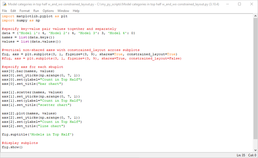
Here is a Python script for displaying bar, scatter, and line charts for categorical data in a column with three subplots and one of two settings for constrained_layout.
- The data for the following subplots example uses the same dictionary object as the preceding subplots example.
- The subplots method in the following script has its first two parameter settings: 3,1. These parameters specify a subplot layout of three rows of subplots in a single column. The subplots method also assigns True of sharex. Therefore, the x ticker values only appear along the bottom chart, but all three charts have tickers for all four models.
- The last parameter in the subplots method assigns either True or False to
the constrained_layout parameter.
- There are two different versions of the subplots statement – each with a different assignment for the constrained_layout parameter.
- The version that appears below assigns a value of True to the constrained_layout setting.
- If a comment marker is inserted at the beginning of the first subplots statement below and the comment marker for the second subplots statement is removed, then the code assigns a value of False to the constrained_layout parameter.
Here is a screenshot of the image from the preceding script with constrained_layout equal to True. The suptitle appears immediately above the title for the top subplots. This is a result of setting constrained_layout to True. Also, x ticker labels only appear along the bottom chart. This is because the sharex parameter equals True.
Here is a screenshot of the image from the preceding script with constrained_layout equal to False. The suptitle is followed by a gap before the chart title from within the first subplot. This is a result of setting constrained_layout to False. Also, x ticker labels only appear along the bottom chart. This is because the sharex parameter equals True.
Next Steps
This tip aims to introduce multi-chart displays with Python and Matplotlib. Because this tip targets SQL professionals, it begins with a SQL script for extracting data from a SQL Server table that is appropriate for insertion in multi-chart displays. The tip starts with a couple of simple examples to acquaint readers with core techniques for creating, configuring, and displaying. Then, the core techniques are expanded upon with more elaborate multi-chart sets as well as with examples that highlight the function of key graphing techniques for multi-chart displays.
The download file for this tip includes a couple of .png files with images of TSQL scripts and matching results sets. The download file also includes seven Python script files for creating a multi-charts set. Some of these files are meant to be edited so that you can view the resulting chart sets in a couple of different configurations.
One obvious next step is to make sure that you can run the code as described in the article. Next, consider re-running selected code examples with bottom half data as opposed to top half data. Finally, after you feel comfortable editing the code in this tip, start using your data instead of the sample data charted in the tip.


About the author
 Rick Dobson is an author and an individual trader. He is also a SQL Server professional with decades of T-SQL experience that includes authoring books, running a national seminar practice, working for businesses on finance and healthcare development projects, and serving as a regular contributor to MSSQLTips.com. He has been growing his Python skills for more than the past half decade -- especially for data visualization and ETL tasks with JSON and CSV files. His most recent professional passions include financial time series data and analyses, AI models, and statistics. He believes the proper application of these skills can help traders and investors to make more profitable decisions.
This author pledges the content of this article is based on professional experience and not AI generated.
View all my tips
Article Last Updated: 2022-07-21